 |
||||||||||||||||
|
|||||
|
|
||||
|
 |
|
|||
|
|||||
|
|||||
 |
||
 |
||||||
 |
 |
|||||
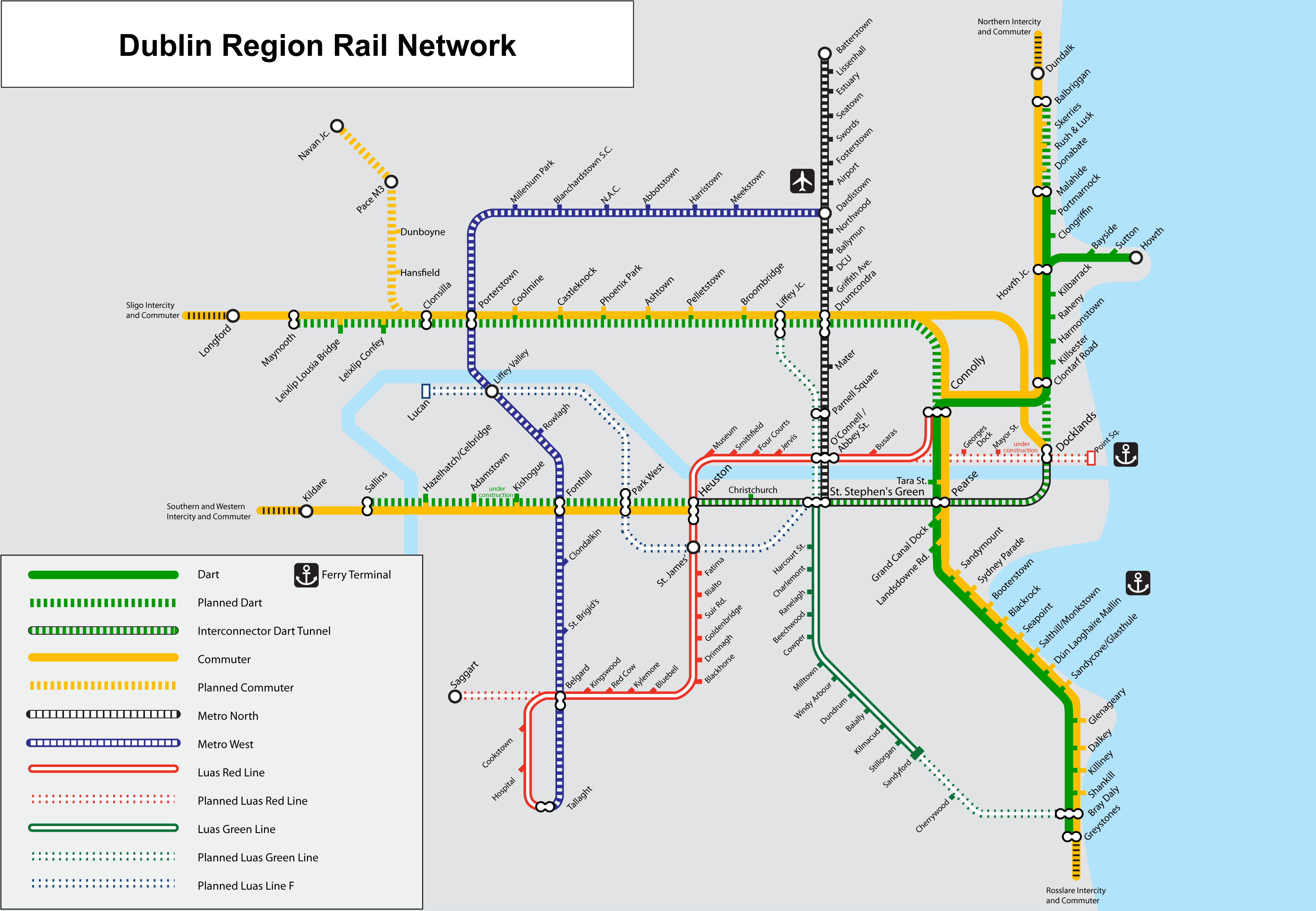
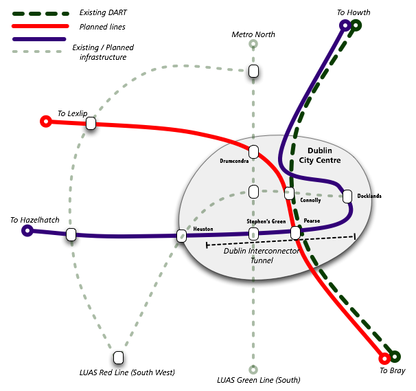
Nodel design - junctions are at stations and lines enter directly. Pelletstown open. |
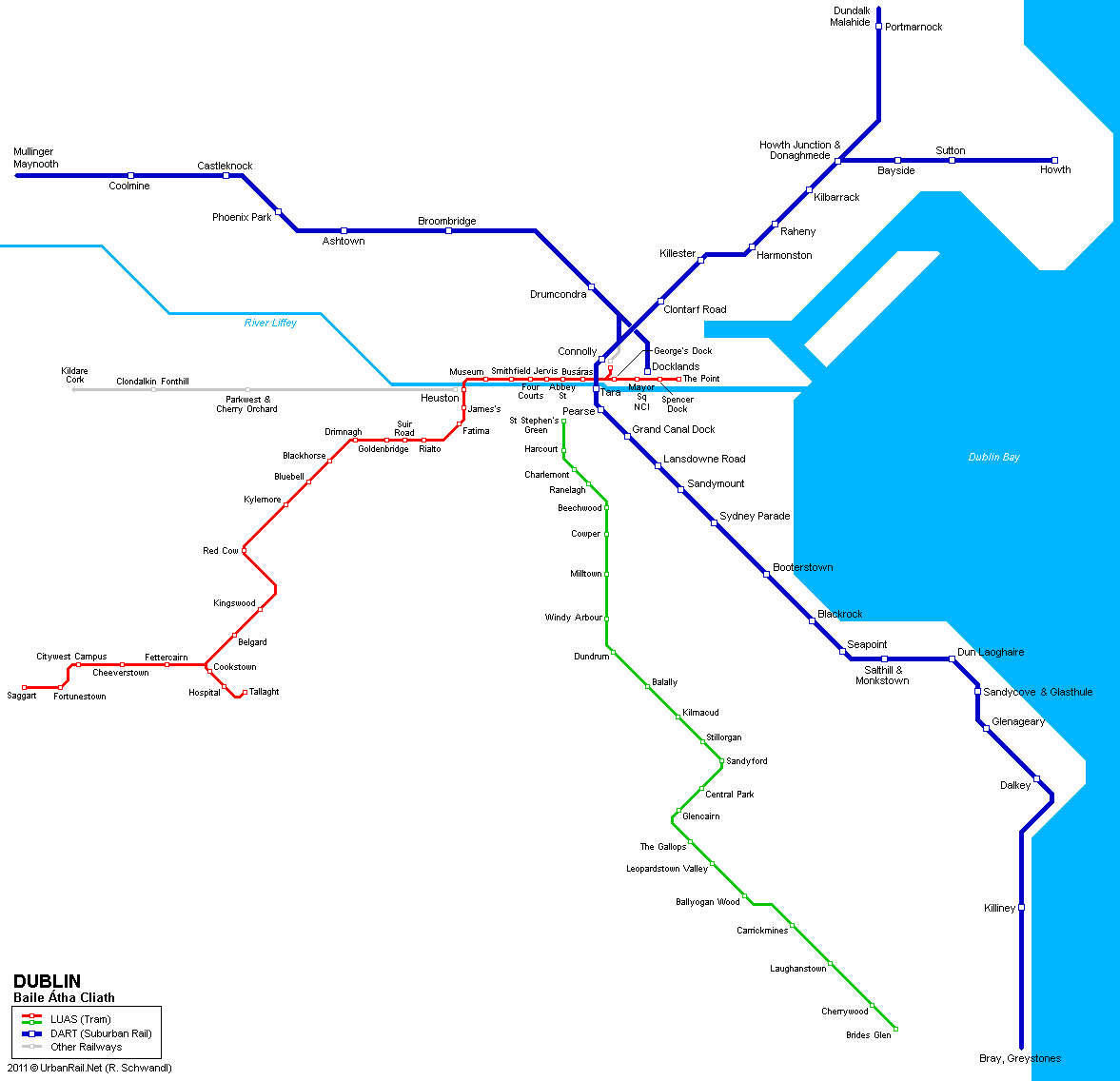
Geographic design - junctions are shown correctly. Pelletstown open. |
|||
 |
||||||||
 |
 |
 |
||||||
|
||
 |
 |
 |
||||||||
 |
||||||||||
 |
||||||||||
 |
||||||||
 |
 |
 |
||||||
 |
||||||||||||||||||||||||||||
 |
 |
|||||||||||||||||||||||||||
 |
||||||||||||||||||||||||||||
 |
 |
 |
||||||||||||||||||||||||||
 |
||||||||||||||||||||||||||||
 |
||||||||||||||||||||||||||||
 |
||||||||||||||||||||||||||||
 |
 |
|||||||||||||||||||||||||||
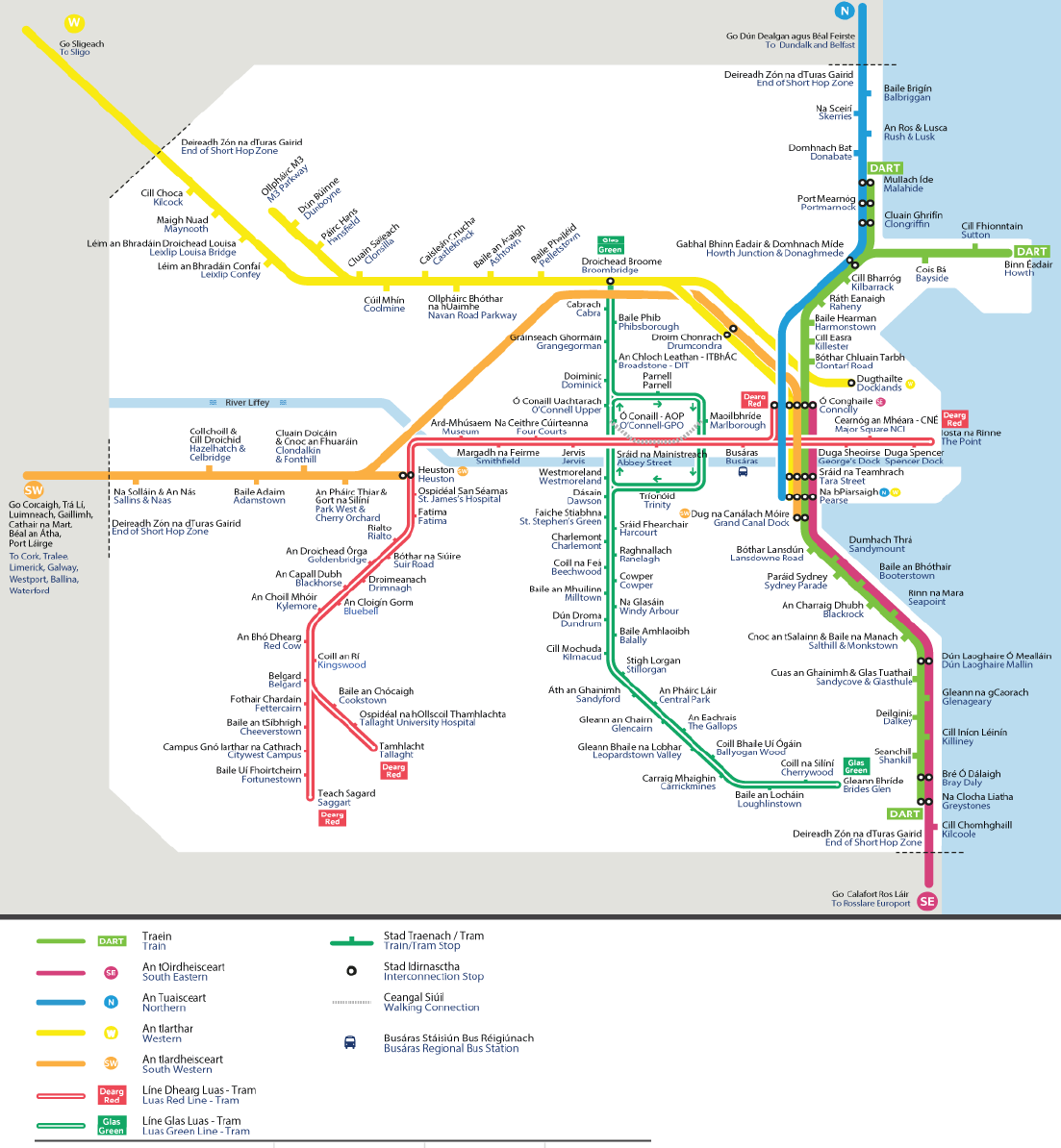
Identical to map below but with extra tram indication at Broombridge. |
||||||||||||||||||||||||||||
 |
||||||||||||||||||||||||||||
Slight difference in tram graphics between these two maps and opening of green line Broombridge extension. |
||||||||||||||||||||||||||||
 |
||||||||||||||||||||||||||||
 |
||||||||||||||||||||||||||||
 |
||||||||||||||||||||||||||||
 |
||||||||||||||||||||||||||||
With Phoenix Park line shown. This was extremely difficult, the junction around Broombridge being patricularly hard. |
||||||||||||||||||||||||||||
 |
||||||||||||||||||||||||||||
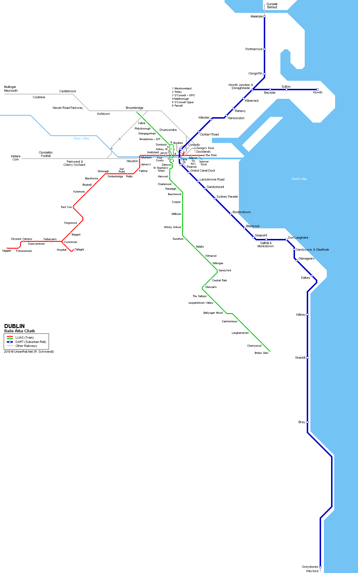
With Luas Green Line extended to Broombridge |
||||||||||||||||||||||||||||
 |
||||||||||||||||||||||||||||
 |
||||||||||||||||||||||||||||
 |
||||||||||||||||||||||||||||
 |
||||||||||||||||||||||||||||
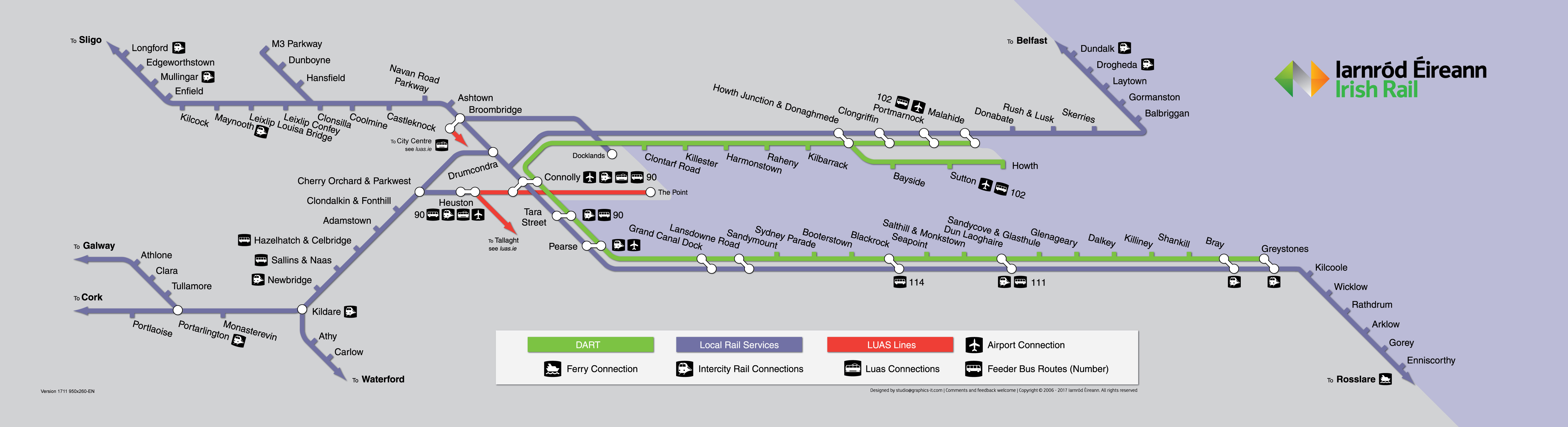
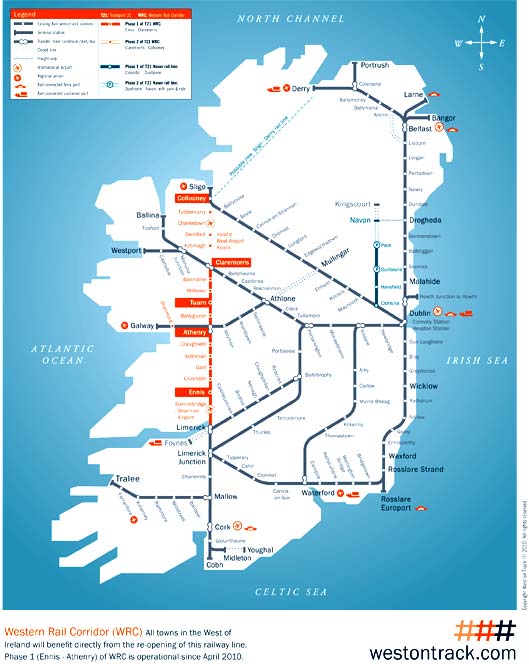
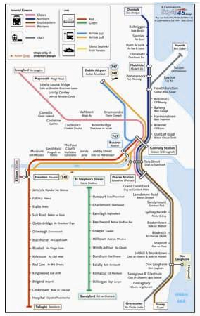
Oranmore station opened. |
||||||||||||||||||||||||||||
 |
||||||||||||||||||||||||||||||||||||||||||||||
 |
||||||||||||||||||||||||||||||||||||||||||||||
 |
||||||||||||||||||||||||||||||||||||||||||||||
 |
||||||||||||||||||||||||||||||||||||||||||||||
 |
||||||||||||||||||||||||||||||||||||||||||||||
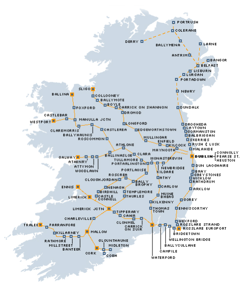
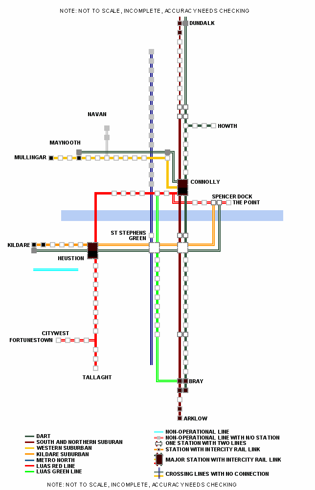
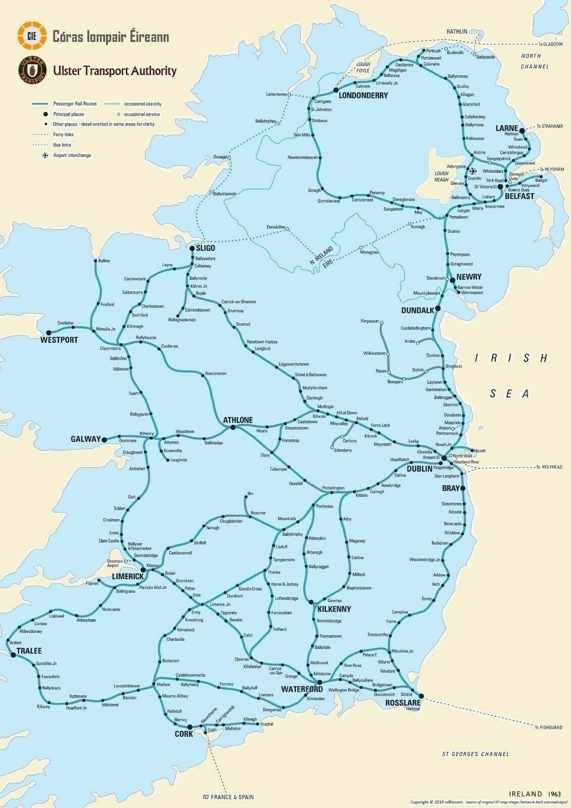
Oh dear, is that the shape of Ireland? |
The Sligo line goes back on itself! And the line from Heuston south? |
|||||||||||||||||||||||||||||||||||||||||||||
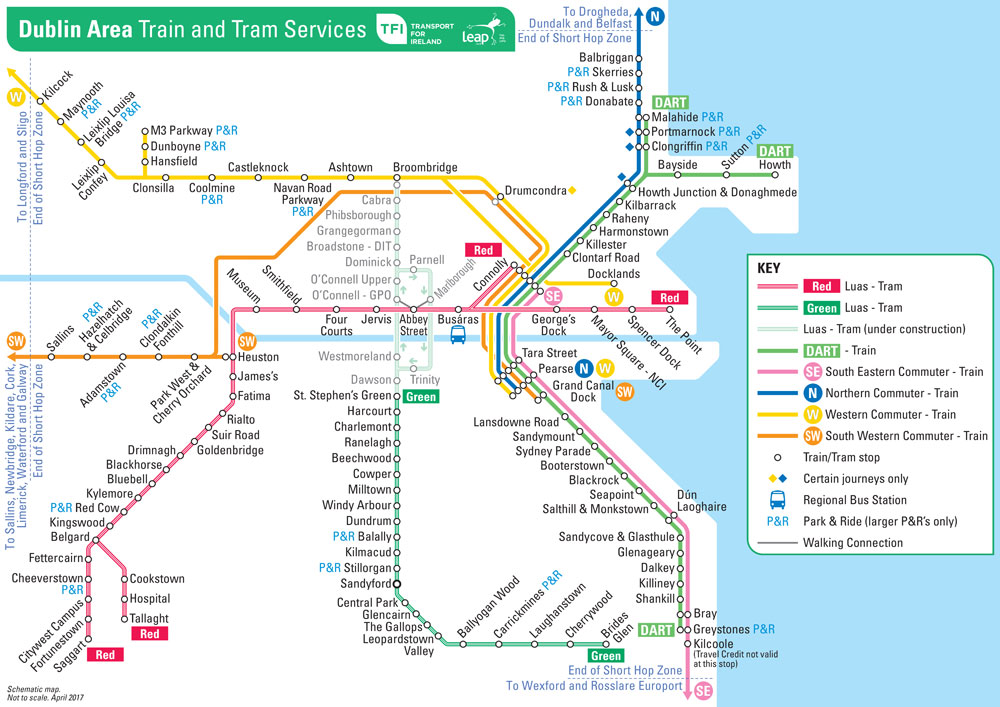
Hansfield station opened. |
||||||||||||||||||||||||||||||||||||||||||||||
 |
||||||||||||||||||||||||||||||||||||||||||||||
 |
 |
|||||||||||||||||||||||||||||||||||||||||||||
 |
||||||||||||||||||||||||||||||||||||||||||||||
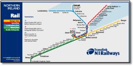
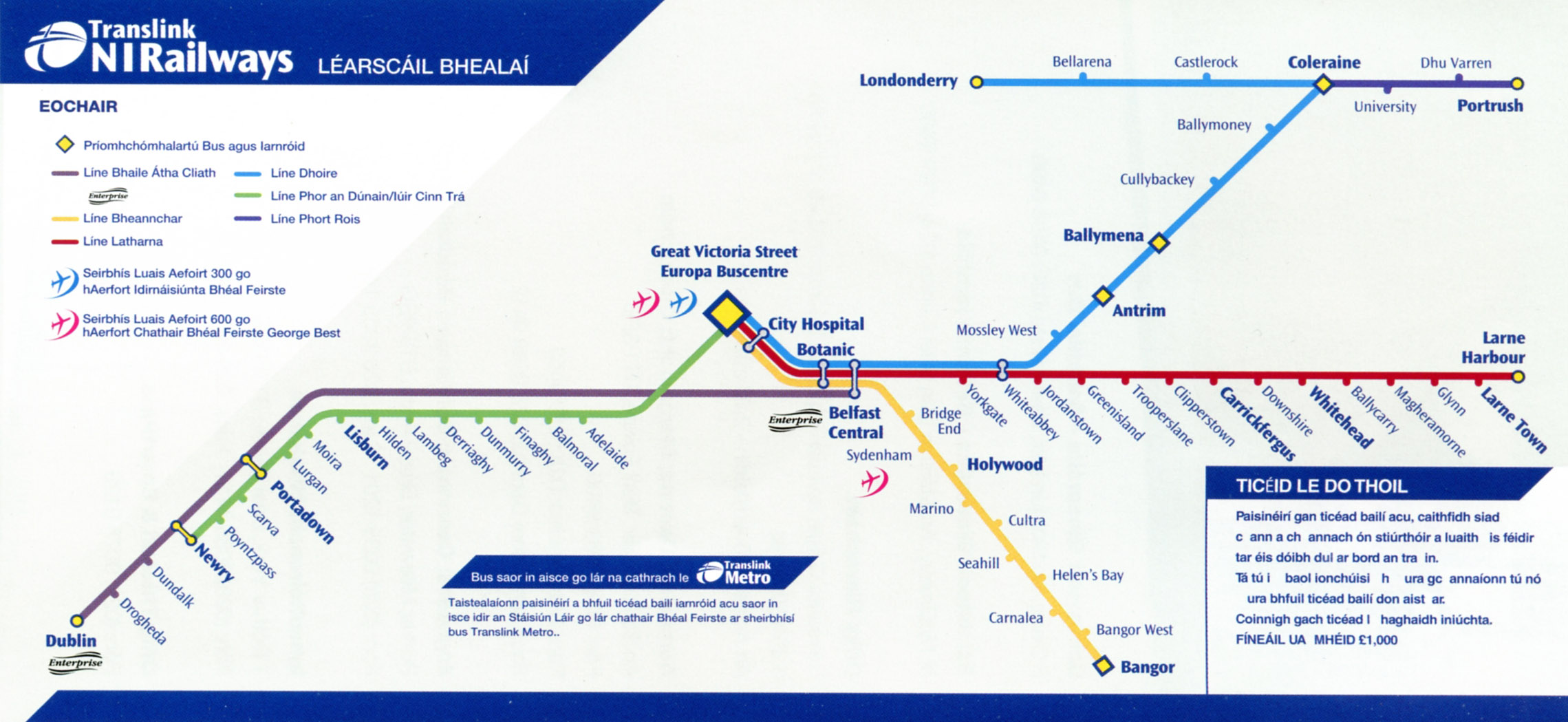
Bridge End renamed Titanic Quarter |
||||||||||||||||||||||||||||||||||||||||||||||
Looks like just a font and capitalisation change compared with 2009 map below. |
||||||||||||||||||||||||||||||||||||||||||||||
 |
||||||||||||||||||||||||||||||||||||||||||||||
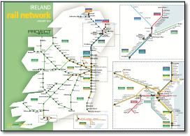
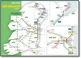
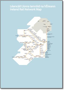
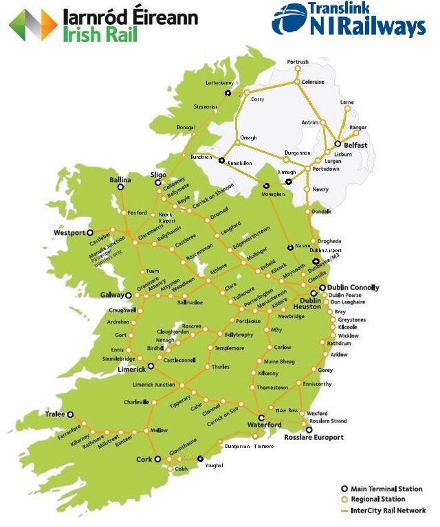
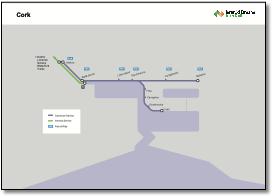
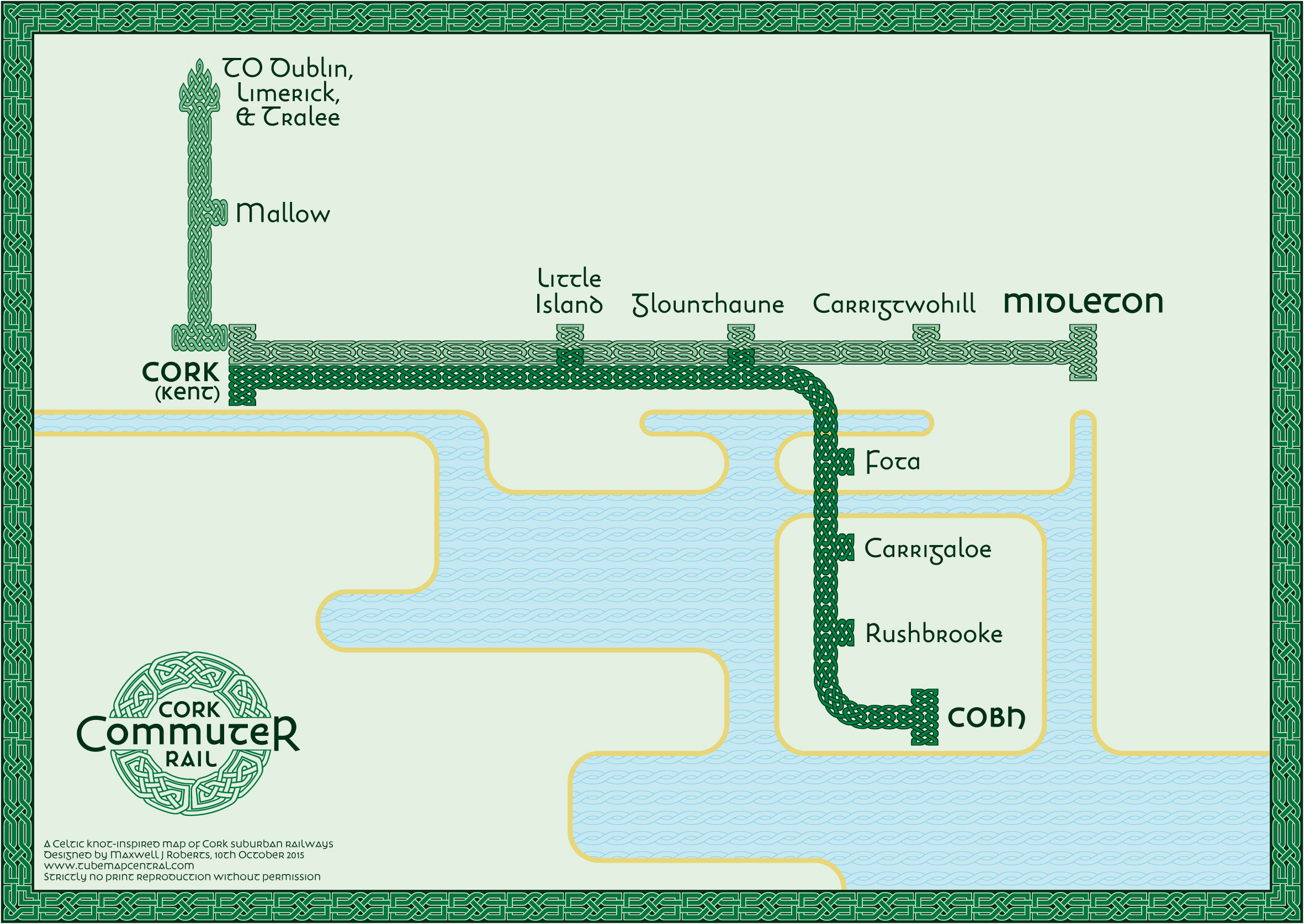
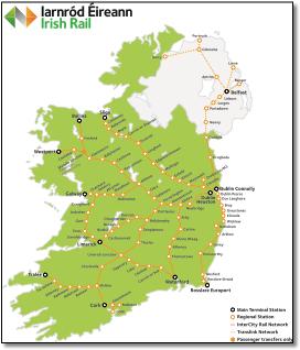
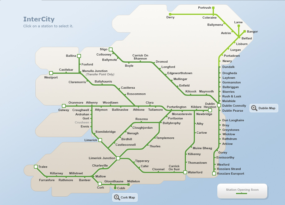
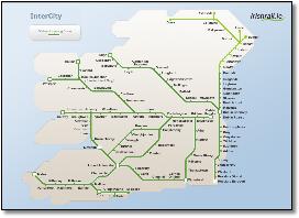
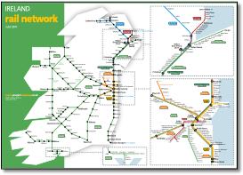
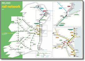
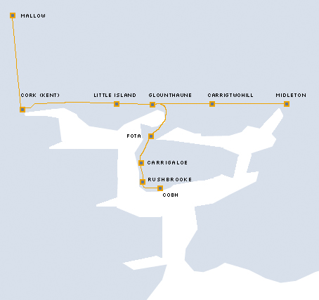
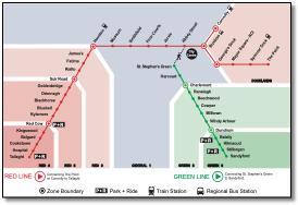
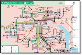
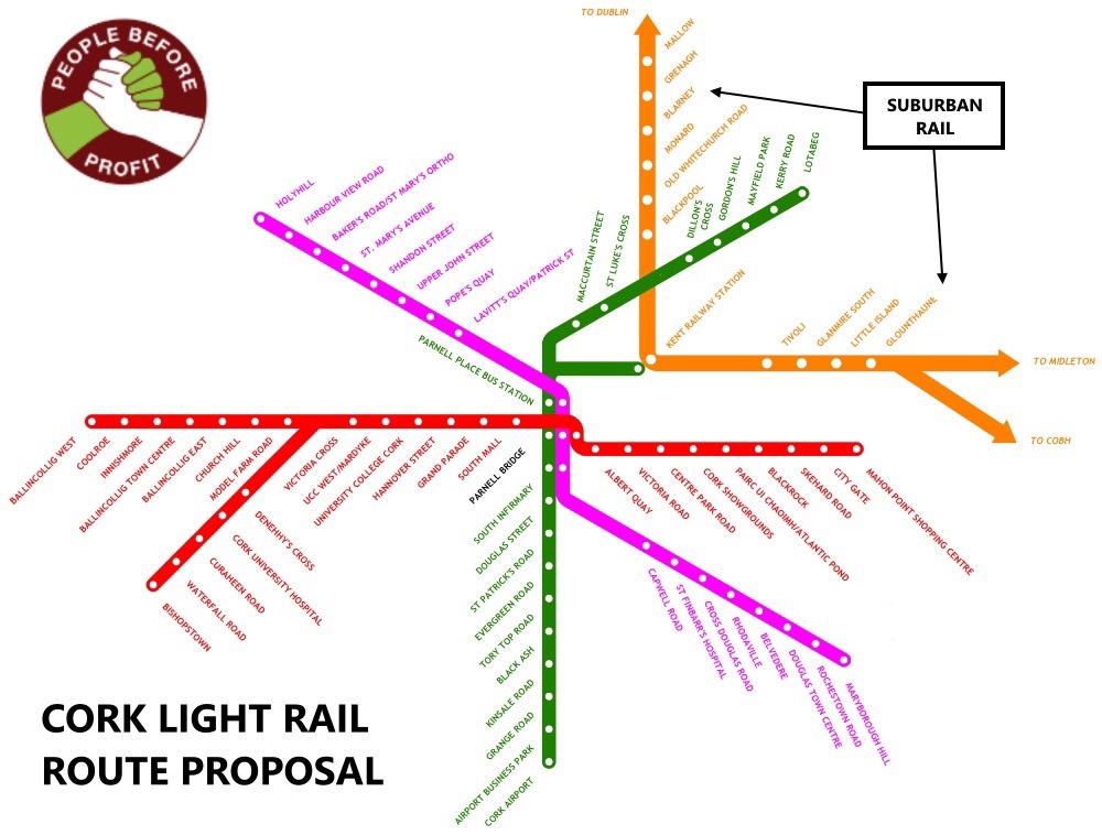
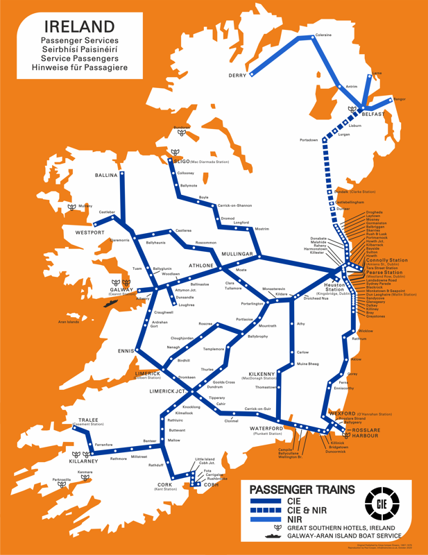
What appears to be the official Iarnrod Eireann (Irish Rail) map of the intercity network is truly awful. Done by an engineer in a CAD program? The Cork - Cobh map, below, is pretty awful too. |
||||||||||||||||||||||||||||||||||||||||||||||
Phoenix Park renamed Navan Road Parkway. |
||||||||||||||||||||||||||||||||||||||||||||||
 |
||||||||||||||||||||||||||||||||||||||||||||||
 |
||||||||||||||||||||||||||||||||||||||||||||||
.jpg) |
||||||||||||||||||||||||||||||||||||||||||||||
Phoenix Park renamed Navan Road Parkway. |
||||||||||||||||||||||||||||||||||||||||||||||
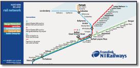
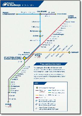
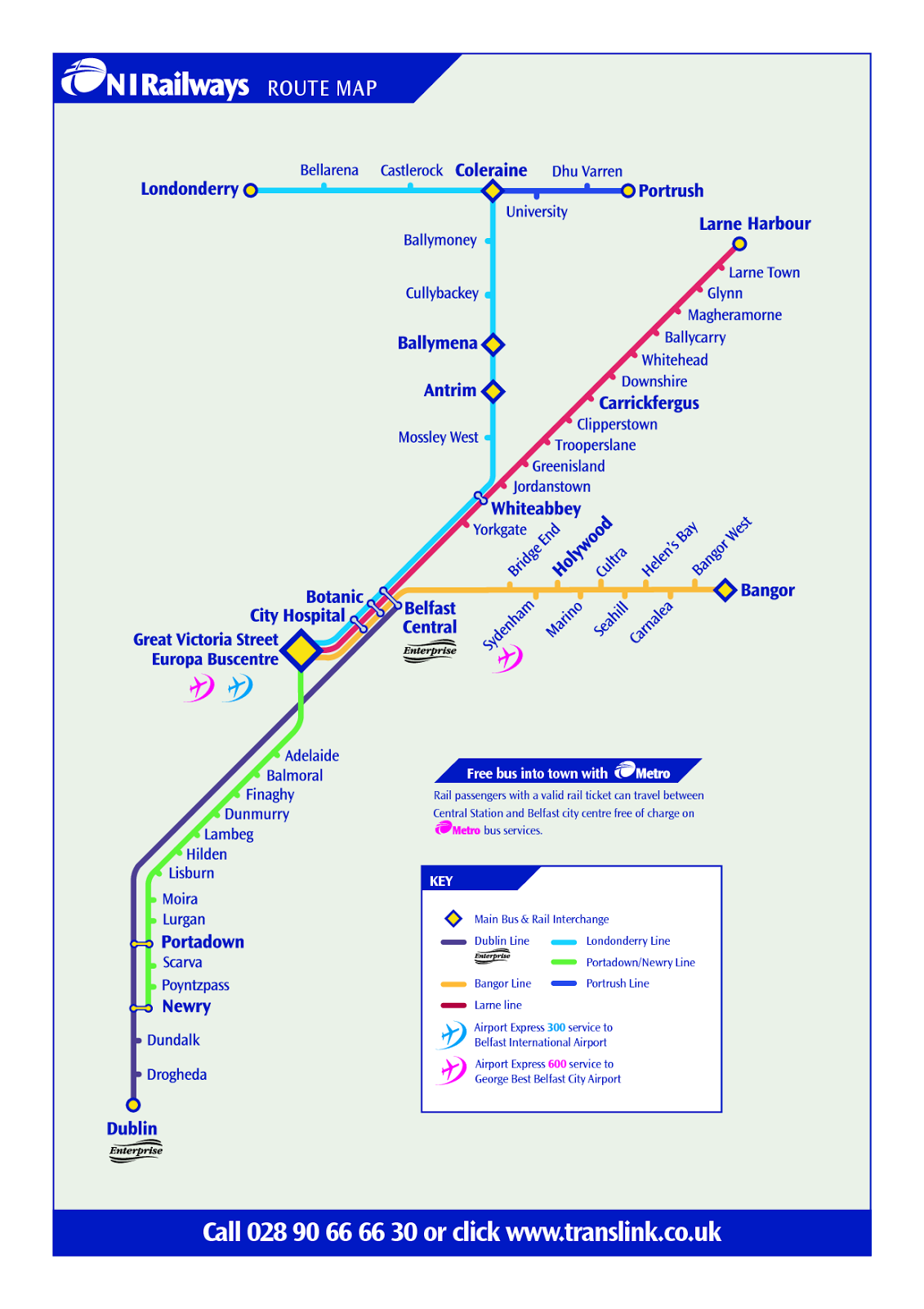
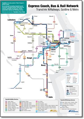
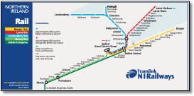
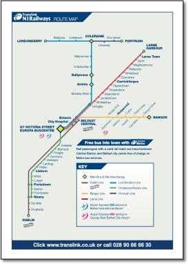
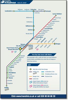
The version most seen at stations and on trains. City Hospital station in wrong place; Londonderry line goes back on itself; Yorkgate should be shown horizontally with more emphasis. |
||||||||||||||||||||||||||||||||||||||||||||||
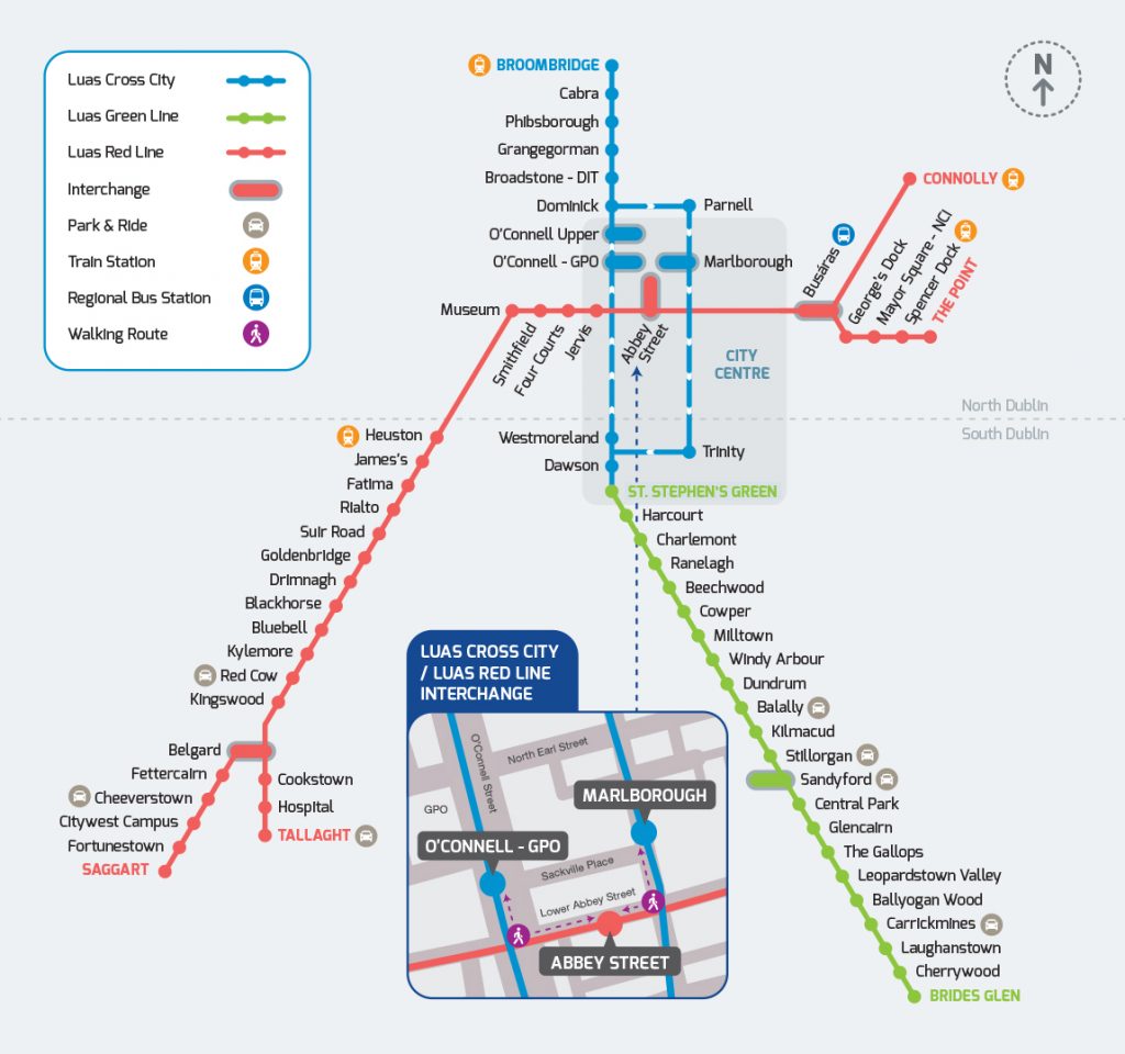
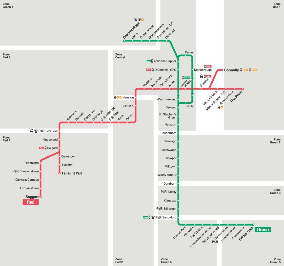
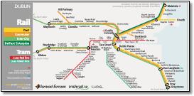
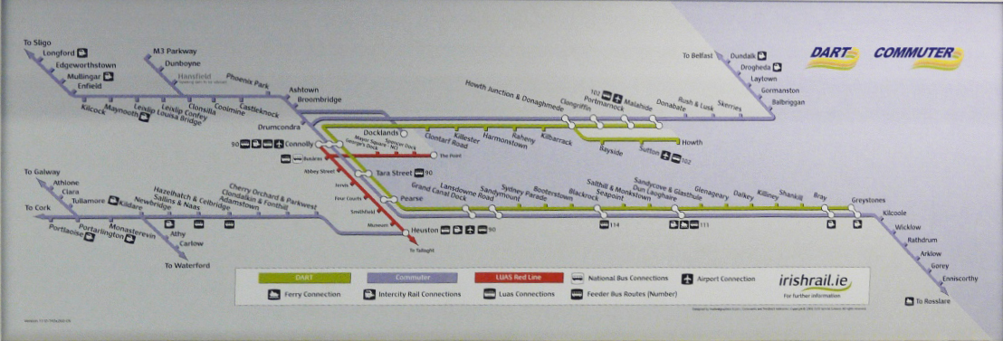
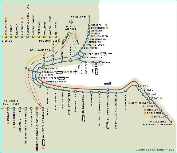
With Luas red line Saggart extension open. |
||||||||||||||||||||||||||||||||||||||||||||||
 |
||||||||||||||||||||||||||||||||||||||||||||||
 |
||||||||||||||||||||||||||||||||||||||||||||||
 |
||||||||||||||||||||||||||||||||||||||||||||||
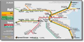
With Luas red line Saggart extension open. |
||||||||||||||||||||||||||||||||||||||||||||||
.jpg) |
||||||||||||||||||||||||||||||||||||||||||||||
 |
||||||||||||||||||||||||||||||||||||||||||||||
 |
||||||||||||||||||||||||||||||||||||||||||||||
 |
||||||||||||||||||||||||||||||||||||||||||||||
 |
||||||||||||||||||||||||||||||||||||||||||||||
.jpg) |
||||||||||||||||||||||||||||||||||||||||||||||
 |
||||||||||||||||||||||||||||||||||||||||||||||
 |
||||||||||||||||||||||||||||||||||||||||||||||
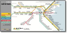
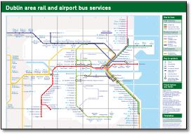
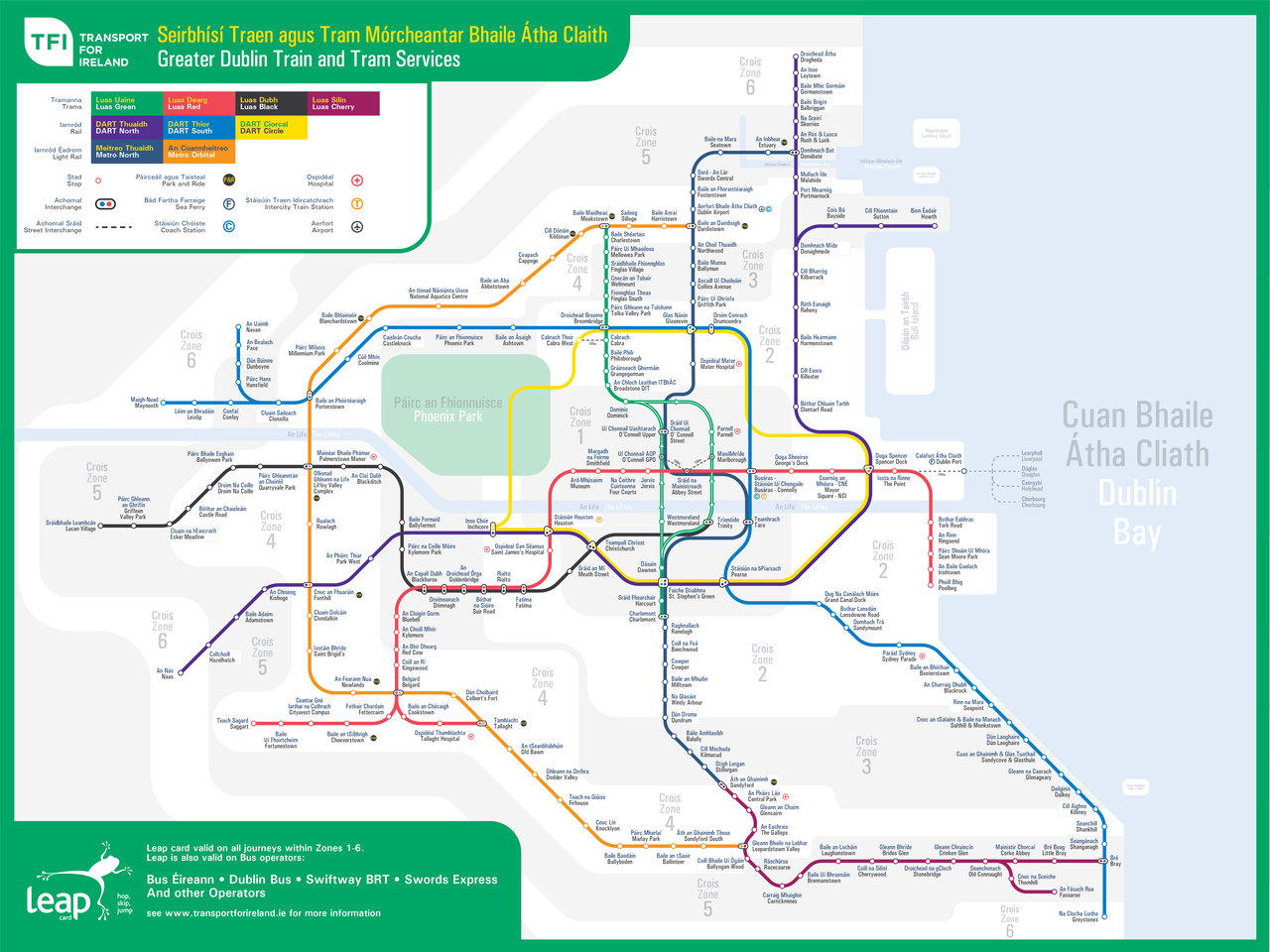
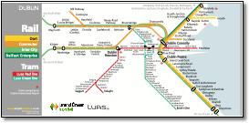
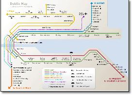
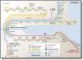
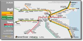
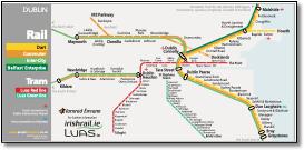
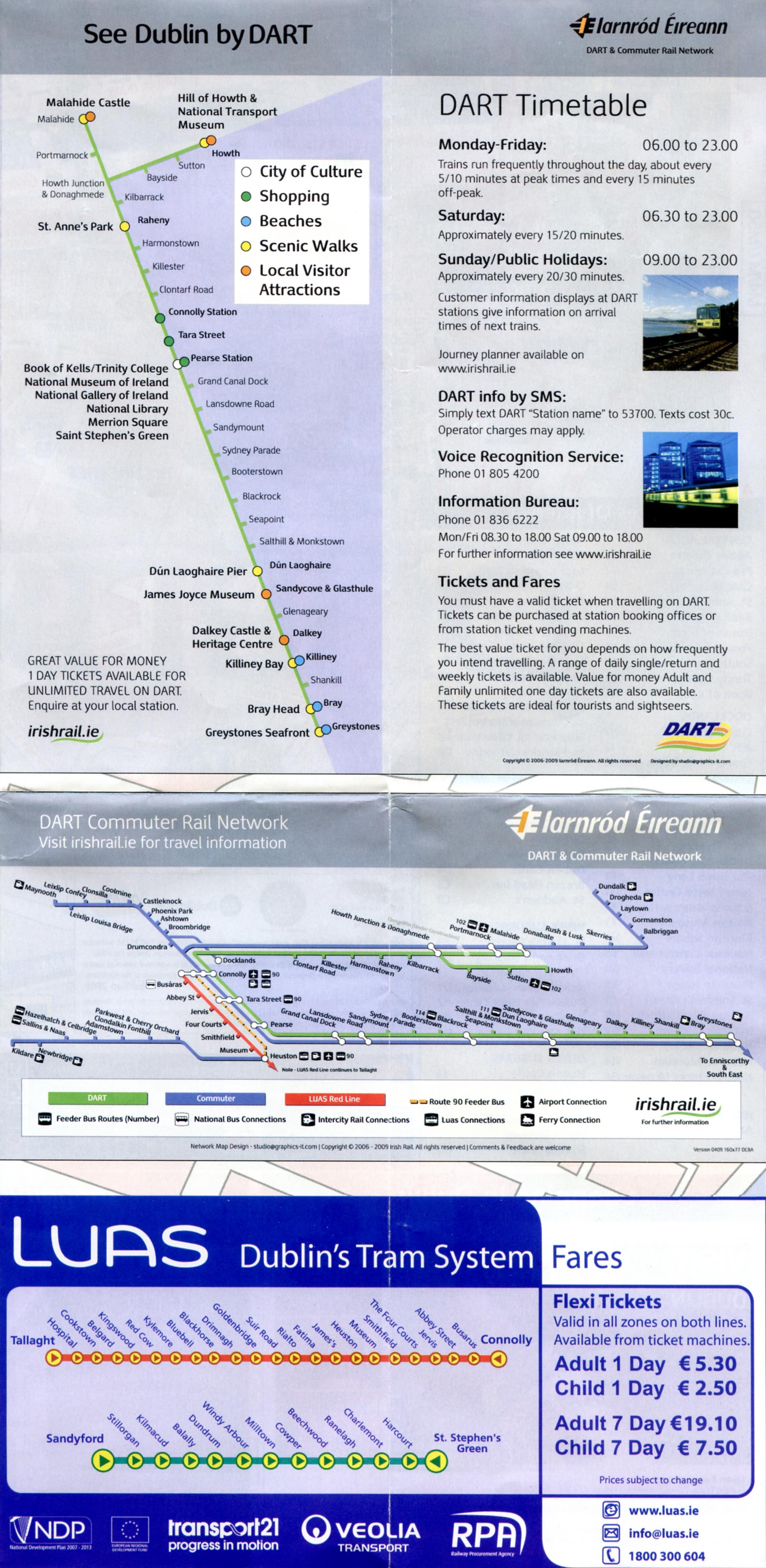
Not recognisable as Dublin Bay. The LUAS is pretty awful too! |
||||||||||||||||||||||||||||||||||||||||||||||
 |
||||||||||||||||||||||||||||||||||||||||||||||
 |
||||||||||||||||||||||||||||||||||||||||||||||
 |
||||||||||||||||||||||||||||||||||||||||||||||
 |
||||||||||||||||||||||||||||||||||||||||||||||
 |
||||||||||||||||||||||||||||||||||||||||||||||
.jpg) |
||||||||||||||||||||||||||||||||||||||||||||||
.jpg) |
||||||||||||||||||||||||||||||||||||||||||||||
 |
||||||||||||||||||||||||||||||||||||||||||||||
 |
||||||||||||||||||||||||||||||||||||||||||||||
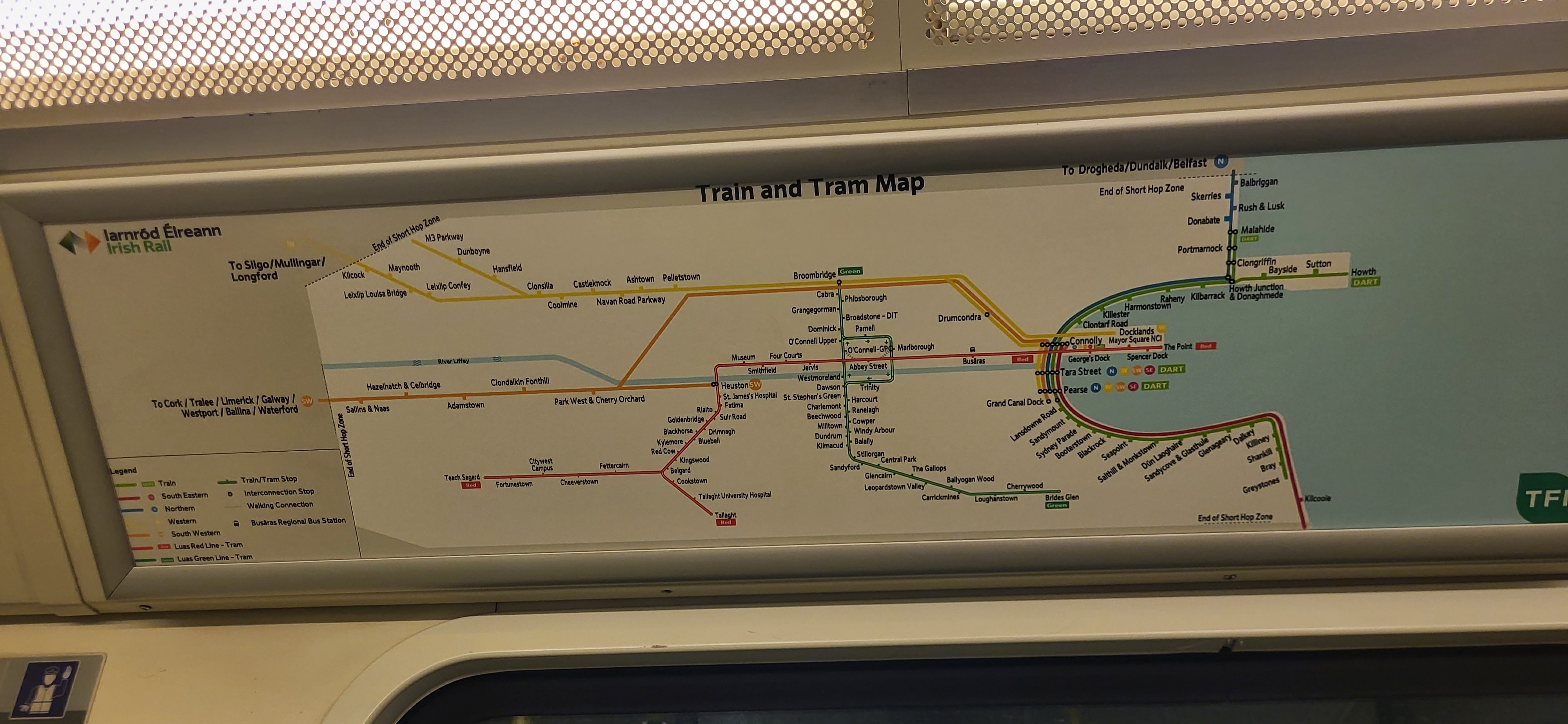
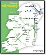
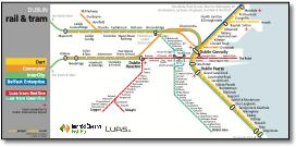
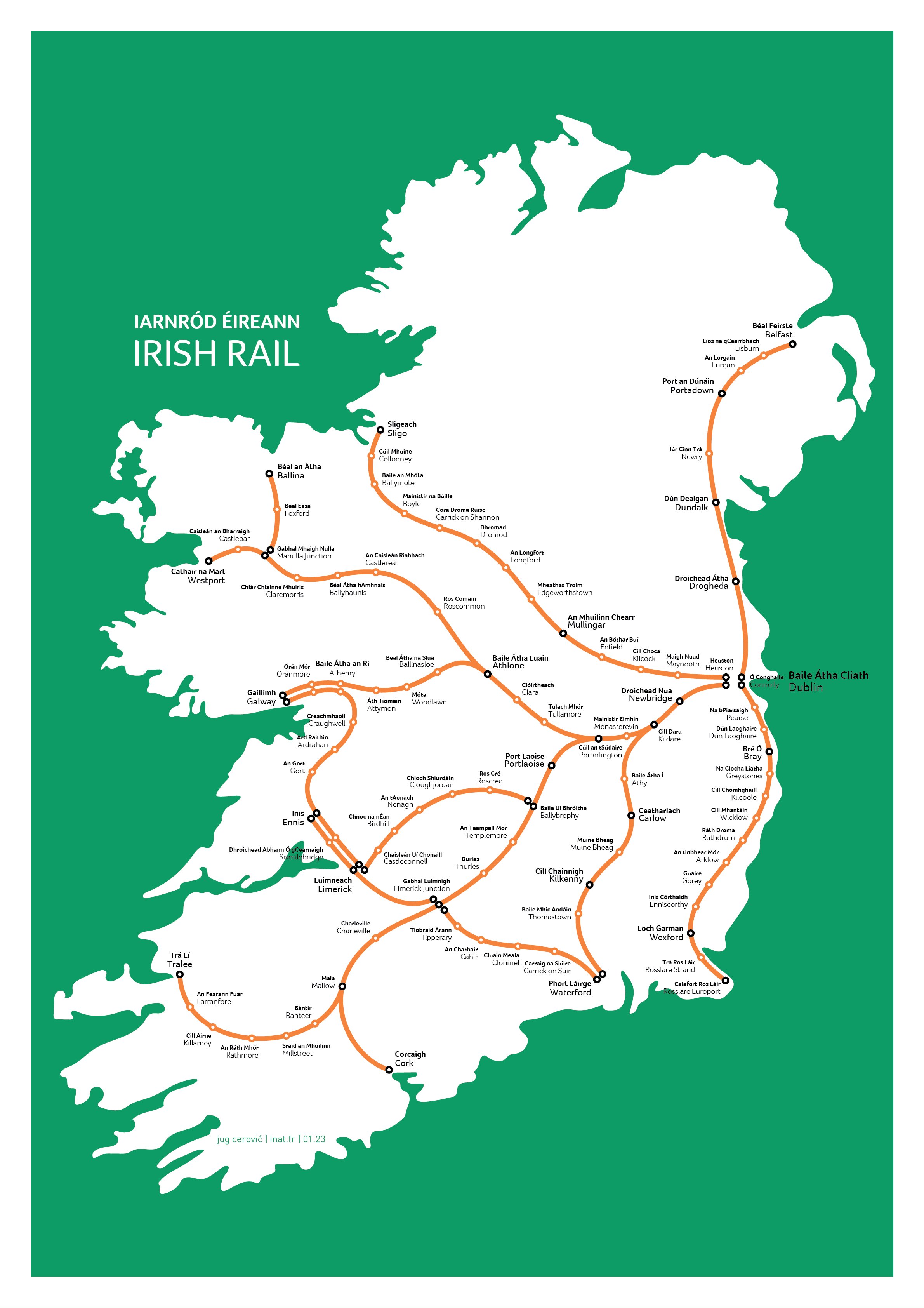
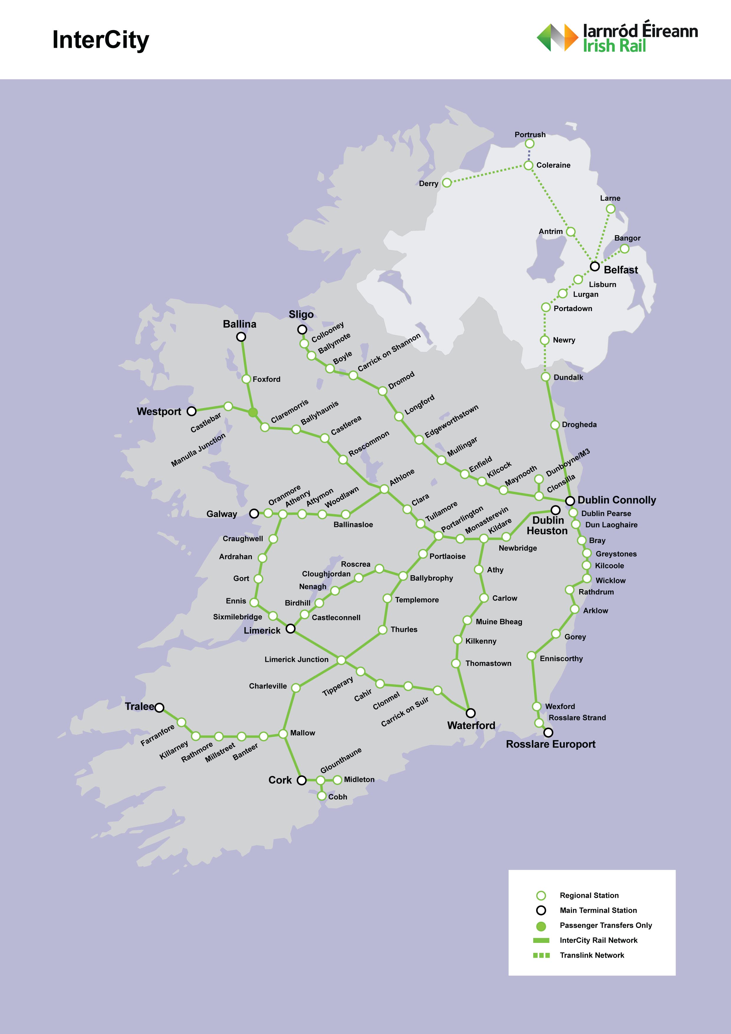
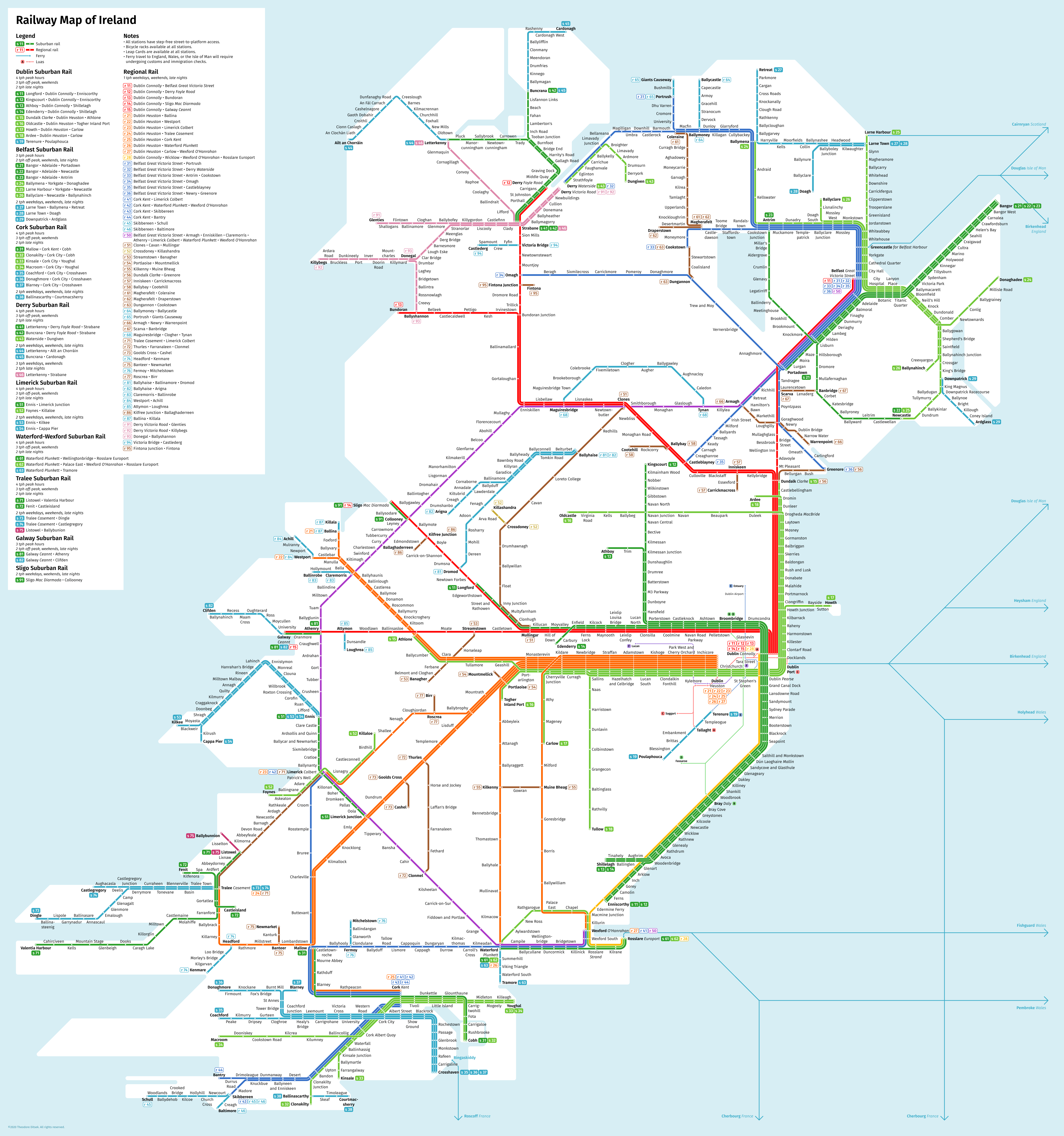
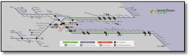
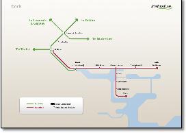
Three rail maps that use completely different design systems. Can that make sense? |
||||||||||||||||||||||||||||||||||||||||||||||
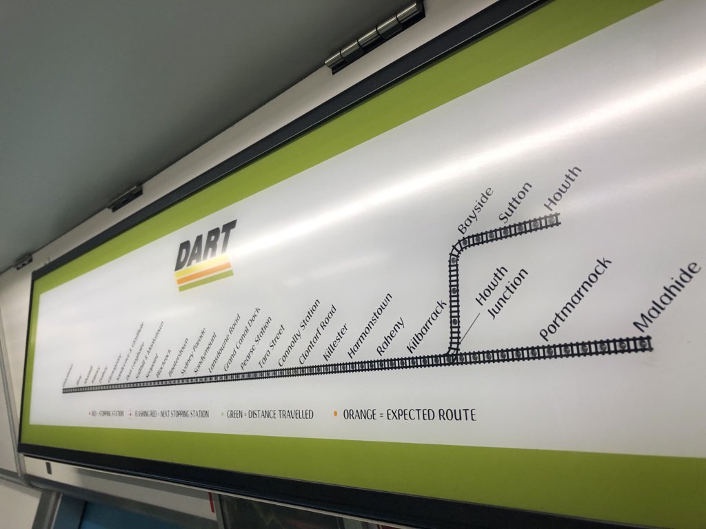
Oh dear, which way do the trains go at those junctions? |
||||||||||||||||||||||||||||||||||||||||||||||
 |
||||||||||||||||||||||||||||||||||||||||||||||
 |
||||||||||||||||||||||||||||||||||||||||||||||
 |
||||||||||||||||||||||||||||||||||||||||||||||
 |
||||||||||||||||||||||||||||||||||||||||||||||
 |
||||||||||||||||||||||||||||||||||||||||||||||
.jpg) |
||||||||||||||||||||||||||||||||||||||||||||||
 |
||||||||||||||||||||||||||||||||||||||||||||||
 |
||||||||||||||||||||||||||||||||||||||||||||||
.jpg) |
||||||||||||||||||||||||||||||||||||||||||||||
 |
||||||||||||||||||||||||||||||||||||||||||||||
 |
||||||||||||||||||||||||||||||||||||||||||||||
 |
||||||||||||||||||||||||||||||||||||||||||||||
 |
||||||||||||||||||||||||||||||||||||||||||||||
 |
||||||||||||||||||||||||||||||||||||||||||||||
 |
||||||||||||||||||||||||||||||||||||||||||||||
 |
||||||||||||||||||||||||||||||||||||||||||||||
 |
||||||||||||||||||||||||||||||||||||||||||||||
 |
||||||||||||||||||||||||||||||||||||||||||||||
 |
||||||||||||||||||||||||||||||||||||||||||||||
 |
||||||||||||||||||||||||||||||||||||||||||||||
 |
||||||||||||||||||||||||||||||||||||||||||||||
|
||||||||||||||||||||||||||||||||||||||||||||||