 |
||||||||||||||||
|
|||||
|
|
||||
|
 |
|
|||
|
|||||
|
|||||
|
|||||
 |
 |
|||
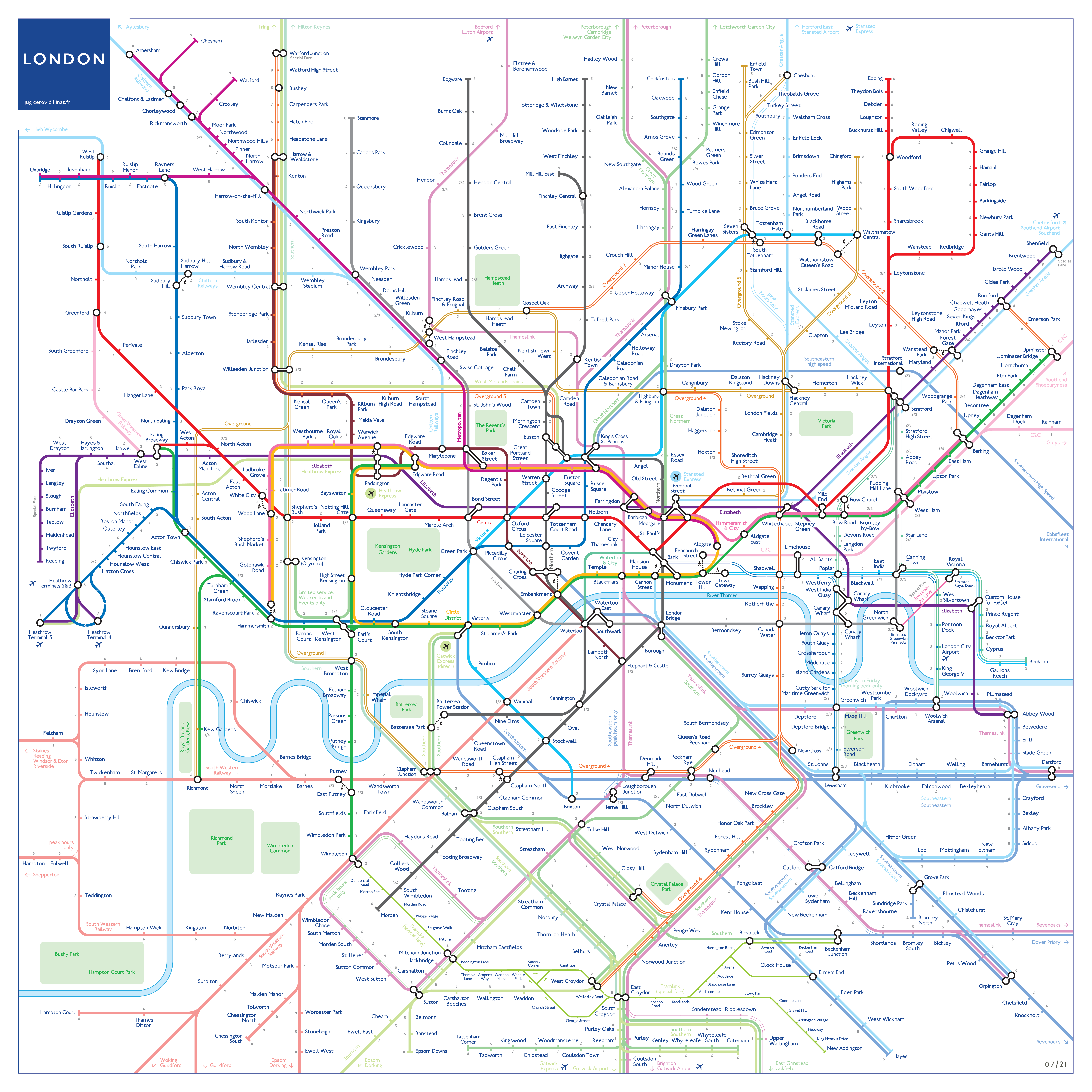
July 2021 review At last, an update to Jug Cerovic's supberb 2018 London map. You've got to love the grid that keeps the verticals aligned - Watford to Hammersmith/Olympia, Kilburn Park to Wimbledon, St Johns Wood to Pimlico, King's Cross to Kennington, Alexandra Palace to London Bridge, Epping to North Greenwich and Cheshunt to New Cross. Horizontally you've got Kensal Green to Stratford, Barons Court to North Greenwich and the daddy of them all - Twickenham to Dartford. Then you've got the diamond pattern of South London services (echoing the very similar Project Mapping solution to this network). There's the wonderful matching loops of the River Thames, identifying numerically the different Overground and DLR routes and the method of showing the zones.The odd station name running over a line matters not - and no key - keys should not be necessary on a good map. Jug has mostly handled the issue of how many lines an interchange blob should handle well, except perhaps at Stratford, where it's unclear what happens to the end of the Jubilee line. All-together producing a harmonious easy to understand map far superior to TfLs rendering. Some of Jug's design elements do slightly detract however as follows (more of which later): • inconsistent same track services As Maxwell Roberts famnously declared 'anyone can design a nice map if they make the captions small enough'. Could they be larger and more legible? He's taken note of some points that were raised in my 2018s review, for example the layouts at Seven Sisters and Paddington. Changes to map from 2018 • Barbican linked to Farringdon (slightly awkward) Same track services changes from 2018 • Baker Street - St. John’s Wood split I understand that Jug treats Tube, Overground and DLR differently to National Rail. On the three TfL groups lines touch when served by different services running on the same track, whereas they're separated on National Rail. I don't understand why they should be different as they're all railways, just operated by different organisations. More likely he's followed TfLs symbolism for the former to keep it familiar but couldn't make this work for National Rail because he's used pastel colours that don't touch happily. It's even worse where he's inexpicably used a white inline - look at the difficult to see multiple DLR routes which touch. Not good. Additionally, there are occasions when lines from the two groups share track. For example Harrow-on-the-Hill to Amersham, TfL Rail and Heathrow Express out of Paddington, Overground and Southern Willesden Junction to Clapham Junction. • Willesden Junction northwards should have London Northwestern (not West Midlands Trains) and Southern touching Layers by operator Jug's rule for layers: - Underground lines on top with bright colors Jug's formula results in some strange bridge effects for example at Westbourne Park where Elizabeth goes over but Heathrow Express goes under even though they run on the same track producing a basket weave effect. Stratford a bit weird. And why have the tube on top when its, er, the Underground? Wansted Park is a bit weird too with the Overground going under and over the Great Eastern mainline. I think he'd be better off with correct vertical alignment so what you see out of the window is what you see on the map. Fantasy alignments Jug joins TfL in creating some fantasy routes that don't exit. You won't find these on any other map! • Heathrow Express drops down creating a fantasy route to Heathrow, even though it runs on the same track as TfL Rail Pastel colours Why? These are main lines. Other points • King's Cross and St. Pancras are two separate stations, they're only combined as one on the tube Just a bit more work to make this a truly great map. |
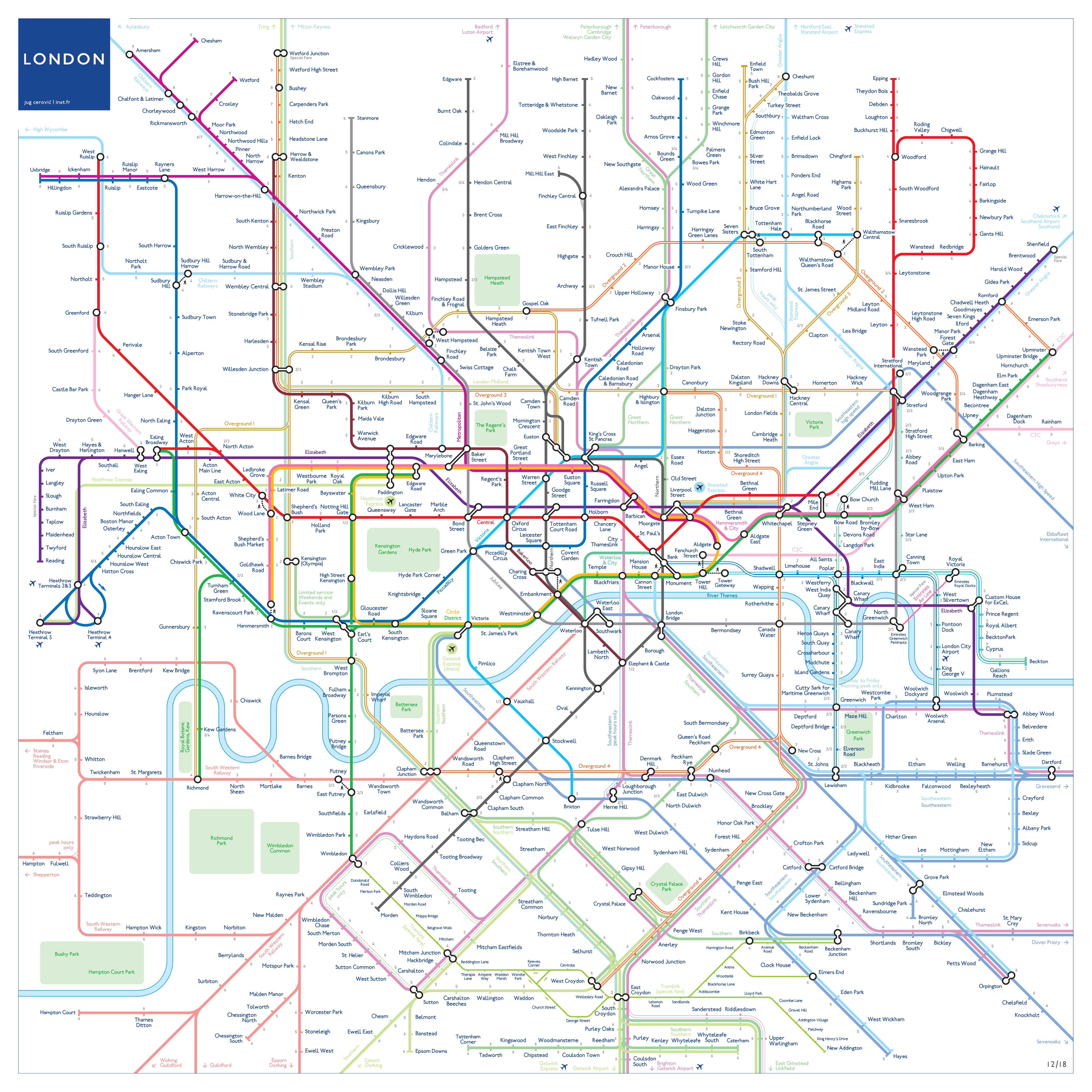
2018 review This map isn't new. Jug has just updated his 2015 map with some of TfLs symbolism - the interchange symbols and the white inlines in particular. He's discarded his perfect solution for all transit maps worldwide, perhaps this is to make his map more familiar to Londoners and TfL in the hope that he might have some success with it. This is clearly not Jugs final version as he's some tidying up to do. For example Southwark running over SE, captions too tight on Heathrow Express out of Paddington, layer issues. And what's going on at Seven Sisters - two stations on the Victoria? Parallel services/routes An issue with TfLs Tube and Rail map is the rule to denote multiple services or lines running over the same route or track. Sometimes they touch, sometimes there is a space. So, for example, the Met and Circle run over the same tracks so the coloured lines touch. Jug has got his knickers in a twist here with the Met and Bakerloo sharing as far as St Johns Wood before diverging, Overground and London Northwestern sharing out of Euston before splitting, Victoria sharing with the Northern and Great Northern out of King's Cross. The Met and Piccadilly share the same tracks to Uxbridge yet these are shown separated. Touching lines are also problematic when they have a white inline, so his decision to include this style while also separating out services on the DLR is questionable. There's also Southeastern out of Blackfriars which touches correctly Thameslink, but here the inline indicates limited service. All a bit of a mess really. • Balerloo line / Watford DC Overground shown with gap whereas • Northern and Victoria touch Great Northern; Geographic accuracy There are also many examples of lines crossing at the wrong place. Maybe it doesn't matter underground but I would have thought it mattered where you can see out of the window, surely even a diagrammatic map should start from a position of geographic accuracy? Examples: • Forest Gate wrong side of Goblin (plus layer issue Goblin goes under Elizabeth but over Greater Anglia); High Speed 1 doesn't run where shown, results in tight bend at Stratford, should be further north. King' Cross and St Pancras are separate stations, unsatisfactory separate routing of Thameslink/GN from KC to Finsbury Park. Peak hours only Greater Anglia service Hackney-Cheshunt via Seven Sisters shown as separate line some distance away from London Overground with which it shares the same track. Heathrow Express different route to Elizabeth line although they use the same track. The interchange symbol Use of LT interchange symbol raises the problem of how many lines can be incorporated - another full subject! Layer issues I wonder why National Rail is always shown as secondary to the Tube, the tube always goes over main lines on this map. • Overground goes over Heathrow Express while Southern goes under north of Shepherd's Bush, Points • Font / line thickness is smaller making the map less efficient than TfLs making it more open in appearance and making it easy to fit in station names etc. Not wishing to be too negative, the map is full of elegance too. Beautiful River Thames and Heathrow loop! The parks are great. There are a lot of new and interesting solutions too and a big attempt to provide visual axis (ie Bakerloo Kilburn Park to Warwick Avenue lines up with the District). Sorry Jug, I don't usually write such long reviews, but this isn't up to your usual high standard! |
|||