 |
||||||||||||||
 |
||||||||||||||
 |
 |
||||||||
|
|
|
|||||||
|
 |
|
|||||||
|
|||||||||
|
|||||||||
|
|||||||||
 |
 |
 |
 |
 |
 |
|||||||
This website This website is a resource portal for rail maps for education, to stimulate debate, present new ideas, criticise and congratulate. Maps are usually selected for being schematic, only occasionally are geographic maps included. Schematic maps must be readable and low-resolution bitmaps are mainly rejected. It is also a promotional site for new maps by Andrew Smithers. Andrew grew up in London fascinated by the tube map, and the Project Mapping name evolved from his graphic design consultancy. The map is the brand A rail network map isn't just about how to get from A to B. A rail network map is about the identity of the business or organisation running services on those lines. It's what makes one operator distinct from another, it's what gives different systems their individual identity. We can pontificate that the brand is about values, visions, focus and relationships. But on the street it boils down to issues like punctuality, cleanliness, value and comfort. And all of those values could apply to any provider of transport services. Corporate branding as realised in symbols, logos and colour schemes may provide identity and recognition - but ultimately is it just wallpaper? Only the map can ever present the individuality of the brand in a graphic form and so should be promoted positively as a major component in the corporate identity. So customers and staff alike can rally around it. For train operating companies and other organisations the route is everything. It is the element that needs thought and time and craft to fashion into a true icon. |
||||||||||||||||||||||||||||||
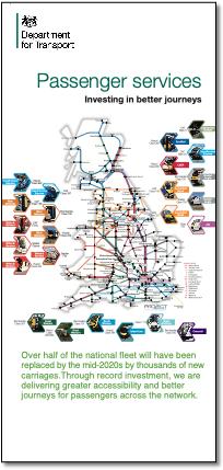
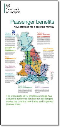
Commission for the DfT Two banners in Horseferry Road reception 2019. |
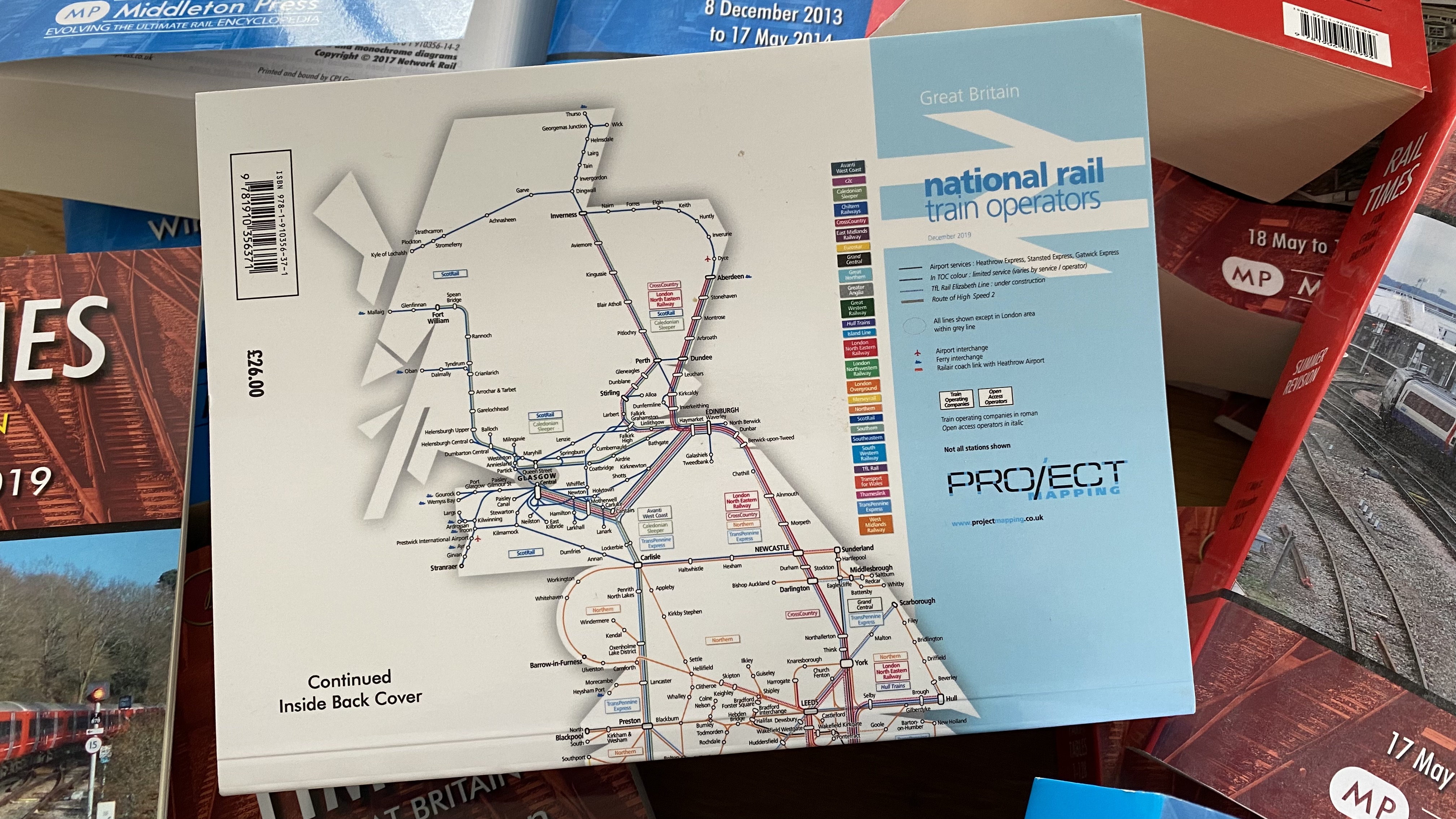
Rail Times On the back and inside covers from 2012 until it ceased publication in 2020. |
|||||||||||||||||||||||||||||
 |
 |
|||||||||||||||||||||||||||||
 |
 |
|||||||||||||||||||||||||||||
|
||||||||||||||||||||||||||||||
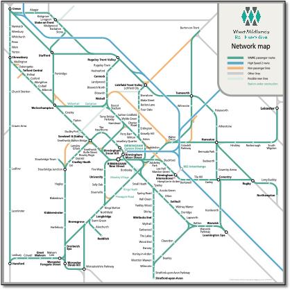
West Midlands Rail Executive maps Series of maps for report |
||||||||||||||||||||||||||||||
 |
||||||||||||||||||||||||||||||
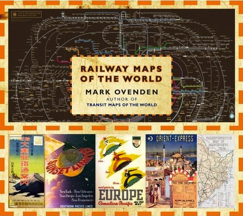
Now in two books Available from Amazon and other booksellers. |
||||||||||||||||||||||||||||||
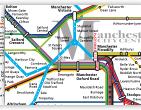
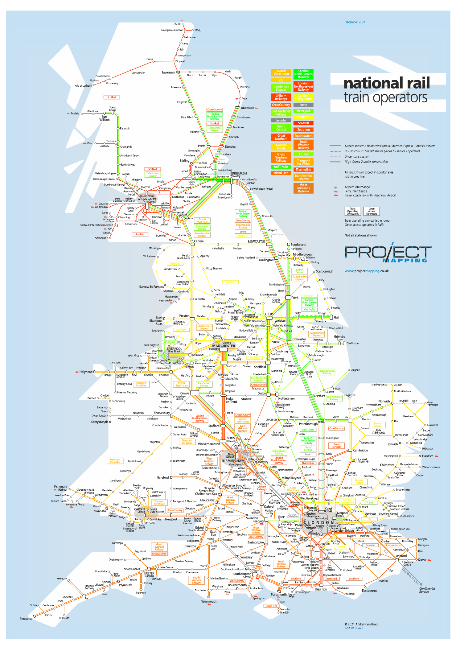
Principles Too much current map design is based slavishly on the London Underground map principles and not enough creative thinking goes into the interpretation of complex modern travel systems. The aim should be to make what is unclear on the ground easier to understand, yet often what is straightforward on the ground is made to look less practical. Relating to reality The map designer should not be forcing a network to follow those abstract rules but should look for clues on the ground to show the individuality of the region being depicted. London has a coke-bottle shaped circle line that defines the shape of the west end and city; Europe has the Rhine Valley with its distinctive arrow shape with the east facing point at Mainz; Manhattan has its own distinctive tilt; there's a tilted parallelogram that links Liverpool and Manchester together; there's the axis of a major thoroughfare, river or coastline - these are the shapes and angles that help the user identify with a map. Yes, complex areas need opening out, long station names have to be coped with, but geography is always there. Innovation This website hopes to show many innovations. For example, the new UK rail maps feature 22.5º angles to enable all main lines to radiate from London and to reflect the backbone, or shape, of the country. They also develop a new system to solve the problem of repetitive place names where there are multiple stations on multiple lines. Lines that have natural curves are shown as such and are not forced into an unnatural grid. The Merseyrail map uses 30º and 60º angles which help to shrink the size of the map to a square and more accurately reflect how the network looks. The balloon loop under Liverpool city centre is shown as such and not forced into squares with the corners rounded off as depicted by Merseytravel. Ticket areas are described better. The Manchester map indicates the city centre by the use of a large capital M (as seen on roundabouts approaching the city), shows the platform layout at the divided Piccadilly station and shows the GMPTE ticketing area as a simple oval. The Railteam map shows all stations in Paris, a new way of showing the routes and a much more effective use of space. The London Overground map interprets the orbital nature of the four disparate lines that formed this politically created network by the use of very shallow curves; a new way to show the central London focus and a different way to show the Thames. The Valleys map reflects the nature of the South Wales valleys and has English and Welsh versions to avoid the pitfalls of a bi-lingual map. However, this site is not suggesting that any of its maps are perfect or finished. Experience shows that maps can always improved given time and new information. Also, views and opinion can develop. There is no such thing as the finished, perfect map. |
||||||||||||||||||||||||||||||
 |
||||||||||||||||||||||||||||||
 |
||||||||||||||||||||||||||||||
 |
||||||||||||||||||||||||||||||
 |
||||||||||||||||||||||||||||||
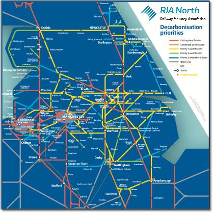
RIA North Decarbonisation priorities map RIA N DECARB MAP v5b 2 SEPTEMBER 2022 |
||||||||||||||||||||||||||||||
 |
||||||||||||||||||||||||||||||
 |
||||||||||||||||||||||||||||||
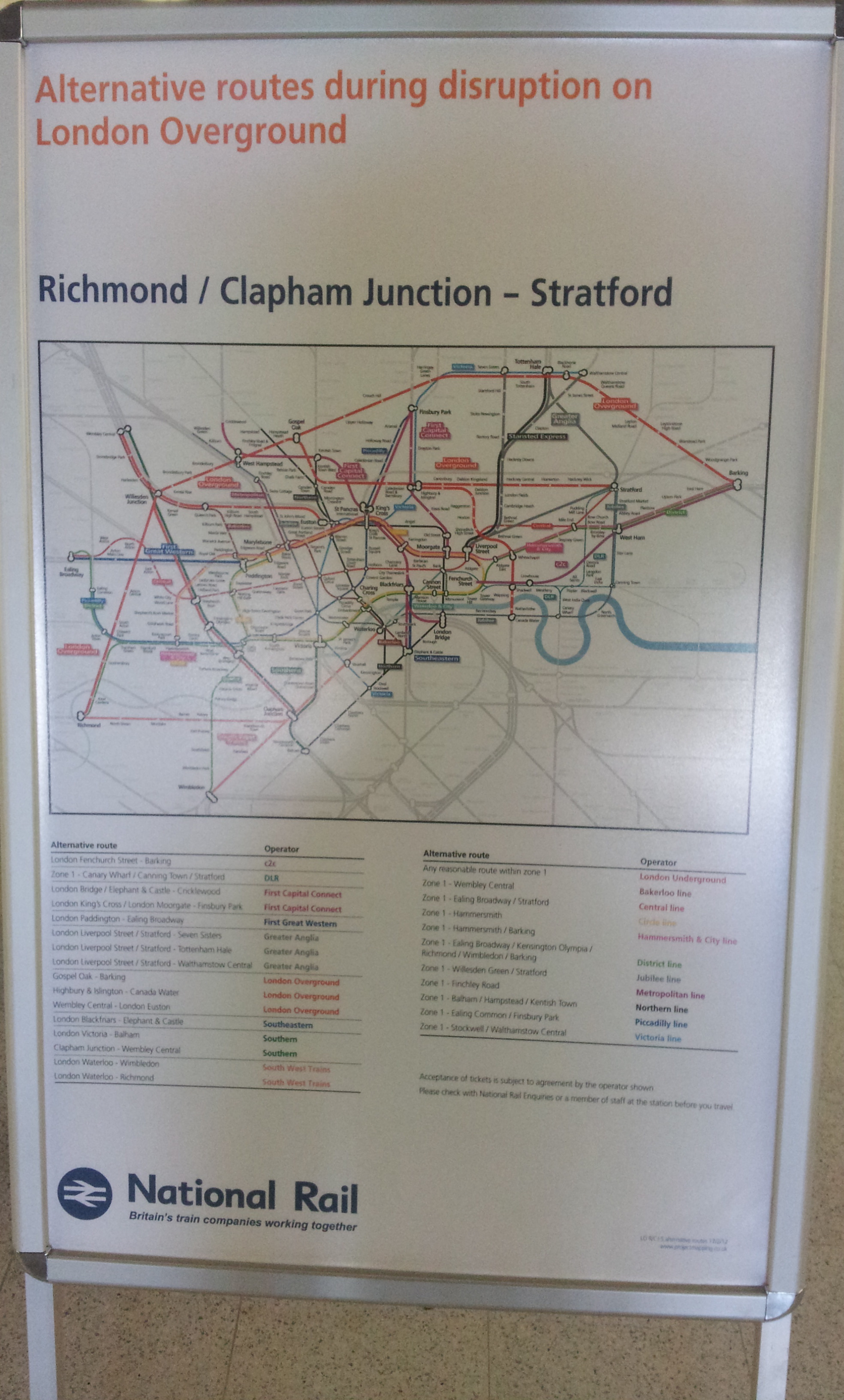
Now on posters London Overground disruption map at Stratford station August 2012. |
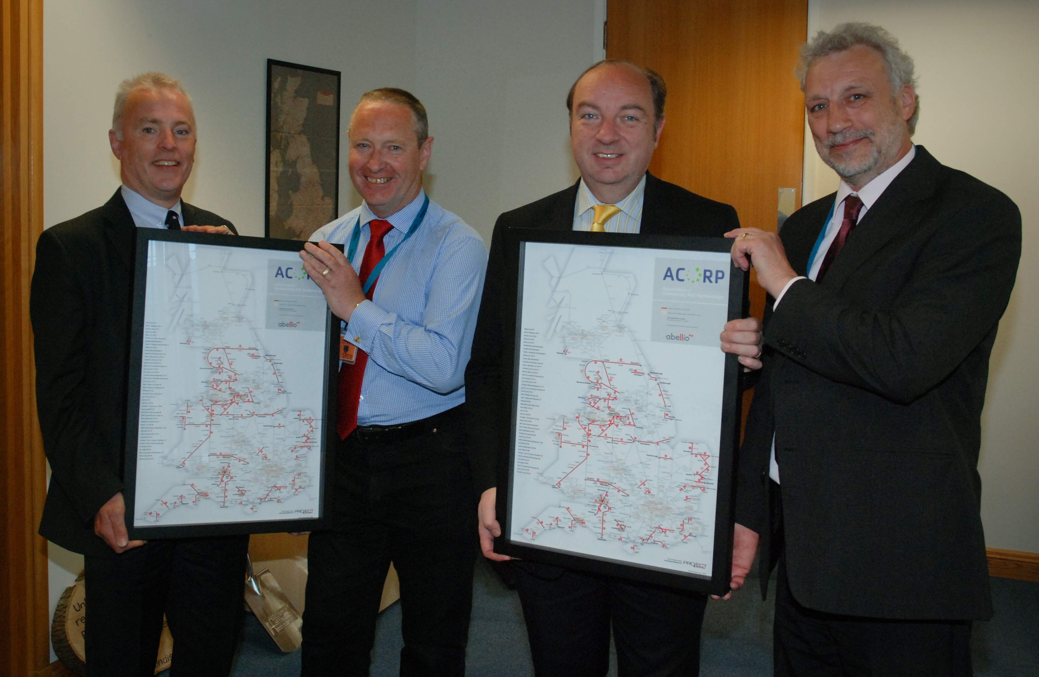
ACoRP Norman Baker MP (transport minister) being presented with one of my maps by Neil Buxton of ACoRP. |
|||||||||||||||||||||||||||||
 |
 |
|||||||||||||||||||||||||||||
Post Covid recovery map by TOC Richard Rowson December 2021 |
||||||||||||||||||||||||||||||
 |
||||||||||||||||||||||||||||||
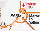
The problem with Beck Although iconic, the groundbreaking map design solution created by Harry Beck (London Transport) has many inherent problems. Lines that are straight often have to made crooked because of the limitation caused by the 45º maximum angle. Then to reduce the number of bends (an enemy of clarity) interchange stations suffer by having multiple interconnected nodes that bear no relationship to the ease or difficulty of a change - and purely for the cartographers convenience. And the dominance of the interchange symbol over the tick, distorting the importance of stations, is questionable. The map also leaves unsolved the issue of different lines sharing the same route, shown inconsistently either touching or separated. And the Beck formula doesn’t work for many other systems, for example, the Paris map using his formula is no more helpful in planning a journey than the geographic one. |
||||||||||||||||||||||||||||||
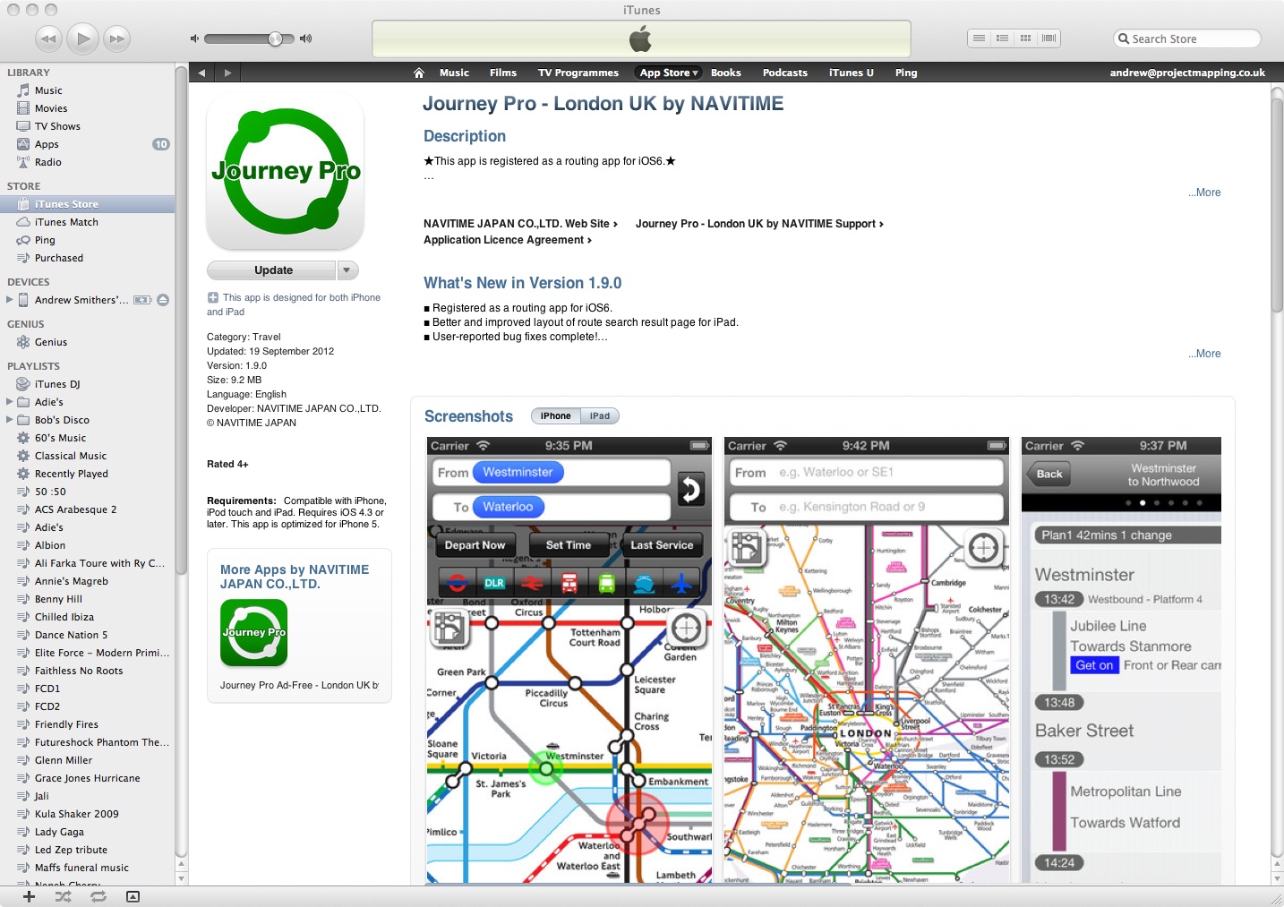
iPhone app by Navitime |
||||||||||||||||||||||||||||||
 |
||||||||||||||||||||||||||||||
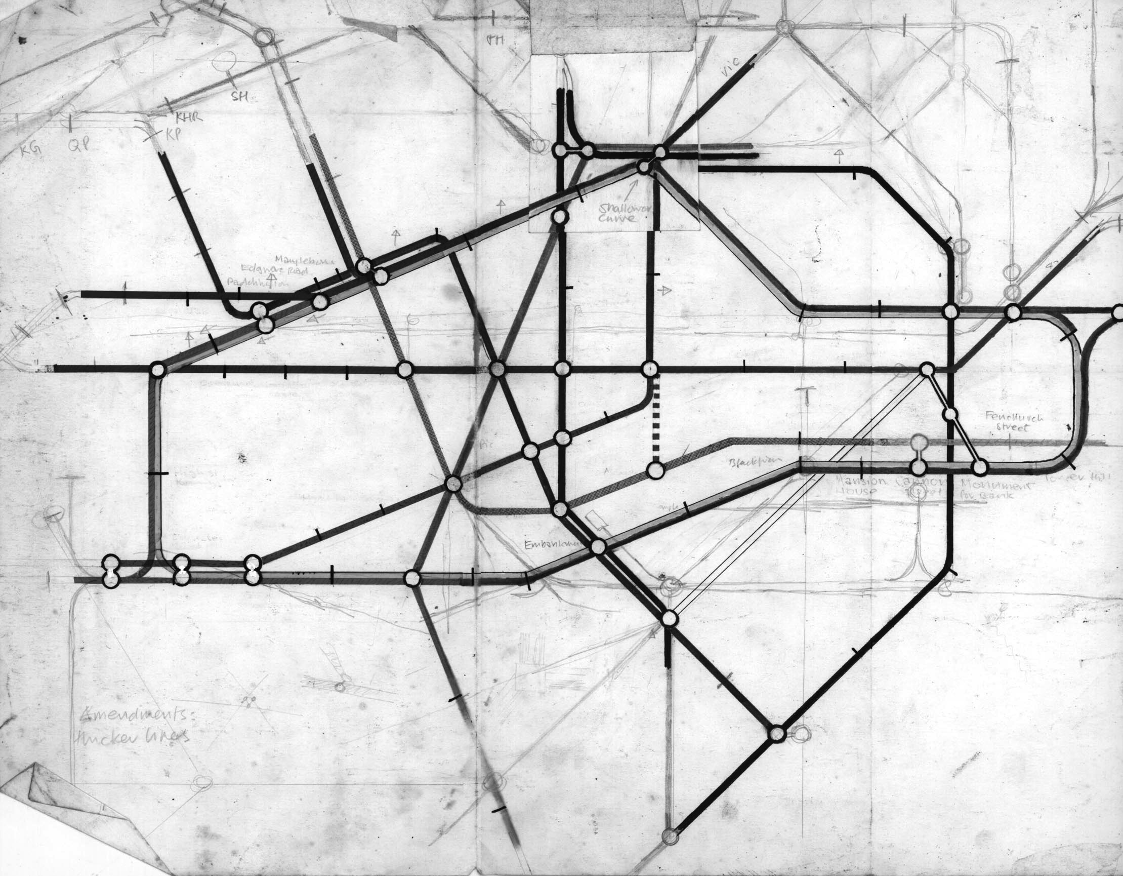
Early tube map My design, with an early use of 22.5º, of the tube map when at school about 1970. Unfortuneately not in colour. |
||||||||||||||||||||||||||||||
 |
||||||||||||||||||||||||||||||
 |
 |
|||||||||||||||||||||||||||||
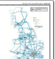
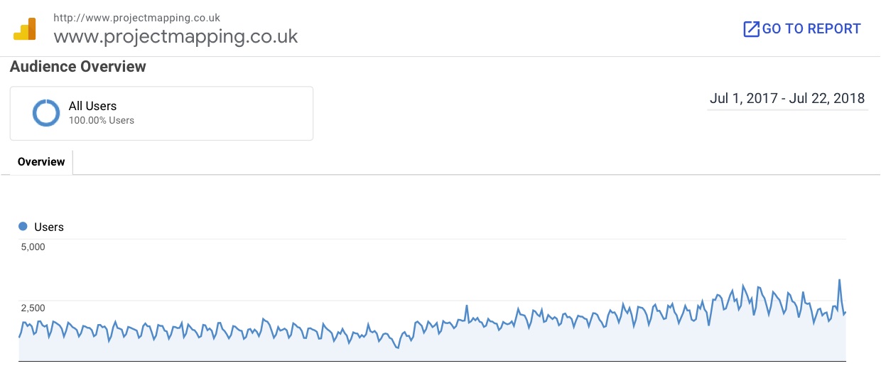
Project Mapping website - averaging around 2500 hits a day. |
||||
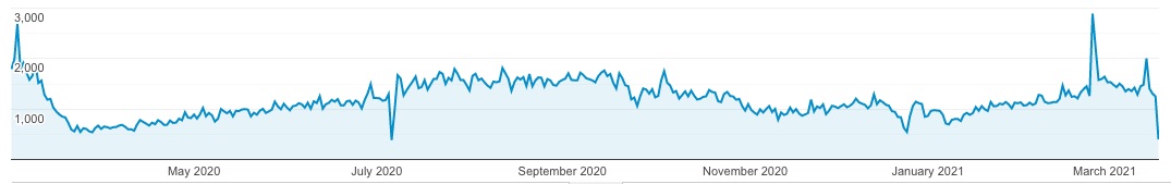
Project Mapping website - averaging around 1800 hits a day. |
||||
 |
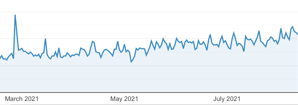 |
||||
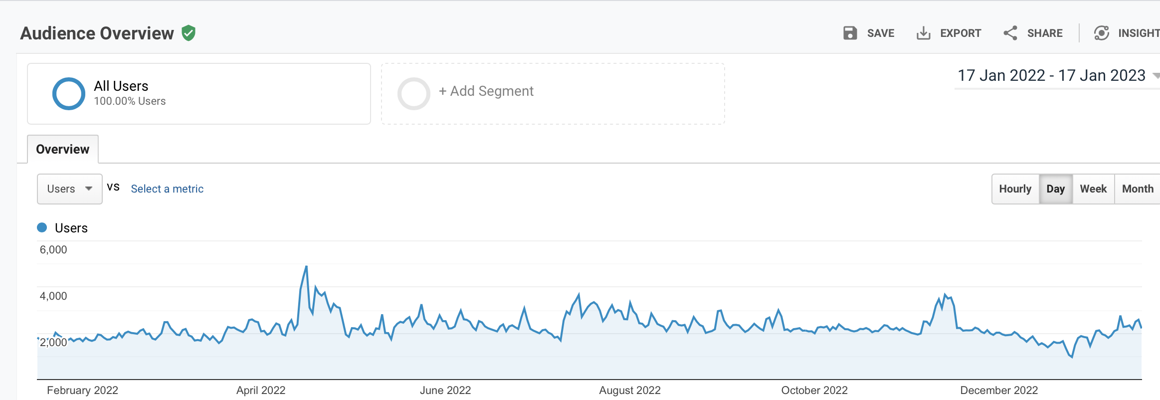
Project Mapping website - averaging around 2500 hits a day. |
|||||
 |
||