 |
||||||||||||||||
|
|||||
|
|
||||
|
 |
|
|||
|
|||||
|
|||||
 |
||||
 |
 |
||||||||||||||||||
 |
|||||||||||||||||||
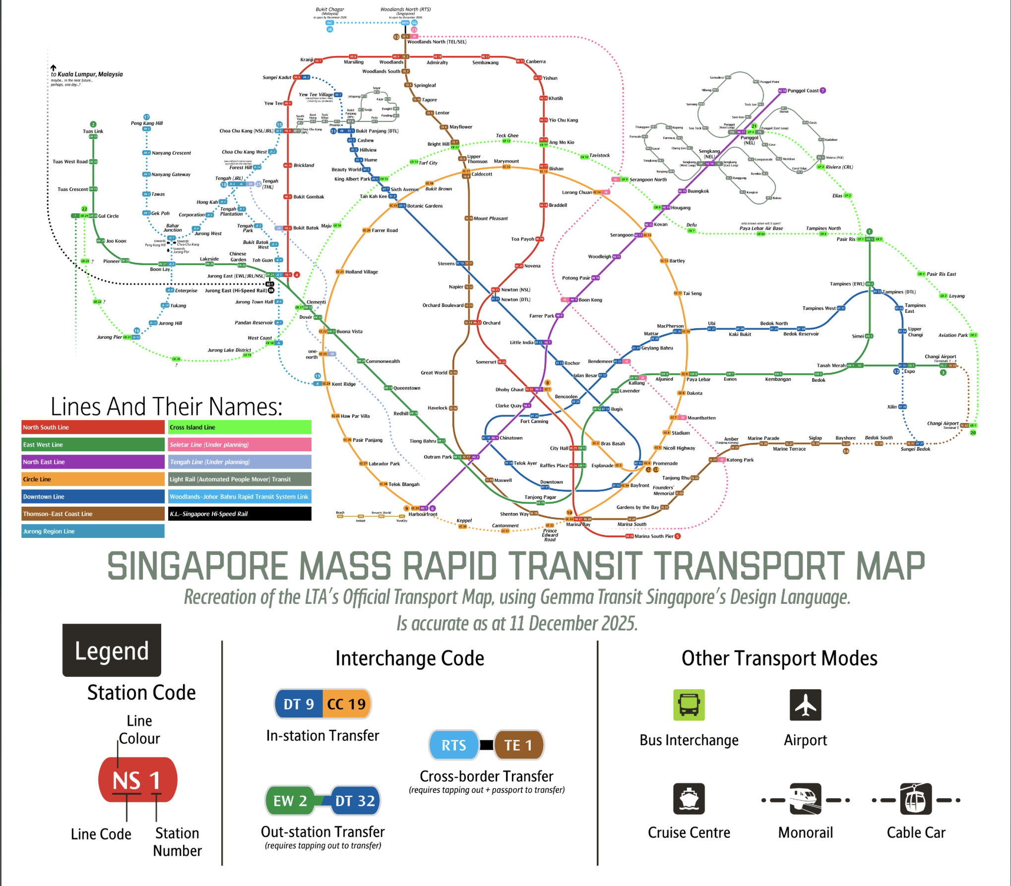
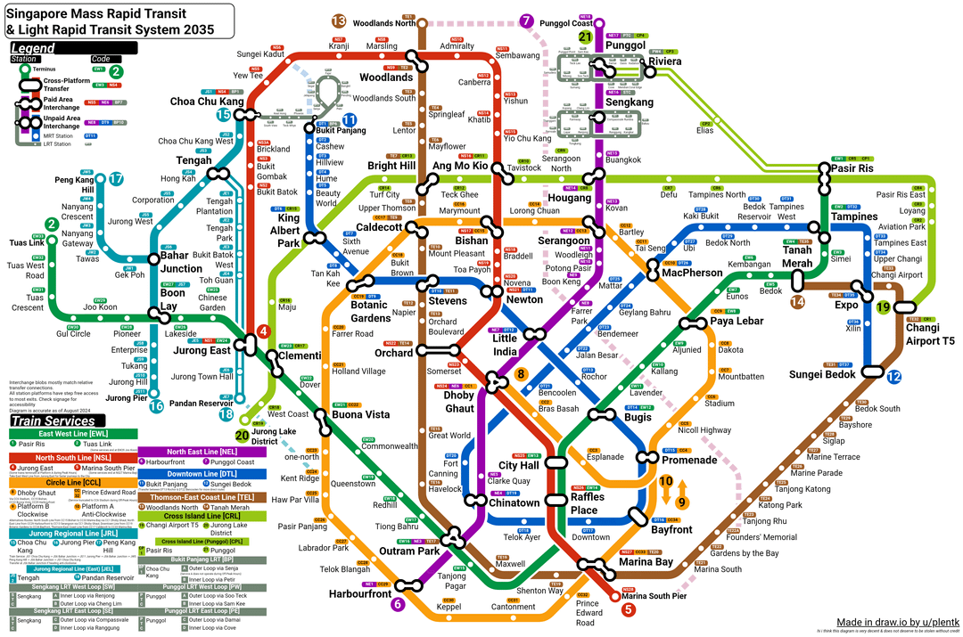
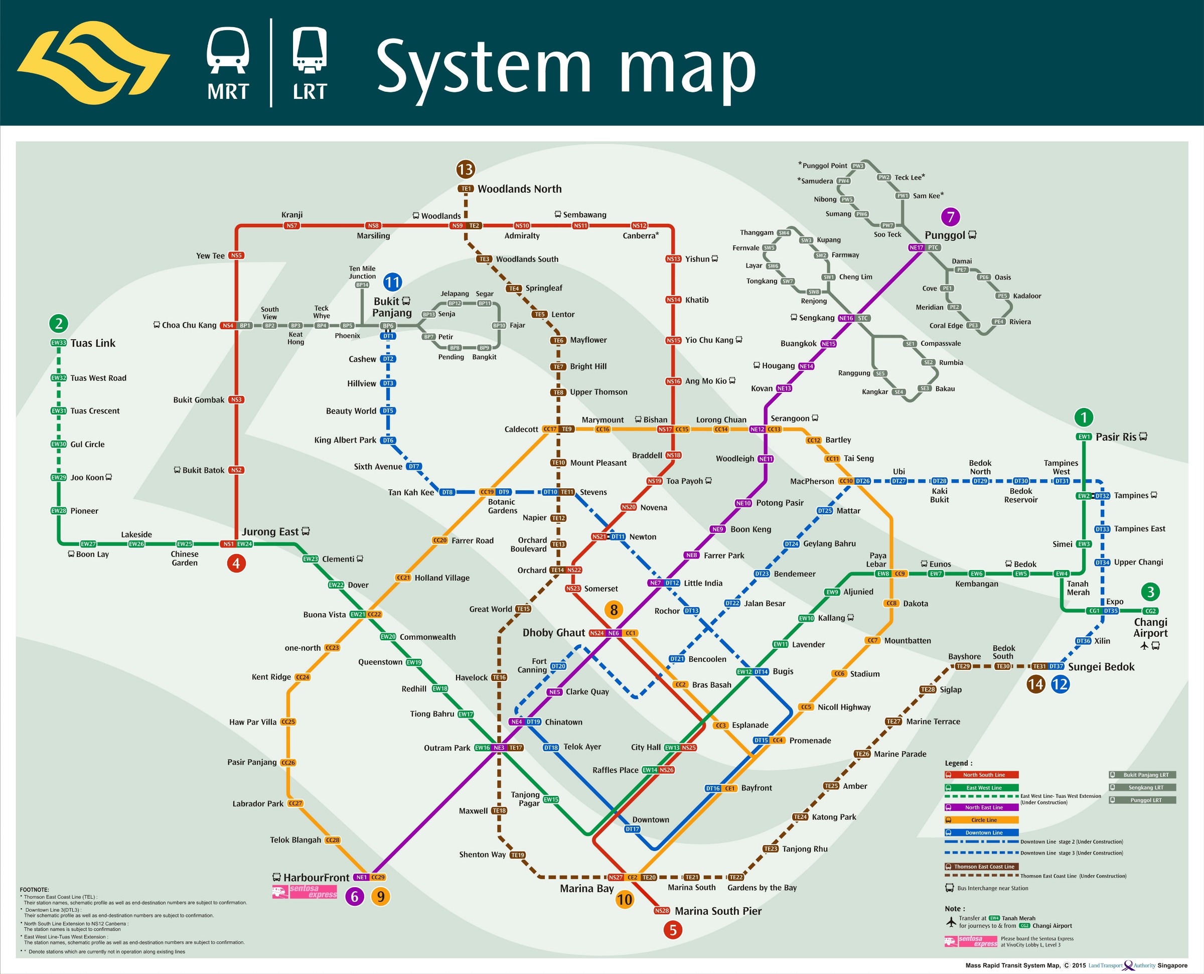
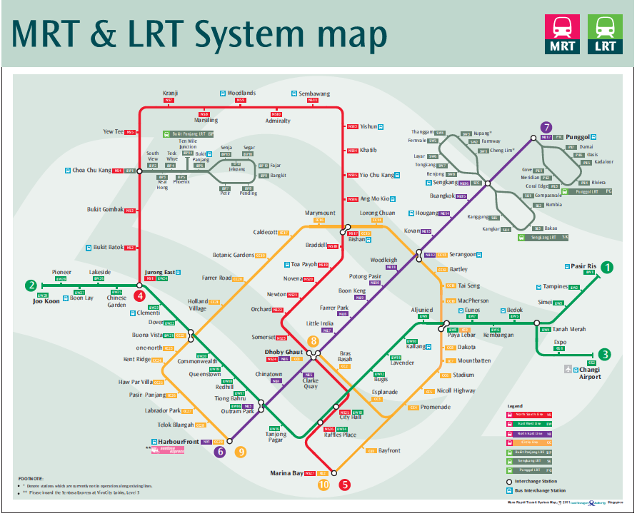
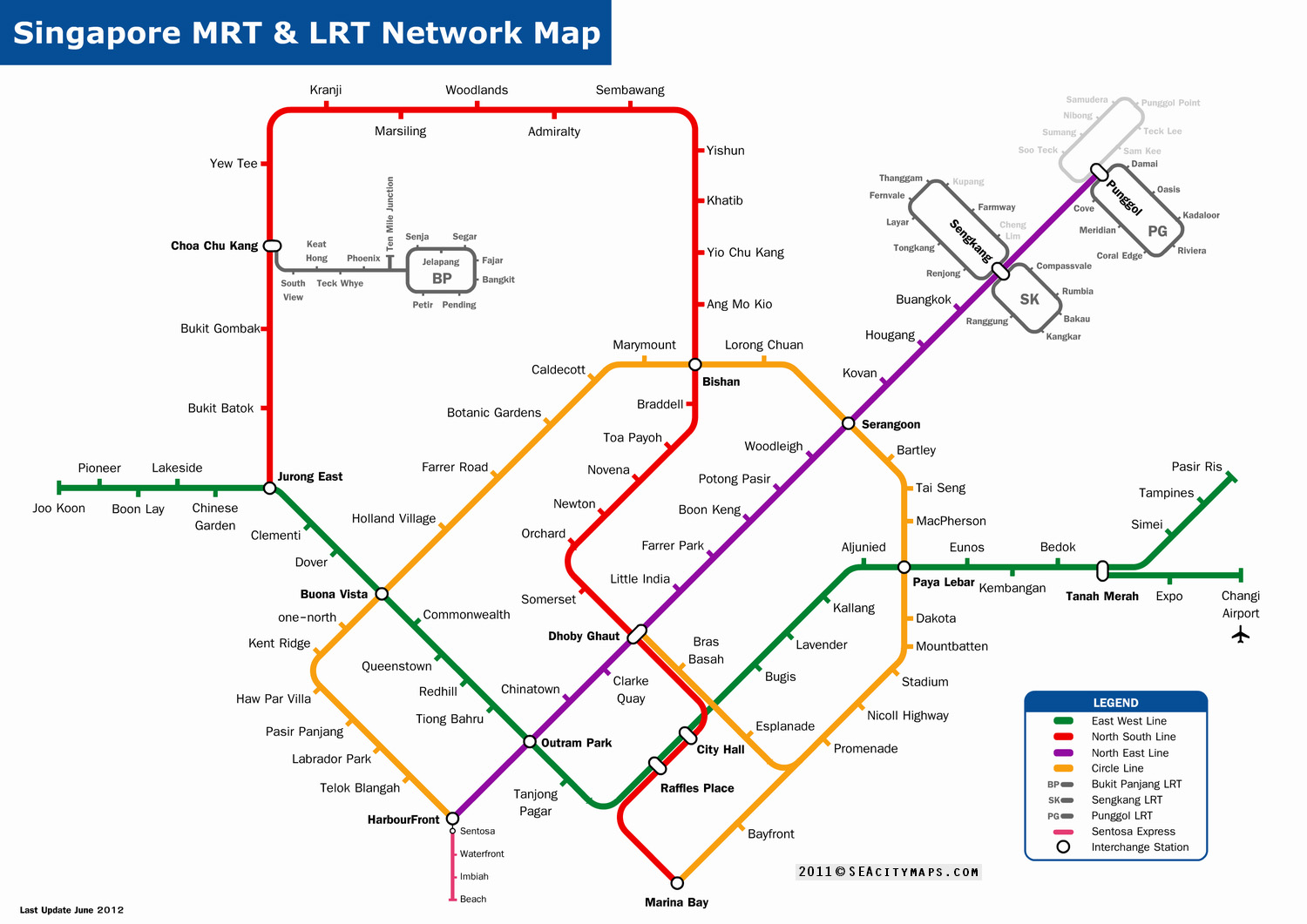
Circle line completed, Jurong Lake District corrected |
|||||||||||||||||||
 |
|||||||||||||||||||
 |
|||||||||||||||||||
 |
|||||||||||||||||||
 |
|||||||||||||||||||
Thomson East Coast line extension to Bayshore shown open. |
|||||||||||||||||||
 |
|||||||||||||||||||
 |
|||||||||||||||||||
Thomson East Coast line extension to Gardens By |
|||||||||||||||||||
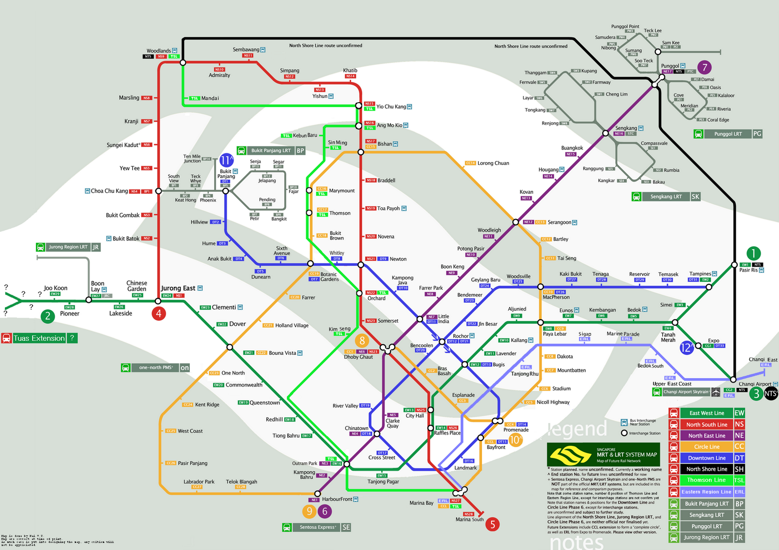
With extra detail on Cross Island Line and Thomson Line. |
|||||||||||||||||||
 |
|||||||||||||||||||||||||||||||||||||||||||||||||
 |
|||||||||||||||||||||||||||||||||||||||||||||||||
 |
|||||||||||||||||||||||||||||||||||||||||||||||||
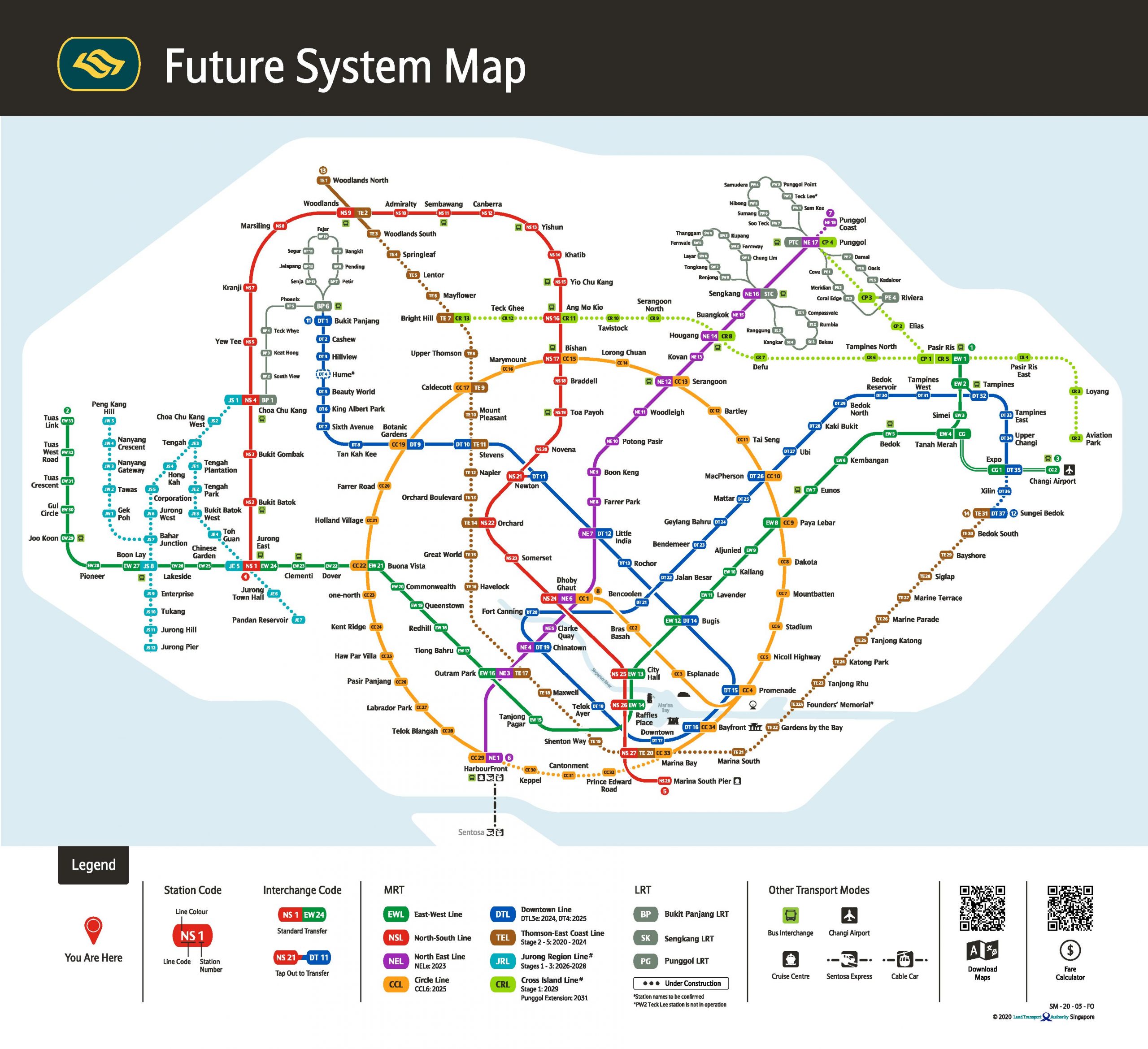
With Cross Island line extensions to Gul Circle, CR1 |
|||||||||||||||||||||||||||||||||||||||||||||||||
 |
|||||||||||||||||||||||||||||||||||||||||||||||||
 |
|||||||||||||||||||||||||||||||||||||||||||||||||
 |
|||||||||||||||||||||||||||||||||||||||||||||||||
Thomson-East Coast line open to Caldicott. |
|||||||||||||||||||||||||||||||||||||||||||||||||
 |
|||||||||||||||||||||||||||||||||||||||||||||||||
 |
|||||||||||||||||||||||||||||||||||||||||||||||||
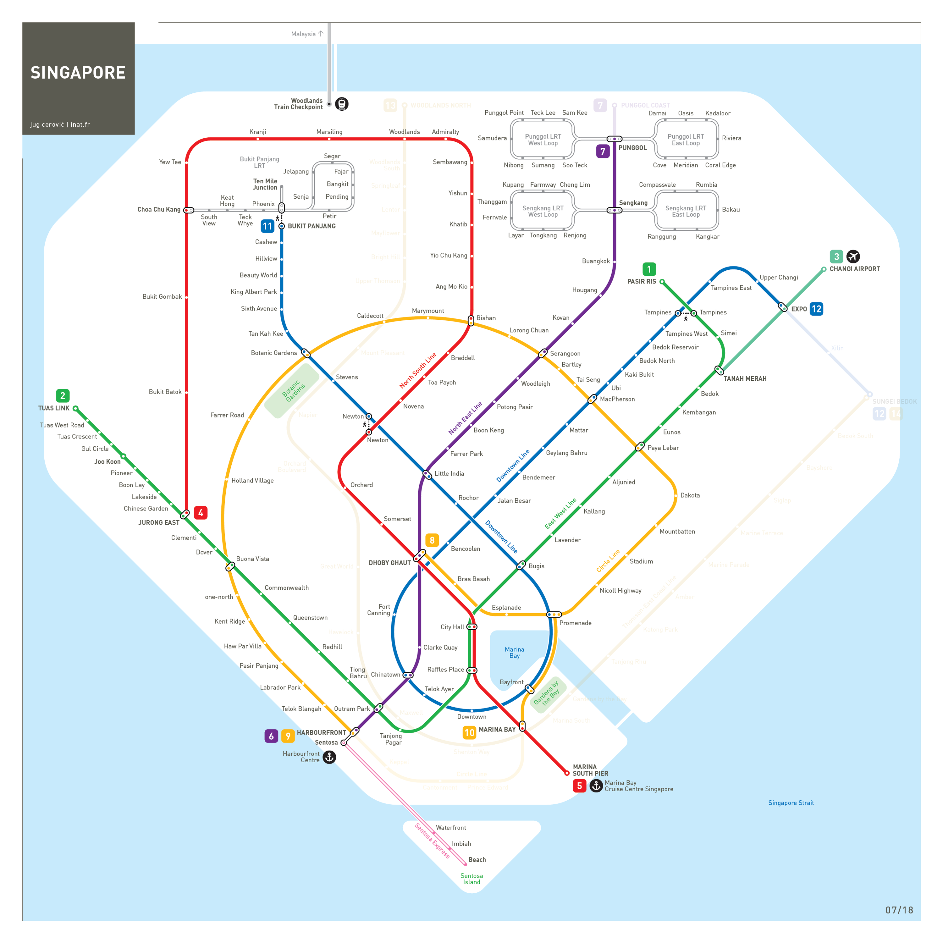
These posters show slight variations in the depiction of un-opened lines. |
|||||||||||||||||||||||||||||||||||||||||||||||||
 |
|||||||||||||||||||||||||||||||||||||||||||||||||
 |
|
||||||||||||||||||||||||||||||||||||||||||||||||
Thomson-East Coast line top three stations now open. |
|||||||||||||||||||||||||||||||||||||||||||||||||
 |
|||||||||||||||||||||||||||||||||||||||||||||||||
 |
|||||||||||||||||||||||||||||||||||||||||||||||||
 |
|||||||||||||||||||||||||||||||||||||||||||||||||
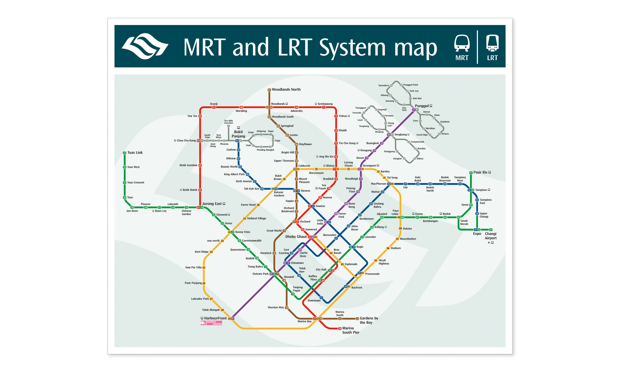
As below but showing all lines and stations open |
|||||||||||||||||||||||||||||||||||||||||||||||||
 |
|||||||||||||||||||||||||||||||||||||||||||||||||
 |
|||||||||||||||||||||||||||||||||||||||||||||||||
 |
|||||||||||||||||||||||||||||||||||||||||||||||||
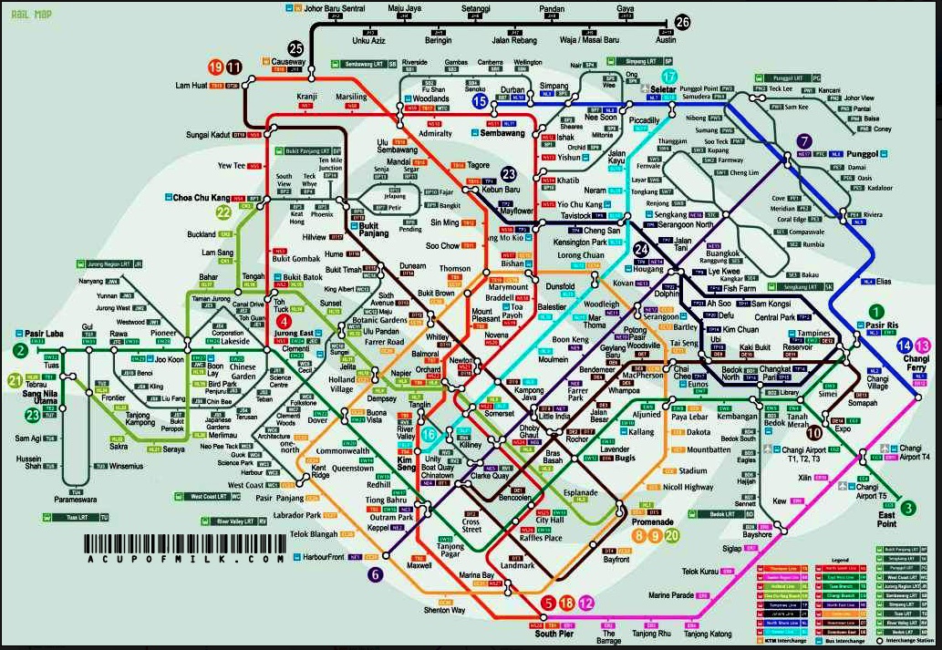
Cross Island Line, Founders' Memorial and Hume stations added; Ten Mile Junction LRT branch removed, new layouts for Punggol and Sengkang LRT, renamed Sentosa Express stations |
|||||||||||||||||||||||||||||||||||||||||||||||||
 |
|||||||||||||||||||||||||||||||||||||||||||||||||
 |
|||||||||||||||||||||||||||||||||||||||||||||||||
 |
|||||||||||||||||||||||||||||||||||||||||||||||||
As below but showing all lines and stations open |
|||||||||||||||||||||||||||||||||||||||||||||||||
 |
|||||||||||||||||||||||||||||||||||||||||||||||||
 |
|||||||||||||||||||||||||||||||||||||||||||||||||
 |
|||||||||||||||||||||||||||||||||||||||||||||||||
 |
|||||||||||||||||||||||||||||||||||||||||||||||||
With Jurong Region line and Canberra |
|||||||||||||||||||||||||||||||||||||||||||||||||
 |
|||||||||||||||||||||||||||||||||||||||||||||||||
With Cross Island Line, Founders' Memorial and Hume, Ten Mile Junction removed |
|||||||||||||||||||||||||||||||||||||||||||||||||
 |
|||||||||||||||||||||||||||||||||||||||||||||||||
 |
|||||||||||||||||||||||||||||||||||||||||||||||||
 |
|||||||||||||||||||||||||||||||||||||||||||||||||
 |
|||||||||||||||||||||||||||||||||||||||||||||||||
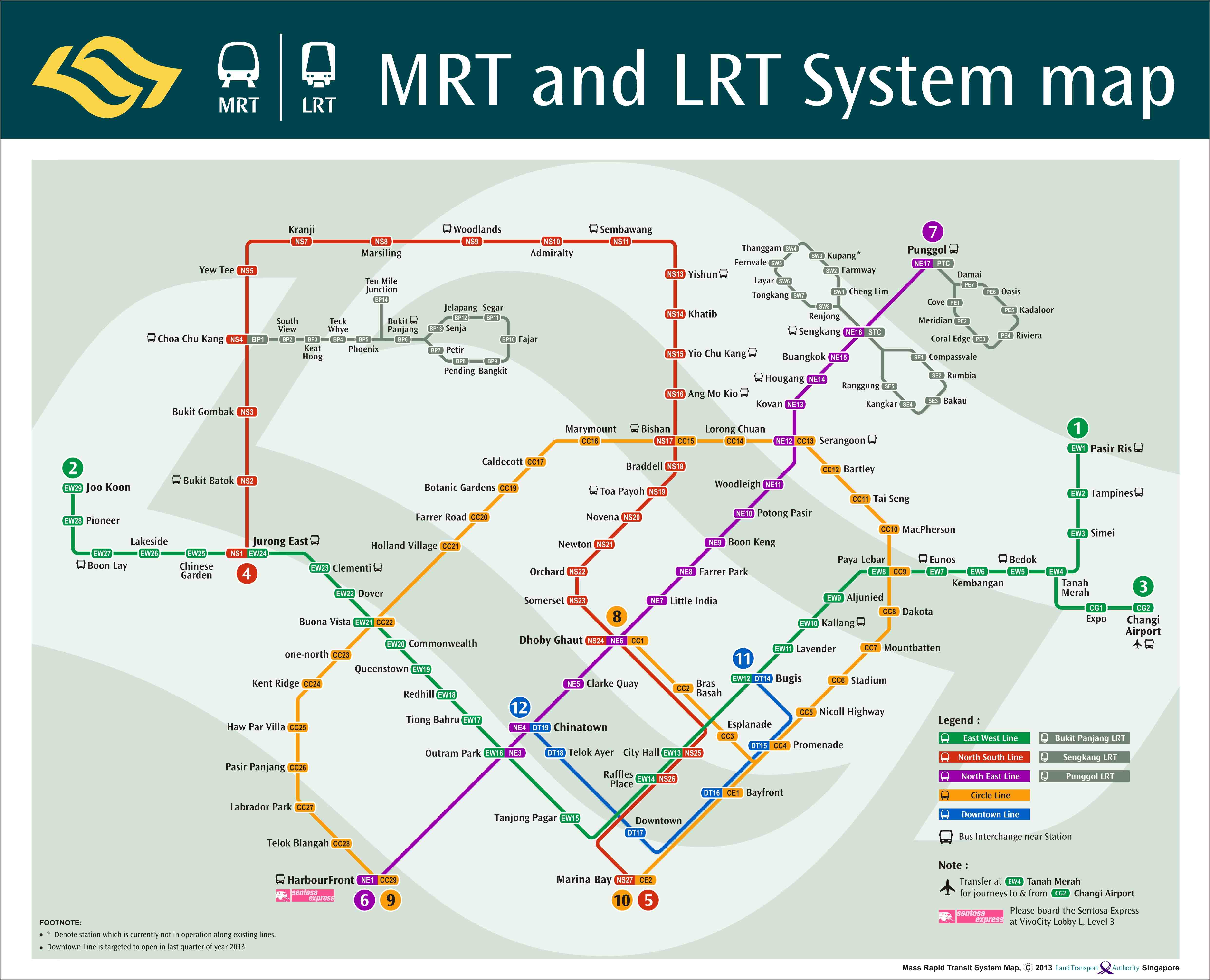
Downtown line to Expo shown open, Circle line extension added. |
|||||||||||||||||||||||||||||||||||||||||||||||||
With revised key |
|||||||||||||||||||||||||||||||||||||||||||||||||
 |
|||||||||||||||||||||||||||||||||||||||||||||||||
 |
|||||||||||||||||||||||||||||||||||||||||||||||||
 |
|||||||||||||||||||||||||||||||||||||||||||||||||
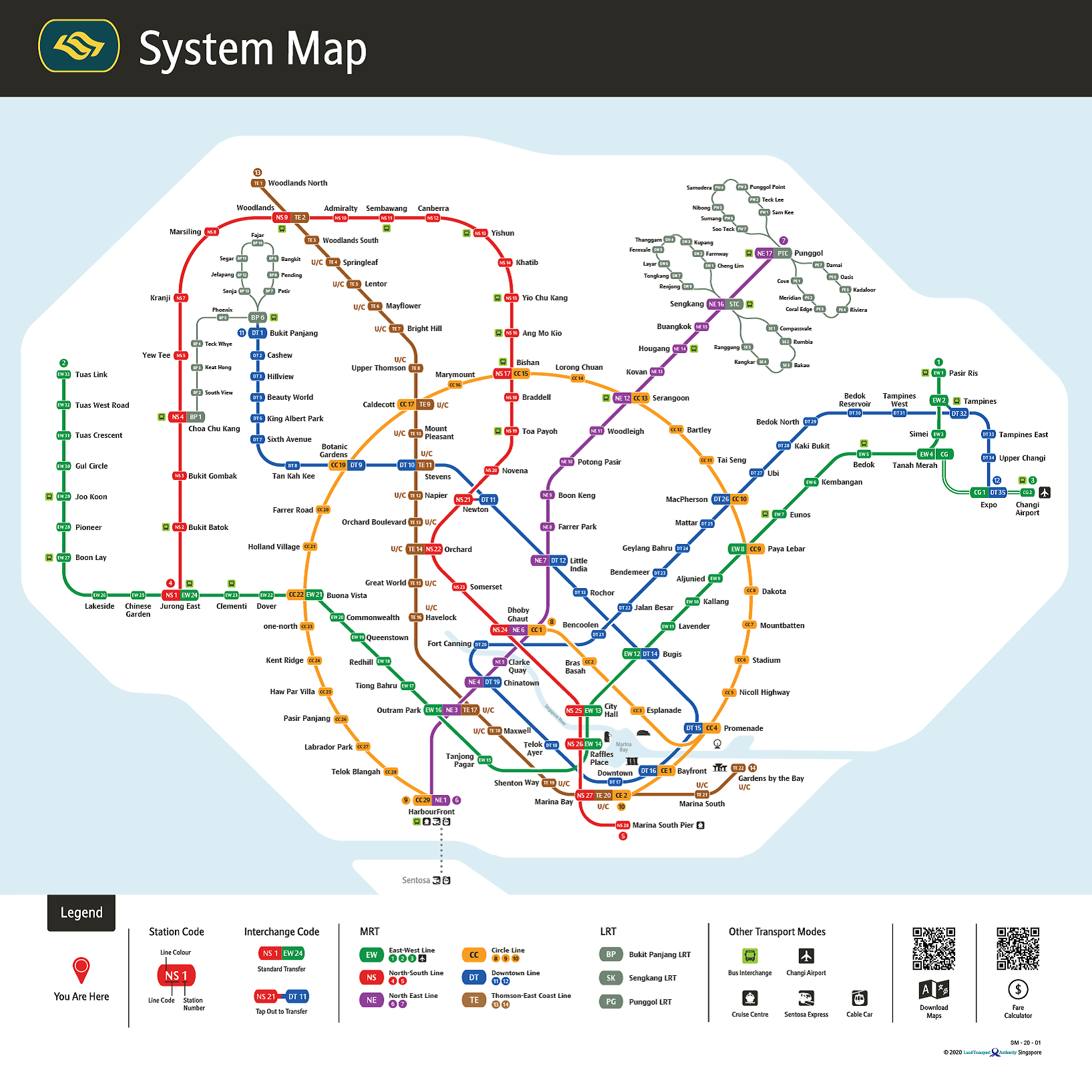
Tuas extension and two Punggol LRT stations shown open, Punggol Coast shown under construction. |
|||||||||||||||||||||||||||||||||||||||||||||||||
 |
|||||||||||||||||||||||||||||||||||||||||||||||||
With North Shore line |
|||||||||||||||||||||||||||||||||||||||||||||||||
 |
|||||||||||||||||||||||||||||||||||||||||||||||||
 |
|||||||||||||||||||||||||||||||||||||||||||||||||
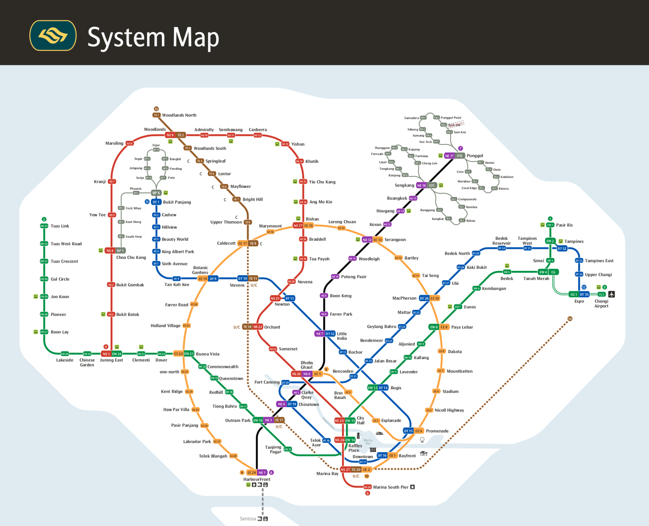
Downtown line shown open to Bukit Panjang. |
|||||||||||||||||||||||||||||||||||||||||||||||||
 |
|||||||||||||||||||||||||||||||||||||||||||||||||
 |
|||||||||||||||||||||||||||||||||||||||||||||||||
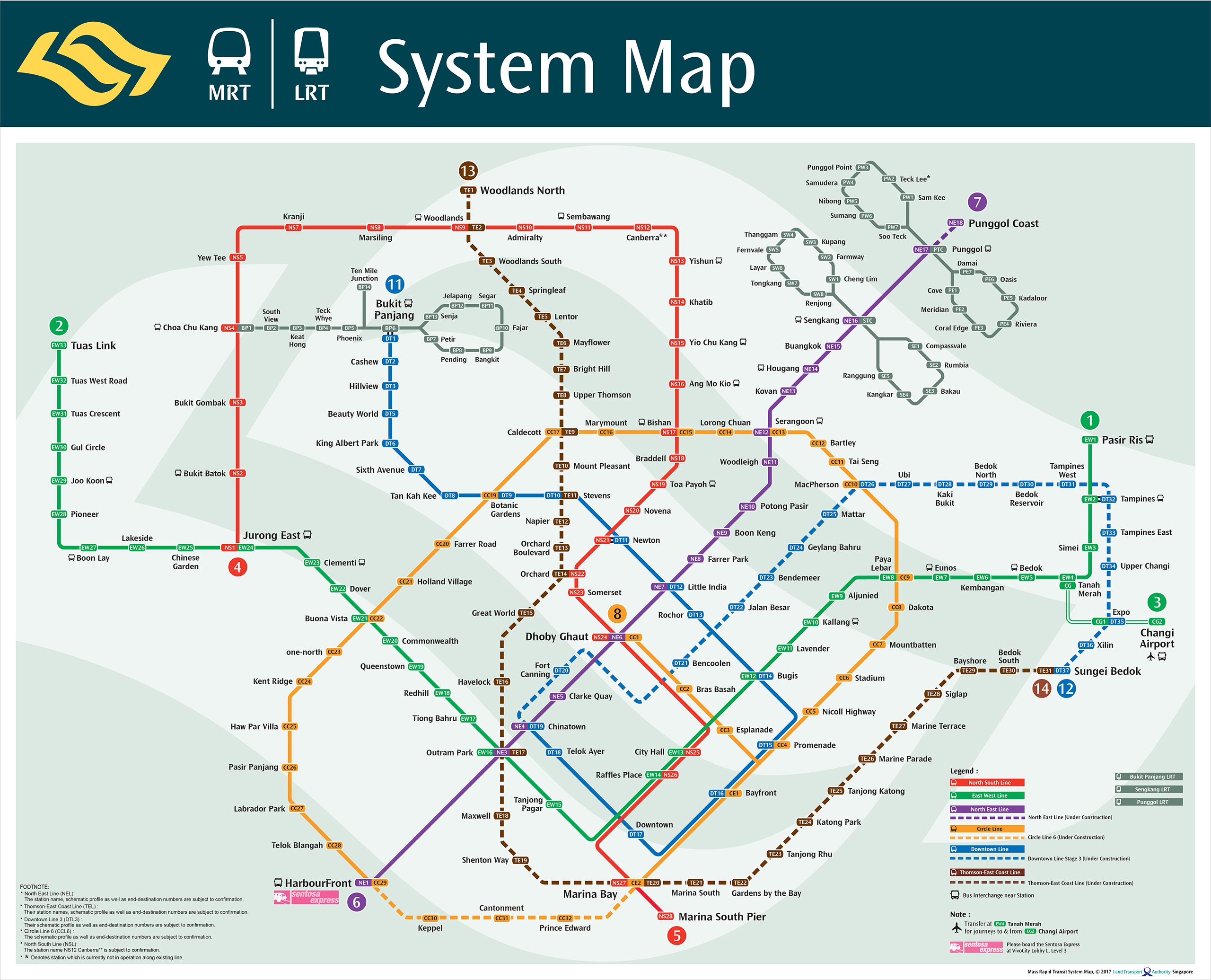
Now with station codes. |
|||||||||||||||||||||||||||||||||||||||||||||||||
• Circle line junction direction not clear at Promenade |
|||||||||||||||||||||||||||||||||||||||||||||||||
 |
|||||||||||||||||||||||||||||||||||||||||||||||||
 |
|||||||||||||||||||||||||||||||||||||||||||||||||
 |
|||||||||||||||||||||||||||||||||||||||||||||||||
 |
|||||||||||||||||||||||||||||||||||||||||||||||||
 |
|||||||||||||||||||||||||||||||||||||||||||||||||
 |
|||||||||||||||||||||||||||||||||||||||||||||||||
 |
|||||||||||||||||||||||||||||||||||||||||||||||||
 |
|||||||||||||||||||||||||||||||||||||||||||||||||
 |
|||||||||||||||||||||||||||||||||||||||||||||||||
 |
|||||||||||||||||||||||||||||||||||||||||||||||||
 |
|||||||||||||||||||||||||||||||||||||||||||||||||
 |
|||||||||||||||||||||||||||||||||||||||||||||||||
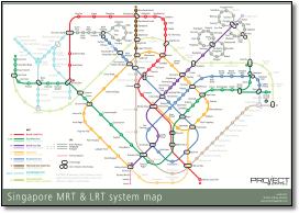
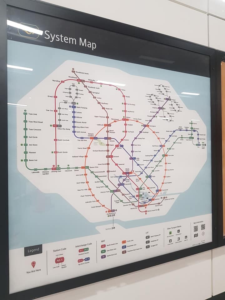
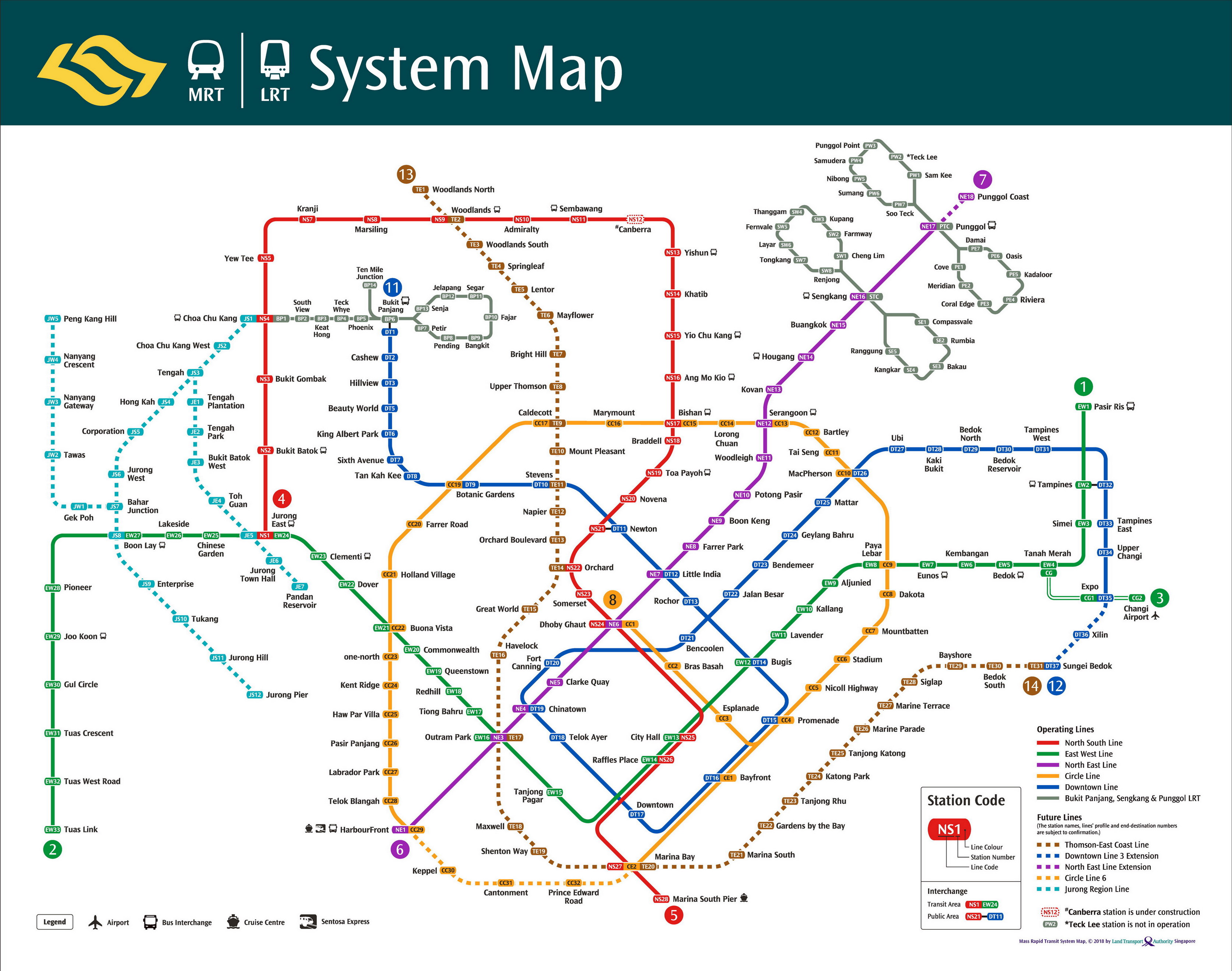
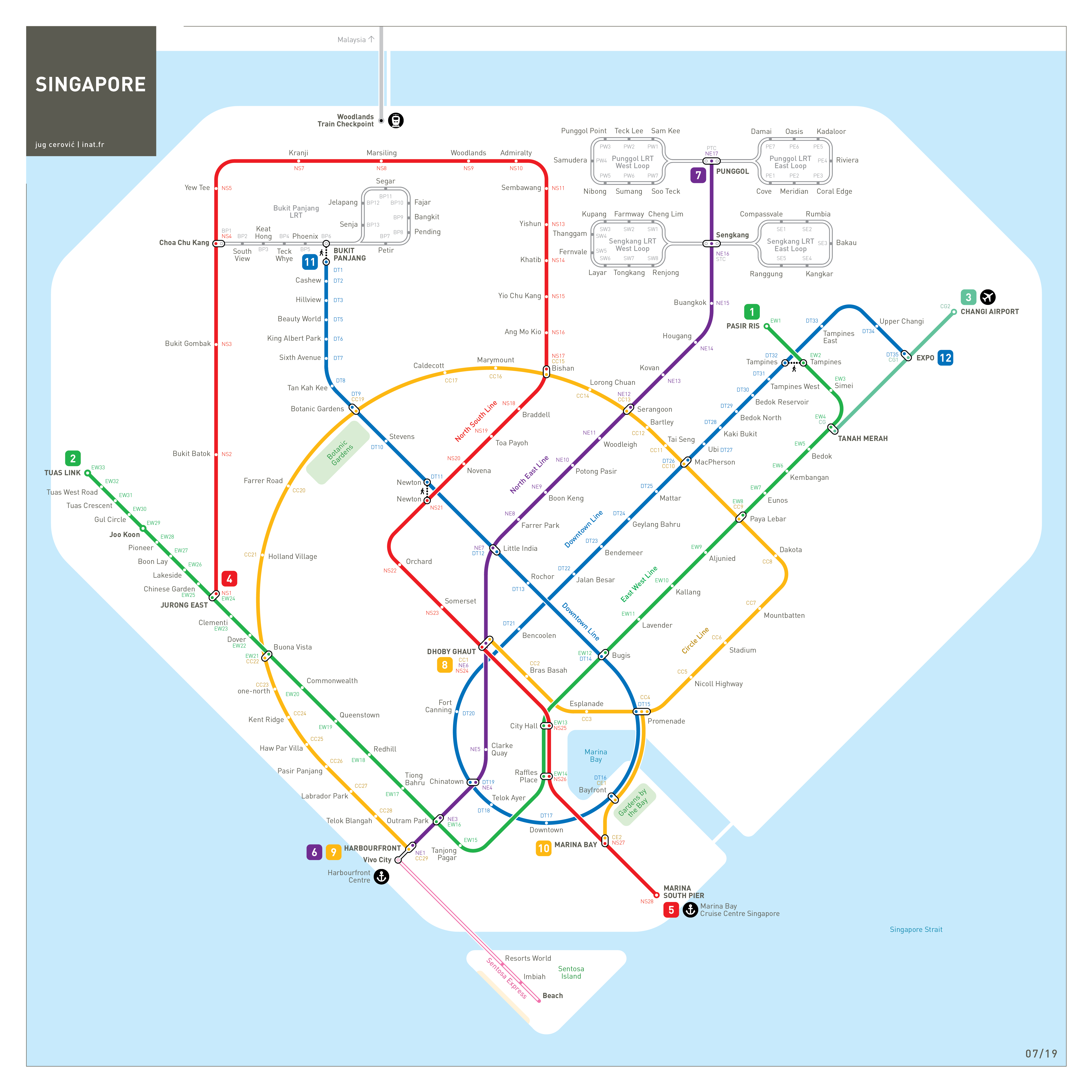
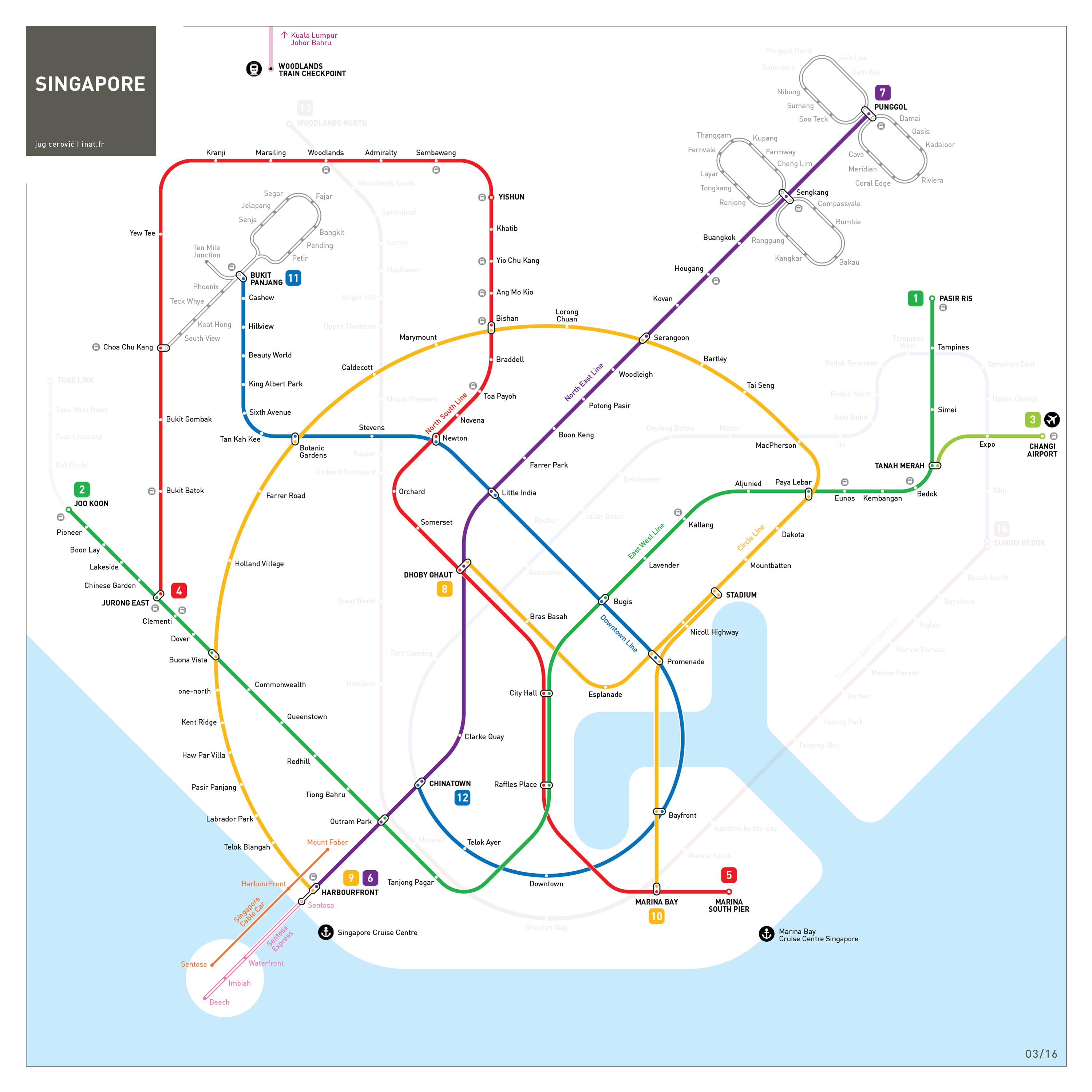
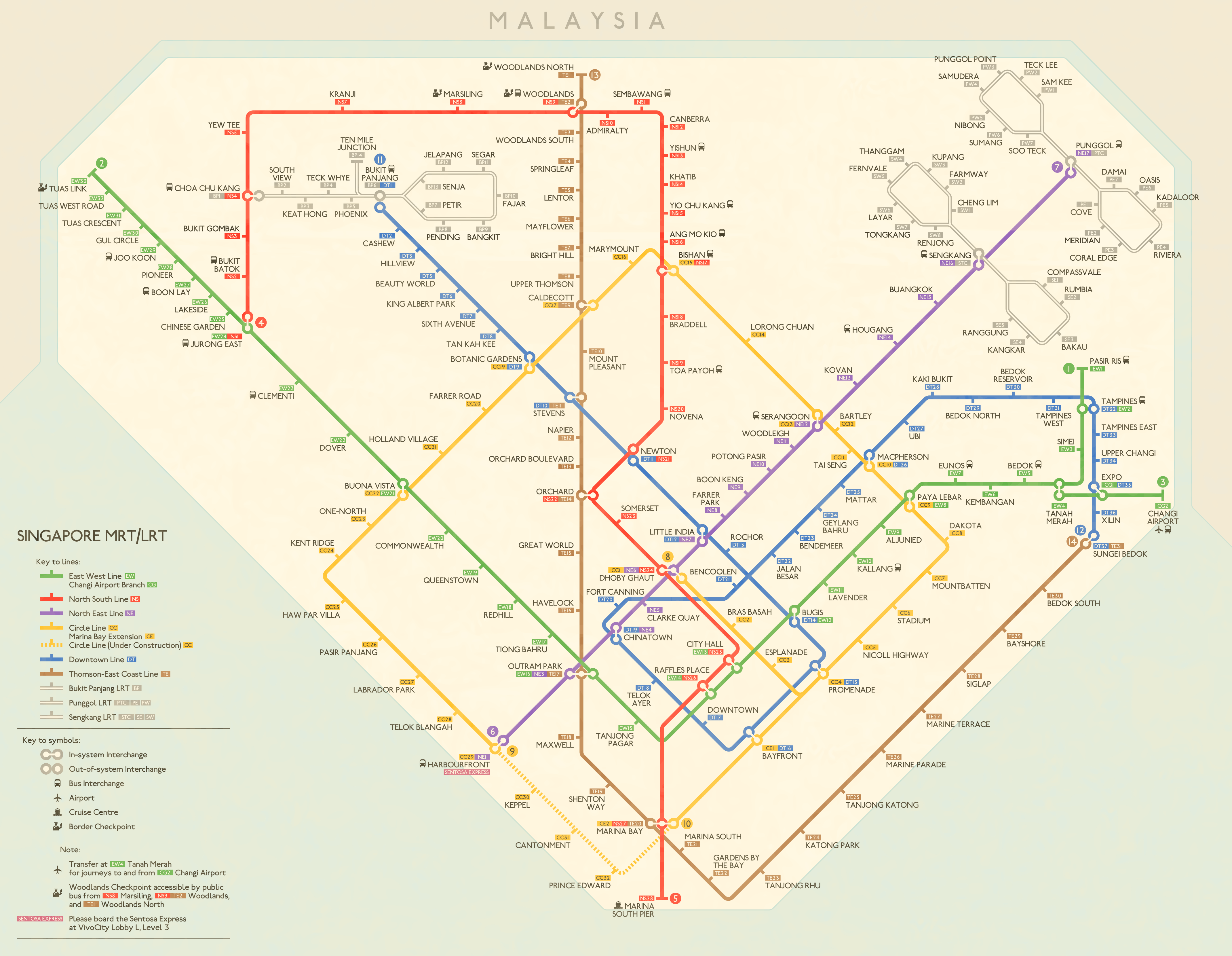
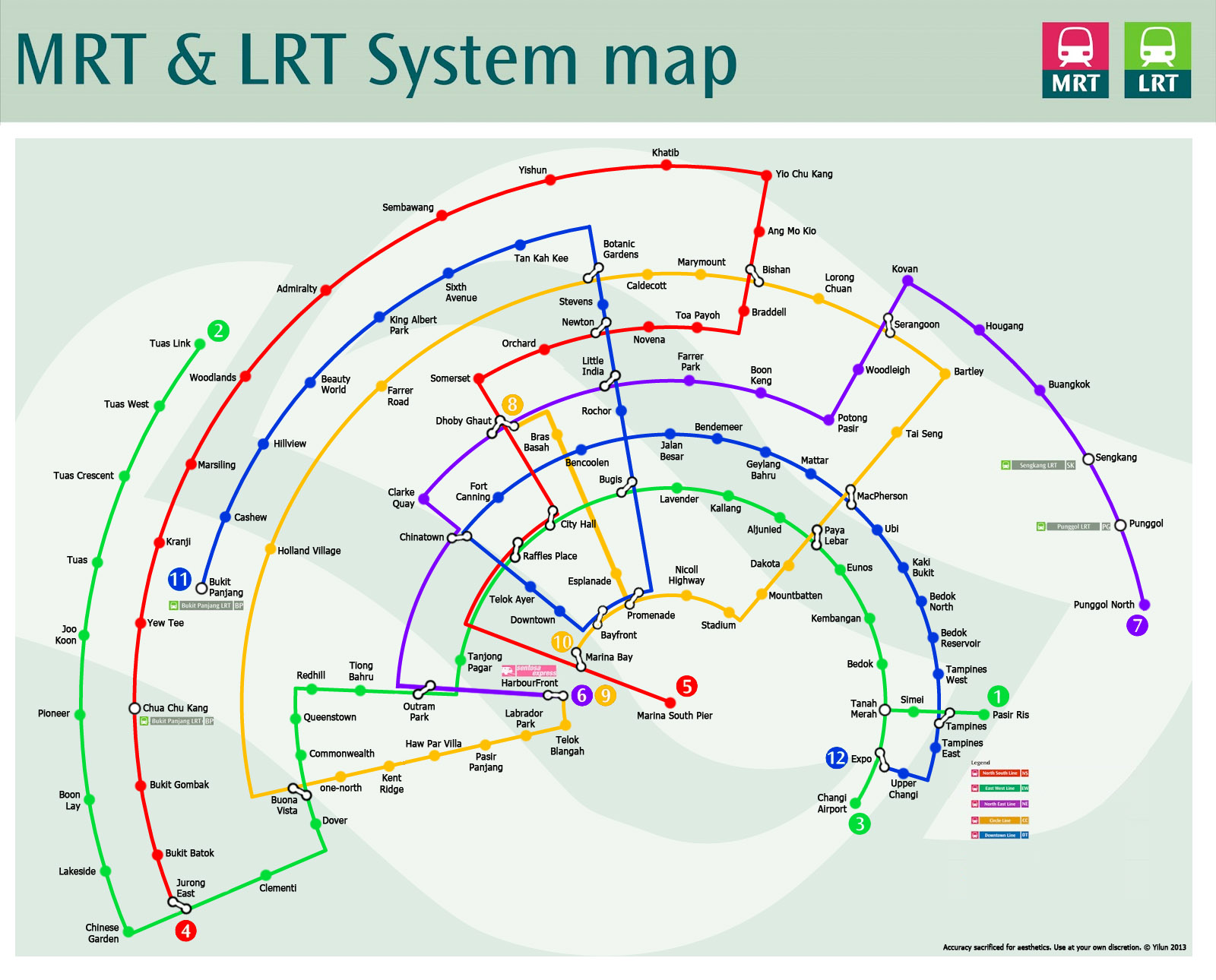
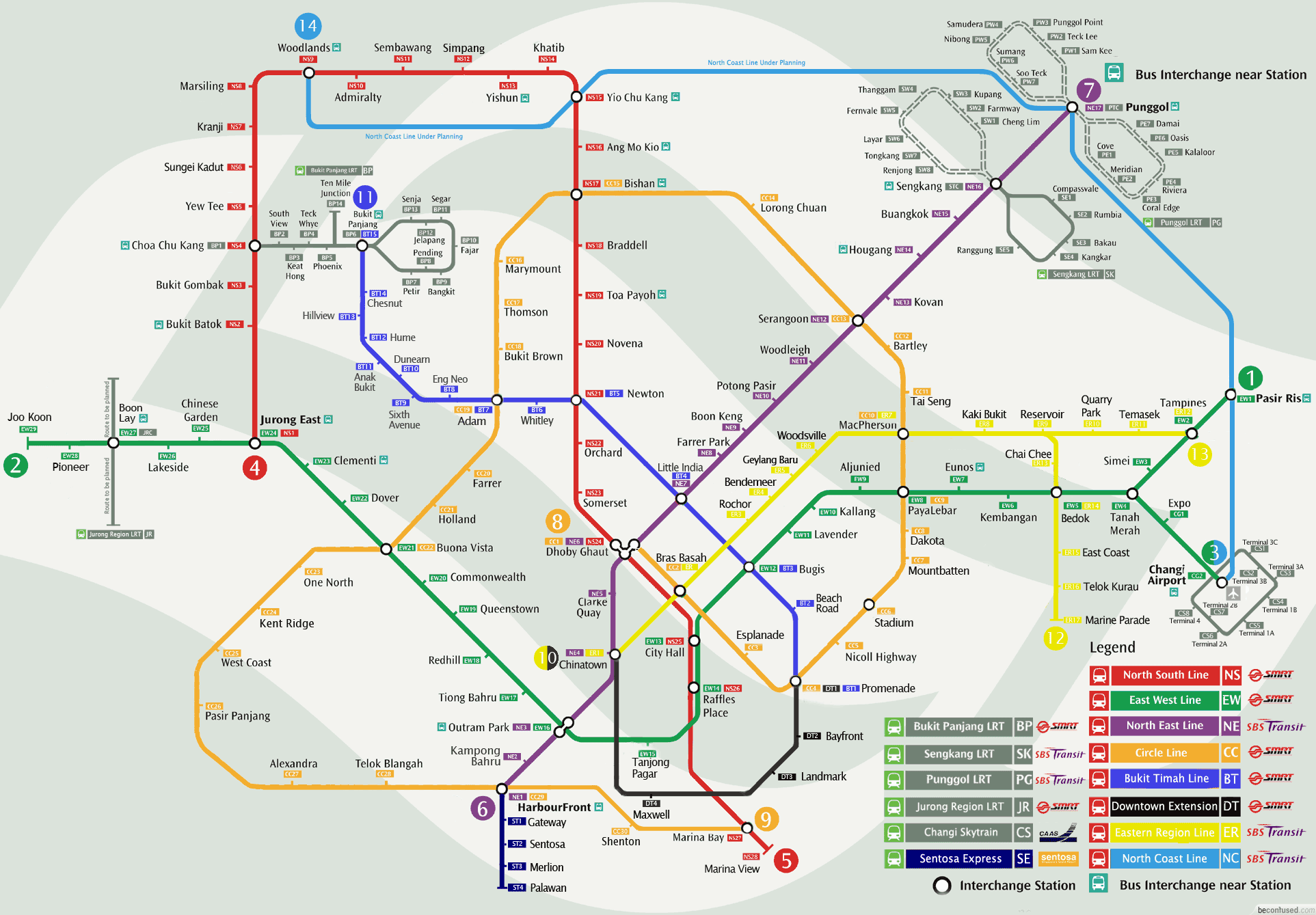
Review by Cameron Booth April 2016 Unofficial Map: Singapore MRT by Andrew Smithers I’ve covered a previous version of this map before (November 2013, 4 stars, [below]), but I think this recent update is worth showing, because it’s always fun to see how a concept can evolve over time. Like the most recent version of the official map and Bernie Ng (November 2013, 3.5 stars). Andrew has come to the conclusion that placing the alphanumeric station identifiers inside each station marker is the best way to go, and it helps the map tremendously. Finding the extra space to place the identifiers adjacent to a station was always problematic, and will become even more so with triple interchanges like Dhoby Ghaut and Outram Park coming online as the system rapidly expands. The new extension to the planned Thompson line past Gardens by the Sea allows Andrew to introduce a lovely curve that echoes that of the Downtown Line above it at the bottom of the map at Shenton Way – a big improvement over his previous iteration. The repeating loop motif that runs through this map is deftly executed and provides the “visual hook” that I always like to see in a good transit map: the design element that ties the whole thing together as a pleasing whole. A few minor points: the two sets of LRT loops to the northeast are perhaps just a little too close to each other, with labels that almost clash at Compassvale and Coral Edge, for example. Similarly, stacking the label at Lorong Chuan in two lines would perhaps keep better visual distance away from the stations on the North East Line. The Downtown Line crossover could be a little neater: the dashes don’t quite align with each other, creating a bit of an ugly clash (Andrew’s previous map was actually better here). Some of the outer stations seem comparatively cramped in their spacing compared to the relatively spacious central area. While the map appears quite schematic, it actually aligns quite well with geographic reality (at least in the central part), as shown by this working diagram. Our rating: An intelligent evolution of ideas. Still four stars, but a better four stars, if you know what I mean. |
|||||||||||||||||||||||||||||||||||||||||||||||||
Tuas extension and two Punggol LRT stations shown open, Punggol Coast shown under construction. |
|||||||||||||||||||||||||||||||||||||||||||||||||
 |
|||||||||||||||||||||||||||||||||||||||||||||||||
 |
|||||||||||||||||||||||||||||||||||||||||||||||||
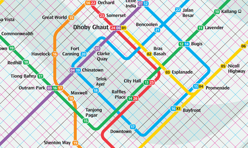
Central area showing design grid. Not clear how the grid works as unequally spaced. |
|||||||||||||||||||||||||||||||||||||||||||||||||
Downtown line shown open to Bukit Panjang. |
|||||||||||||||||||||||||||||||||||||||||||||||||
 |
|||||||||||||||||||||||||||||||||||||||||||||||||
 |
|||||||||||||||||||||||||||||||||||||||||||||||||
 |
|||||||||||||||||||||||||||||||||||||||||||||||||
 |
|||||||||||||||||||||||||||||||||||||||||||||||||
 |
|||||||||||||||||||||||||||||||||||||||||||||||||
 |
|||||||||||||||||||||||||||||||||||||||||||||||||
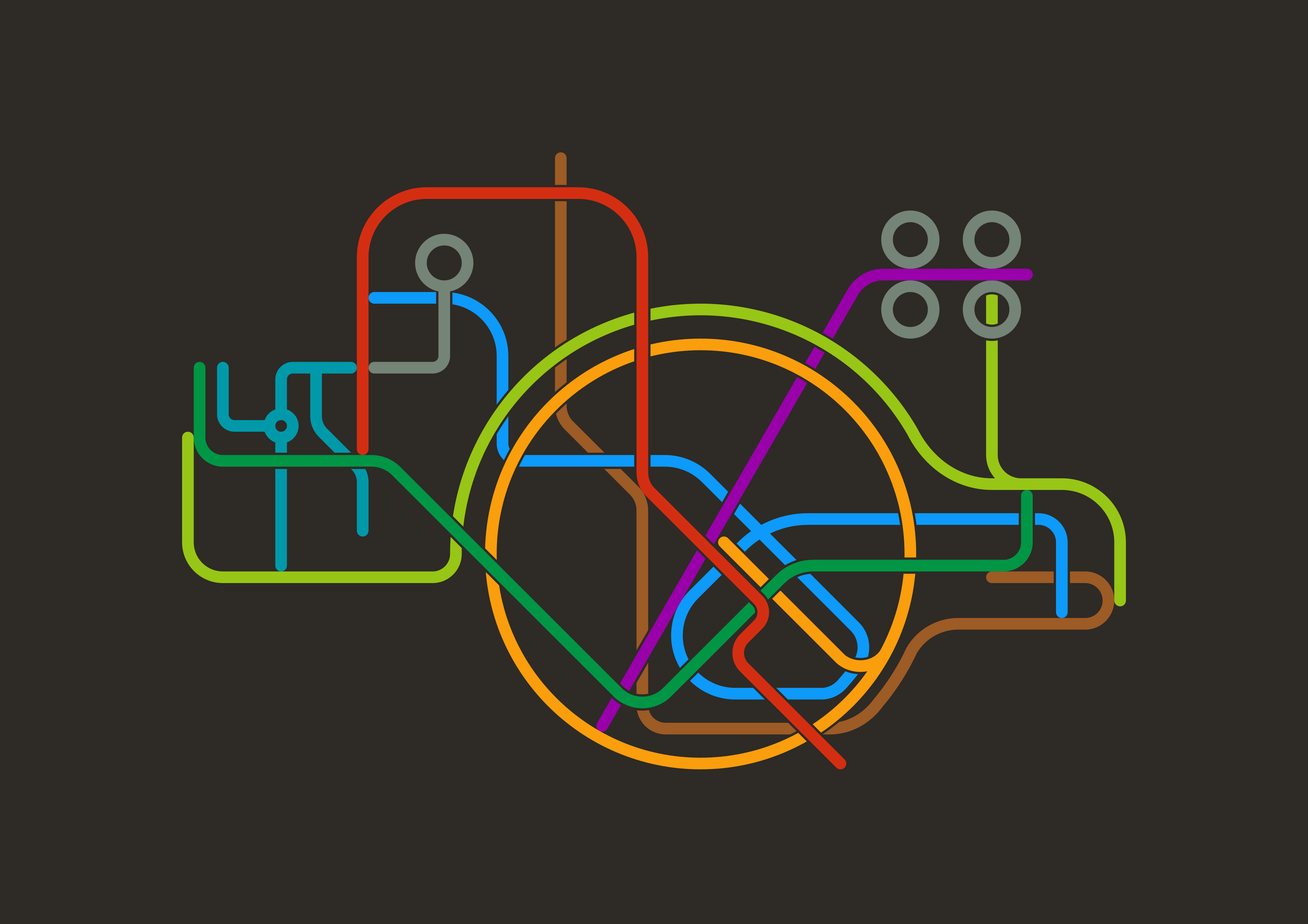
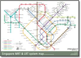
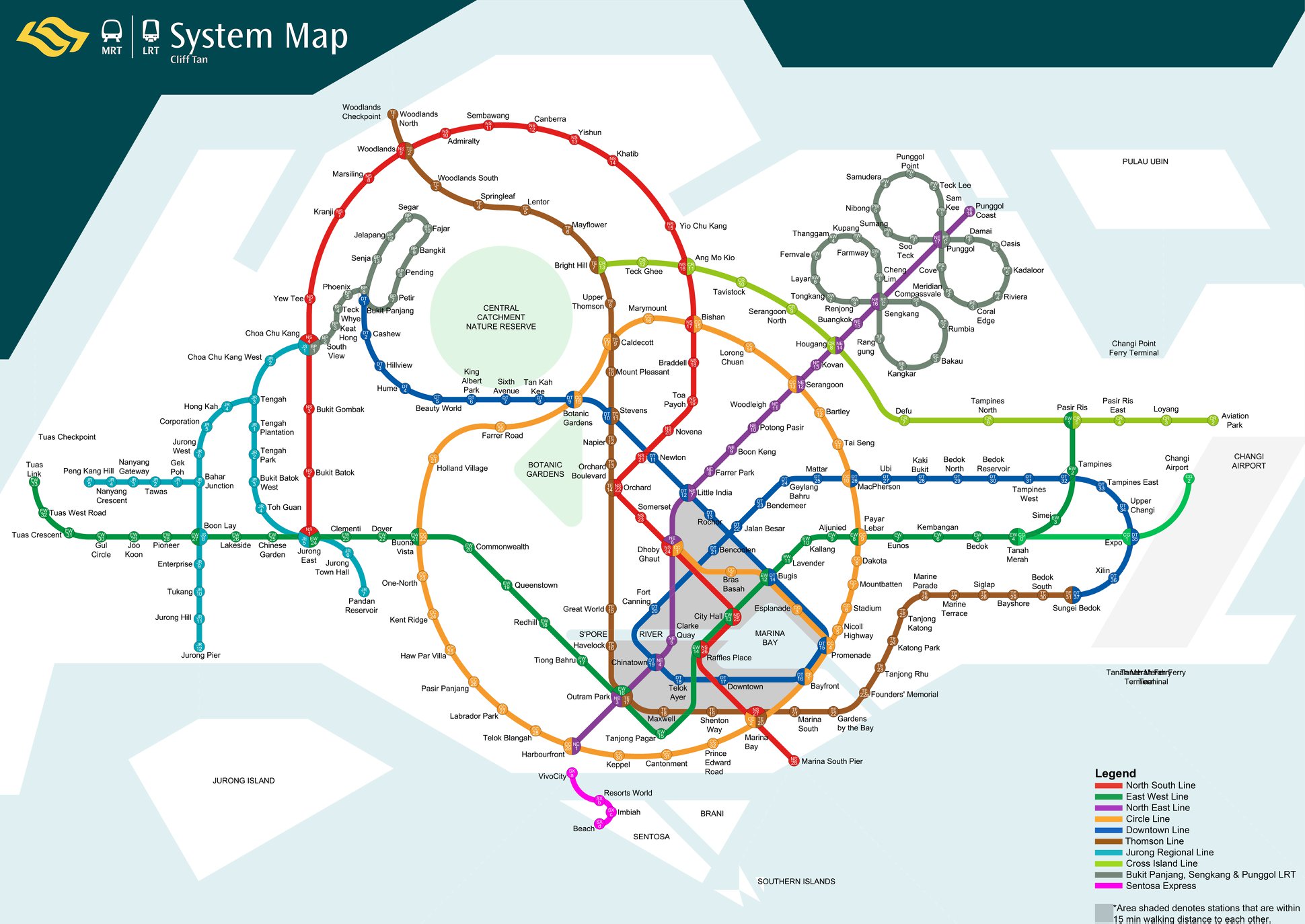
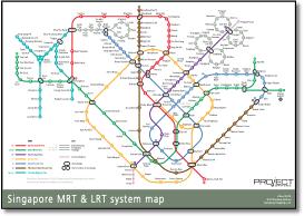
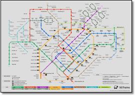
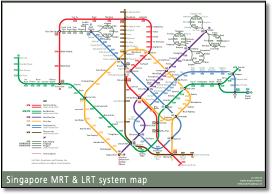
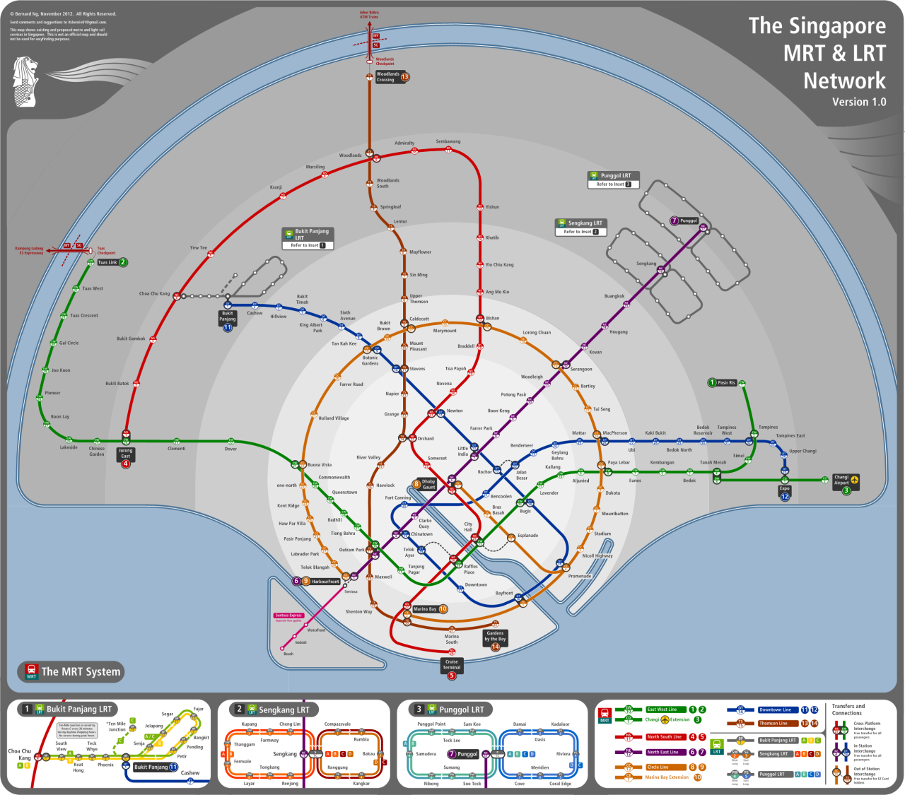
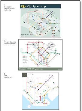
Review by Cameron Booth November 2013 Unofficial Map: Singapore MRT by Andrew Smithers As promised, here’s an unofficial map of Singapore’s rail transit that takes the future extensions and integrates them far more effectively and attractively than the official future map. This map was created by Andrew Smithers, who runs the quite excellent Project Mapping website — well worth losing a few hours to all the maps he has over there! Immediately, you can see how design is used to simplify and clarify the routes — the Thomson Line becomes a north-south axis for the map, while the new Downtown Line now describes a perfect diamond-shaped loop. This motif is echoed beautifully by the larger loop of the yellow Circle Line — which visually lives up to its name far more here than on the official map — and even by little double-crossover between the Downtown and North East lines at the bottom centre of the map. Repetition of design themes in a transit map is a lovely thing, and it really helps to hold a map together thematically. That’s not to say that everything is perfect, however. The station codes — used to help non-English speakers buy tickets and navigate the system — are just as problematic here as they are on the official map. Andrew has opted to place them on the opposite side of the route line to the station name; while it works well in the less-crowded parts of the map, it can get a little messy in places, especially where the Downtown Line runs close to the North East and Circle Lines in the densest part of the map (just to the right of centre). Our rating: A lovely example of how repeated design elements can thematically tie a map together. Four stars. |
|||||||||||||||||||||||||||||||||||||||||||||||||
 |
|||||||||||||||||||||||||||||||||||||||||||||||||
.svg.png) |
|||||||||||||||||||||||||||||||||||||||||||||||||
|
|||||||||||||||||||||||||||||||||||||||||||||||||
 |
|||||||||||||||||||||||||||||||||||||||||||||||||
 |
|||||||||||||||||||||||||||||||||||||||||||||||||
|
|||||||||||||||||||||||||||||||||||||||||||||||||
 |
|||||||||||||||||||||||||||||||||||||||||||||||||
 |
|||||||||||||||||||||||||||||||||||||||||||||||||
 |
|||||||||||||||||||||||||||||||||||||||||||||||||
|
|||||||||||||||||||||||||||||||||||||||||||||||||
 |
|||||||||||||||||||||||||||||||||||||||||||||||||
 |
|||||||||||||||||||||||||||||||||||||||||||||||||
 |
|||||||||||||||||||||||||||||||||||||||||||||||||
 |
|||||||||||||||||||||||||||||||||||||||||||||||||