 |
||||||||||||||||
|
|
|||||||||||||||||||||||
|
|||||||||||||||||||||||
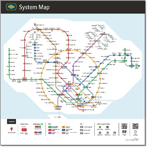
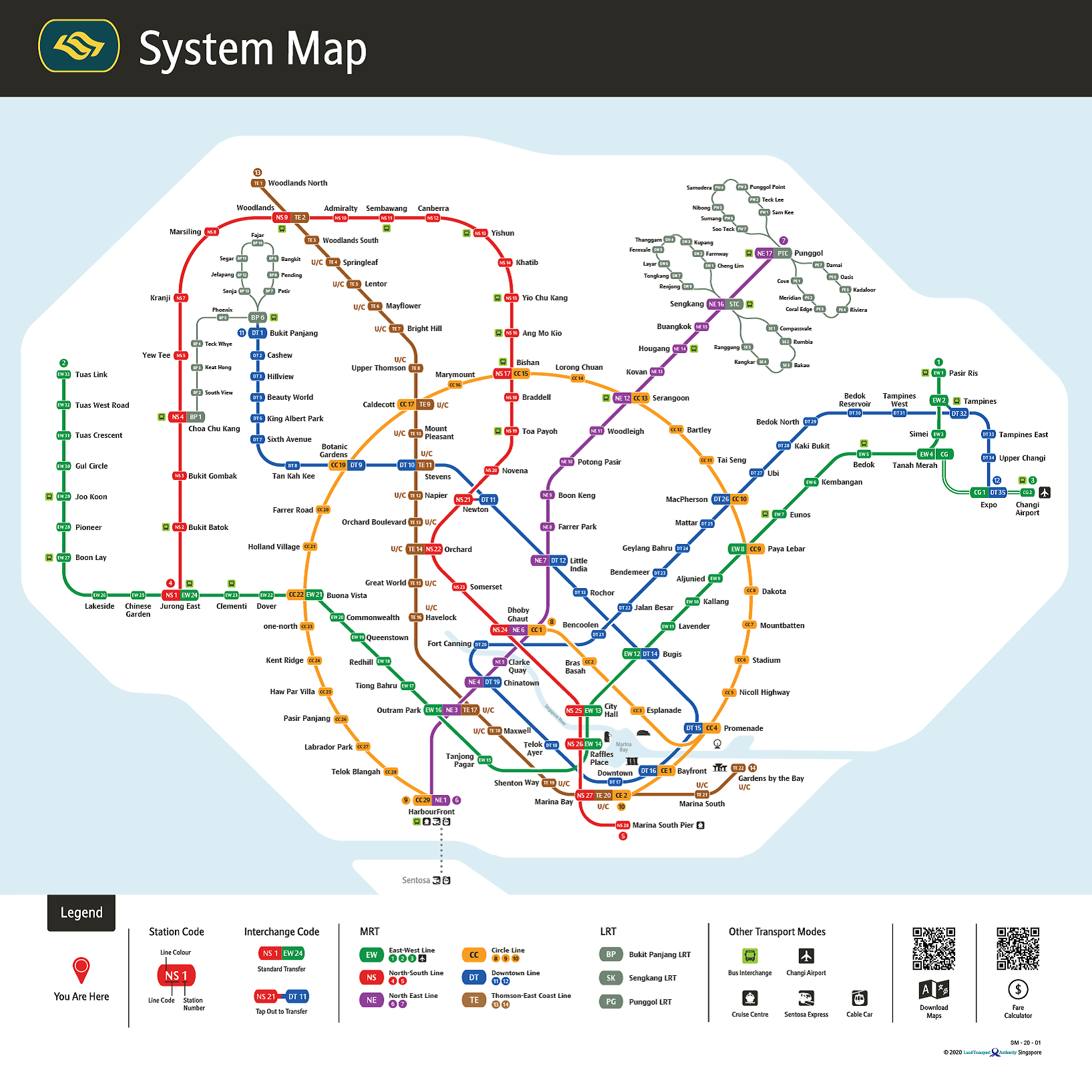
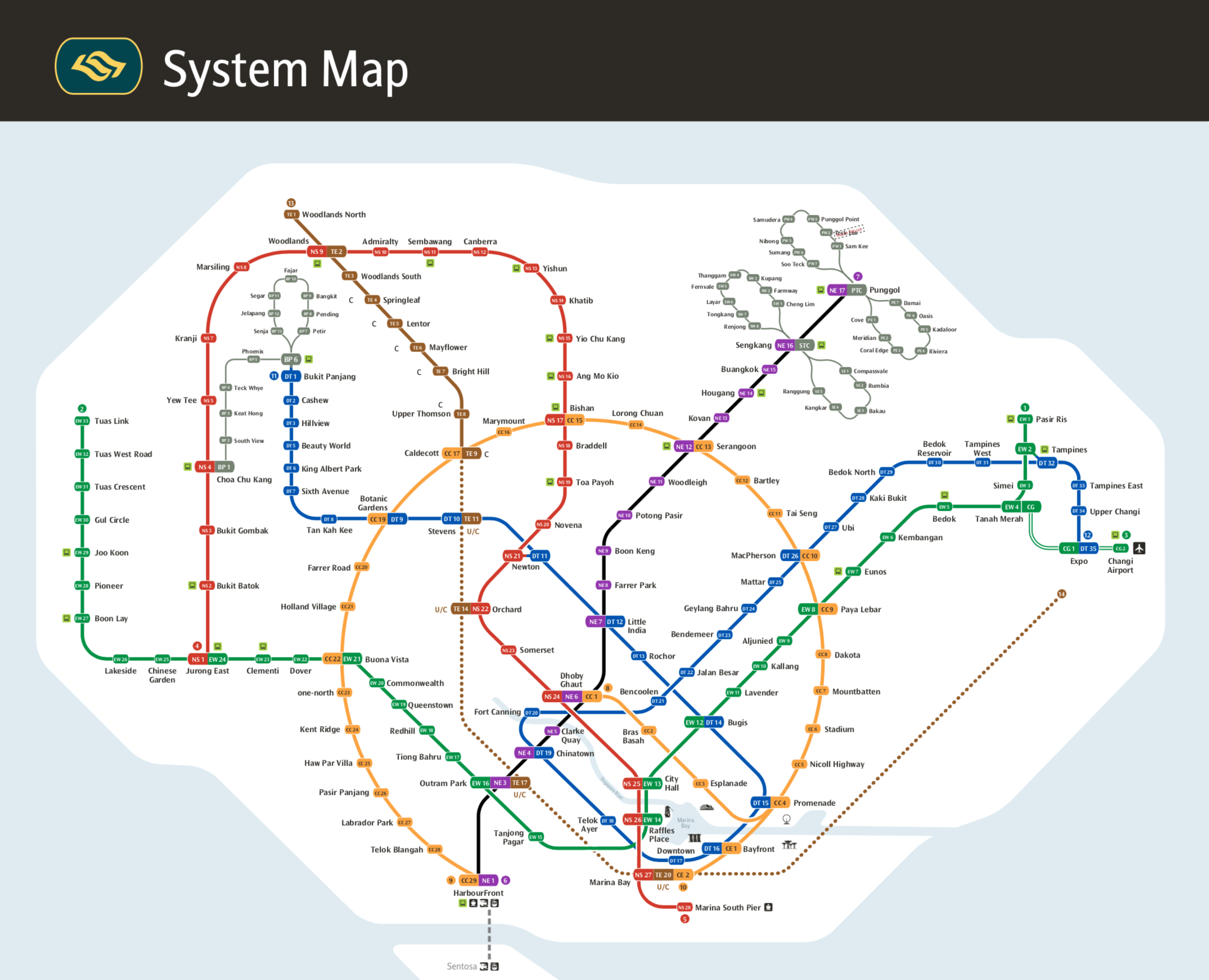
The whole map is now softer with larger circumference curves compared with the angular previous version. The font is about 10% larger. The Circle line now being circular certainly provides more focus. The downtown area is improved by the Raffels Place - City Hall axis being vertical as it is in reality, an important visual clue. The downside is that downtown is now squashed into a smaller area than before. One of the principles established by Harry Beck in his London Underground masterpiece was to enlarge the centre where stations are closer together. It's now extremely busy around Clarke Quay and Downtown, with stations and captions a bit too close for comfort. All the symbols are a bit small for my liking, the prominent landmarks (which look a bit clip arty!) are difficult to make out. I think the out-of-station connectors were better previously in black as the new coloured links seem to suggest a branch line. The Sengkang and Punggol loops are still shown wrongly as the service is four self-contained circles, not butterfly loops as shown. The Bukit Panjang loop has for some reason turned 90º anti-clockwise from geographic reality. There are unexplained letter Cs and U/Cs alongside the Thomson-East Coast line which ends rather inexplicably in the middle of nowhere on the second version. Some of the station lozenges - or 'caplets' - have slightly misaligned station numbers within them, and presentation of interchanges is sometimes odd, for example the blue Downtown line caplet at Expo station is placed over the green East-West line sort of blocking it. Similarly at Jurong East. A white keyline where lines cross is missing between the green and blue lines by Raffles Place. There's a white keyline around the larger interchange caplets. Does this make navigating lines through the station slightly more difficult, for example at Buki Panjang where the LRT also does a smart 90º turn? Together with an undeveloped coastline its a slightly disappointing result after 4 years work. For sure its an improvement on the previous version but it would be nice to see the professionalism, passion and focus of a dedicated map designer to make it look - inspired. By clicking on the file top right once open you can see immediately the improvement. Could they have got the circle line exactly centred horizontally? There's space to do it... |
 |
||||||||||||||
System map December 2019 compared with nearest comparison October 2017 |
|||||||||||||||
 |
 |
||||||||||||||
 |
 |
|||