 |
||||||||||||||||
|
|||||
|
|
||||
|
|
||||
|
|||||
 |
|||||
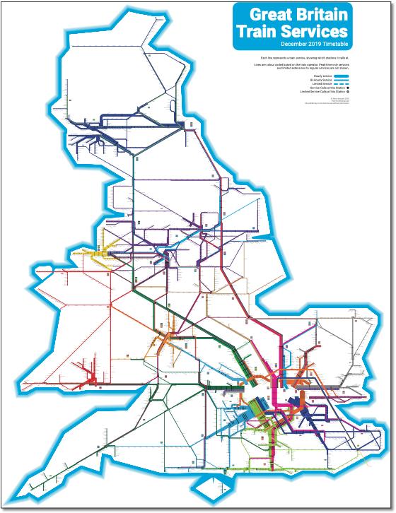
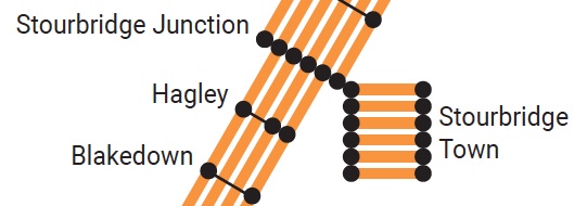
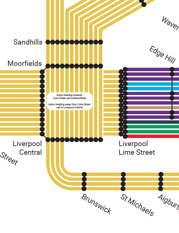
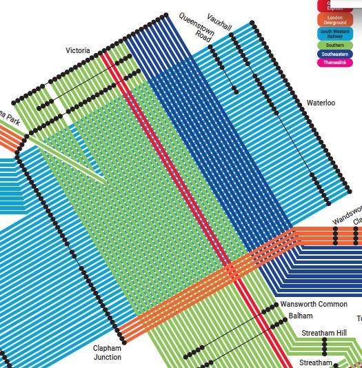
Well, 10 out of 10 for the research and design time Alex has put into this 30º/60º design. Although it would have been nice if the obvious plagiarism of Project Mappings all station map had been acknowledged as his starting point. The main concept is that users can ascertain how many trains there are per hour on any service. Showing services (on top of routes) is an astonishing achievement but the method chosen is too cumbersome to be visually acceptable. He does this by duplicating the whole route the number of times an hour trains run (although a thinner line is used to show bi-hourly services), leading to, for example, four parallel lines for the North London line Richmond-Stratford service. This builds up to 42 lines at the extreme example, Waterloo. Clapham Junction is just mind boggling. The amount of maintenance this level of information requires doesn't bear thinking about. I don't think its possible to make this map work using this method and Alex needs to rethink his system.
|
|||||
 |
|||||
 |
 |
|||