 |
|||||||||||||||
|
|||||
|
|
||||
|
 |
|
|||
|
|||||
|
|||||
|
|||||
 |
 |
||||||||||||||||||||||||||||
 |
 |
||||||||||||||||||||||||||||
 |
|||||||||||||||||||||||||||||
 |
|||||||||||||||||||||||||||||
 |
|||||||||||||||||||||||||||||
 |
 |
||||||||||||||||||||||||||||
 |
|||||||||||||||||||||||||||||
 |
 |
||||||||||||||||||||||||||||
 |
|||||||||||||||||||||||||||||
|
|||||||||||||||||||||||||||||
 |
 |
 |
||||||||||
 |
||||||||||||
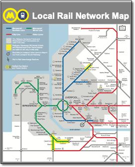
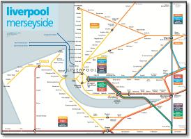
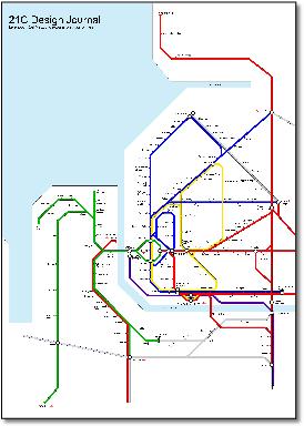
Looks very similar to map from Kijog below. |
||||||||||||
 |
||||||||||||
 |
 |
||||||||||||||||||||||||||||||||||||||||||||
 |
|||||||||||||||||||||||||||||||||||||||||||||
 |
|||||||||||||||||||||||||||||||||||||||||||||
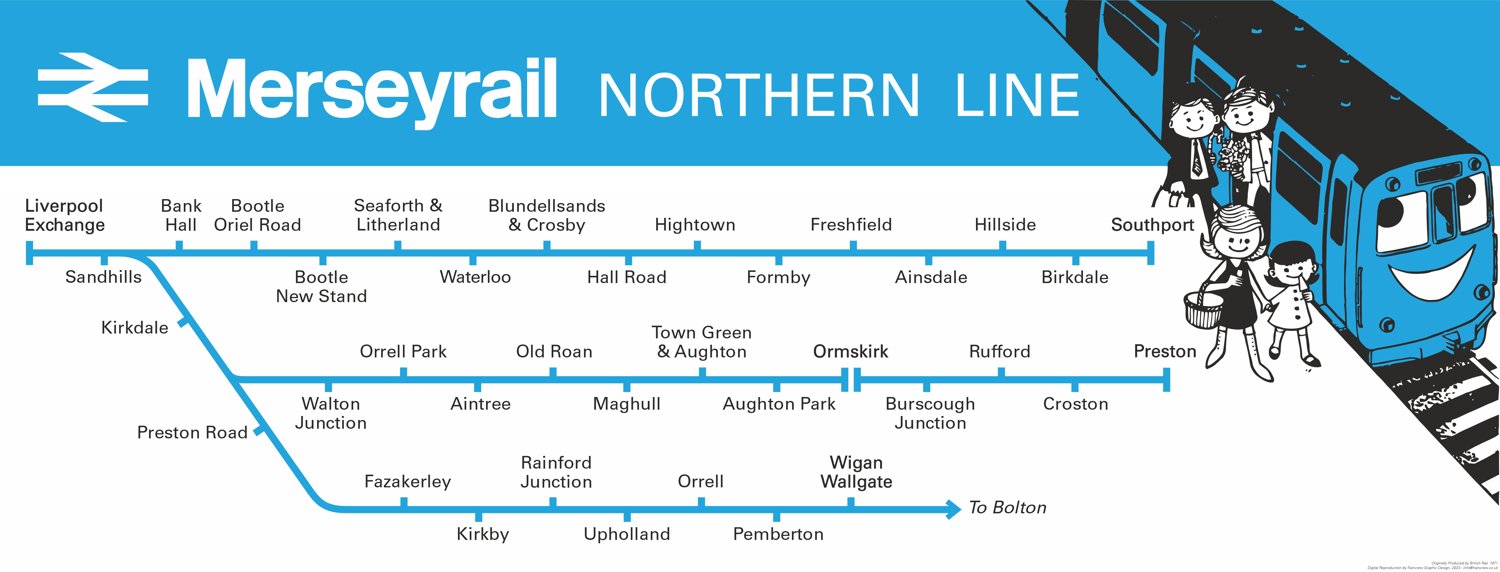
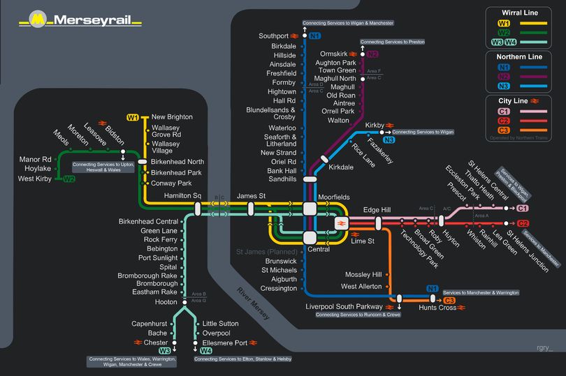
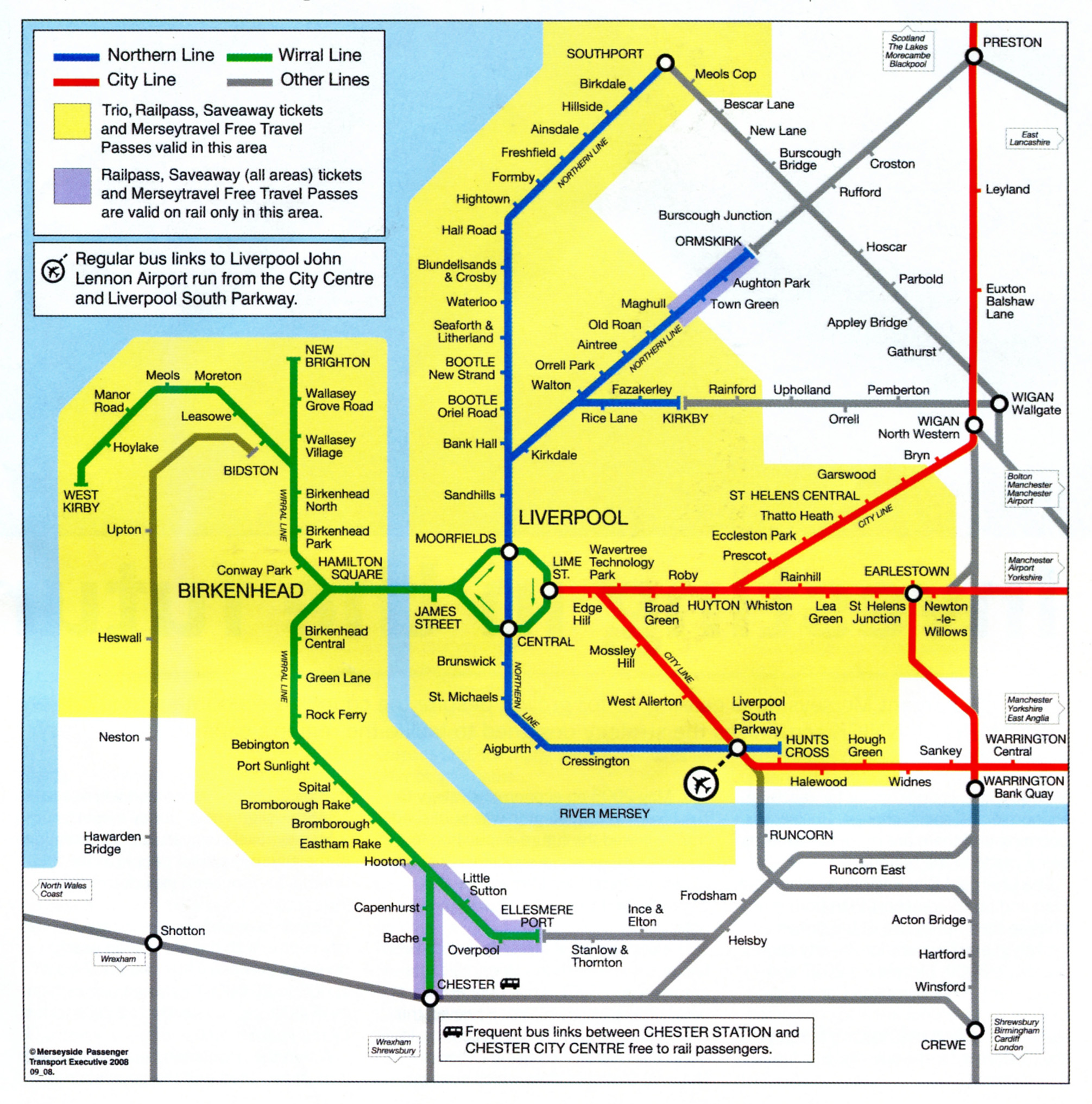
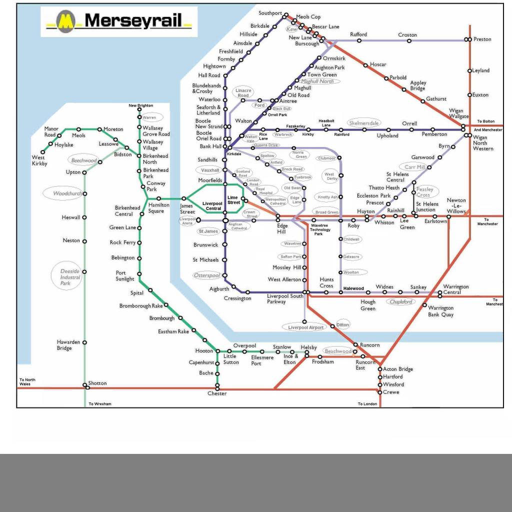
1 Consistency in the use of interchange circles (all these are locations where you can, or have to, change trains). 2 Better relationship between line weight, station tick and circle sizes, and captions - more ‘even’ in appearance overall. 3 Captions correctly aligned with stations and optically spaced between nodes. 4 Consistent 30º and 60º angles suit the railways of the region and work better than conventional 0º, 45º & 90º angles. 5 Better presentation of the difficult Earlestown triangle - the WCML is bent instead of the Merseyrail line (as it is in reality) to make the Lime Street - Warrington service look better (and at the same time the main Chester - Manchester service). 6 Routings made obvious where lines cross between stations (by bridges). 7 Altrincham - Stockport line added; Blackpool route added, connection between Wigan stations shown. 8 Southport and Kirby to Manchester routes are straighter; Warrington shows the two distinct routes shared by the station. 9 Overall, map fits a smaller area. |
|||||||||||||||||||||||||||||||||||||||||||||
 |
|||||||||||||||||||||||||||||||||||||||||||||
 |
 |
||||||||||||||||||||||||||||||||||||||||||||
 |
 |
 |
|||||||||||||||||||||||||||||||||||||||||||
 |
|||||||||||||||||||||||||||||||||||||||||||||
 |
|||||||||||||||||||||||||||||||||||||||||||||
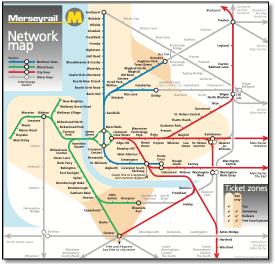
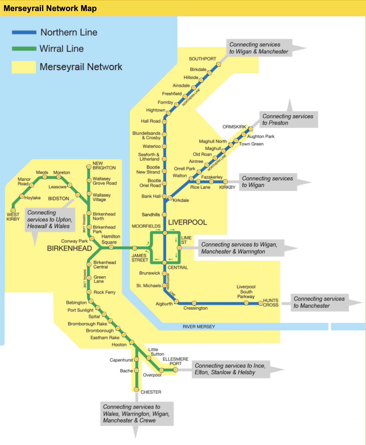
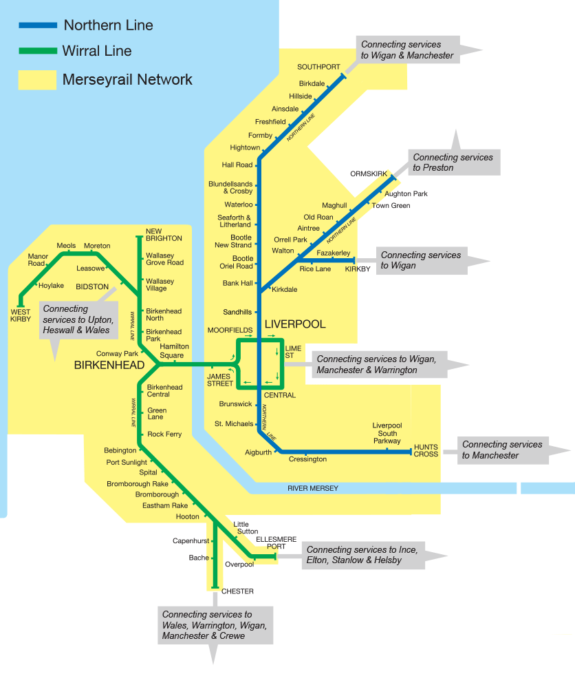
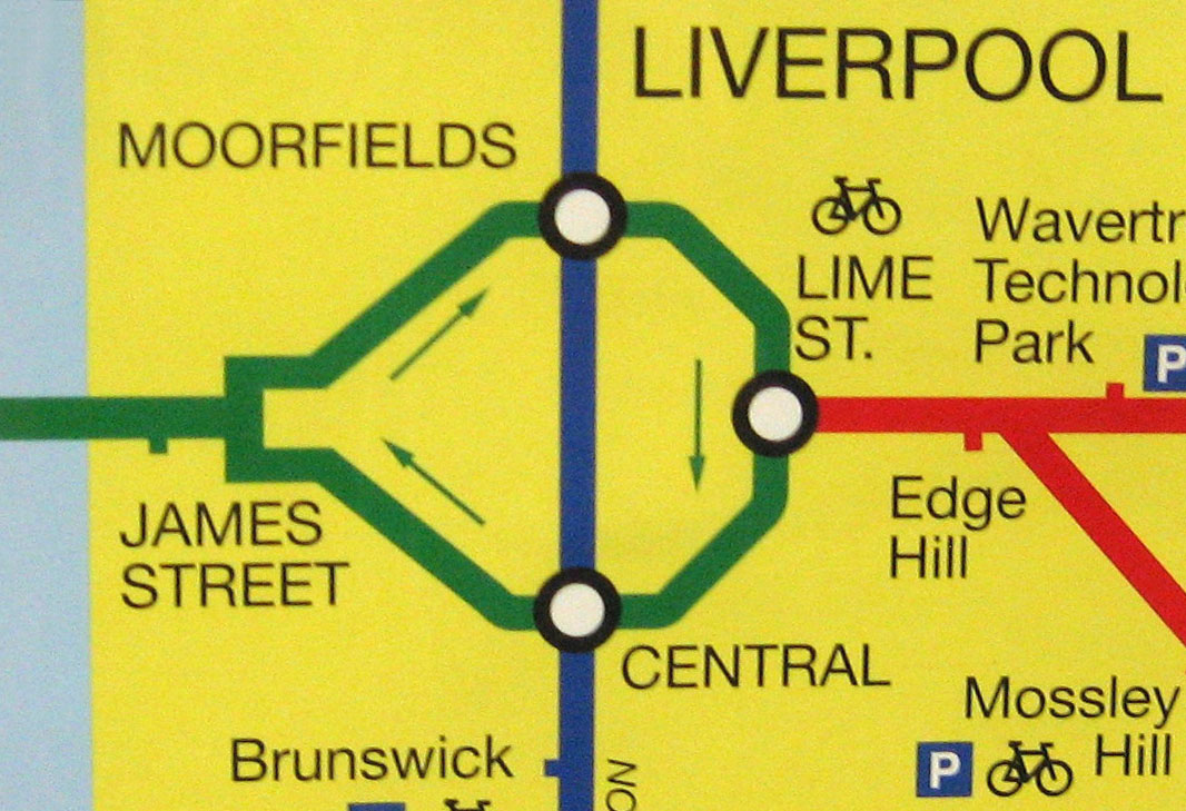
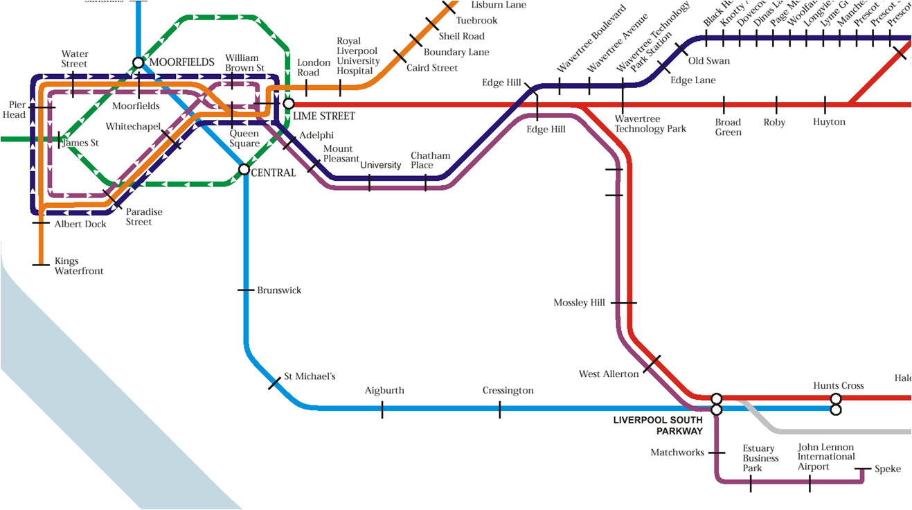
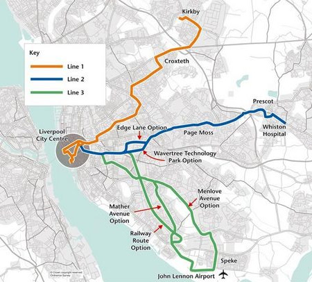
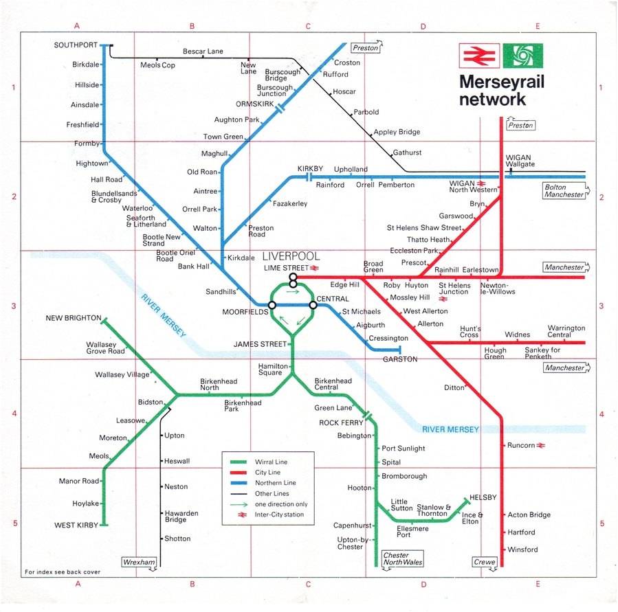
1 Bad alignment of station names with circles or ticks (eg Ellesmere Port and Sankey are not centred on their ticks), bad spacing (many examples but Warrington Bank Quay is centred but applies to a station circle to the left, Wavertree Technology Park is flush left but applies to a station tick below). 2 Some stations shown with an interchange symbol (Warrington Bank Quay, Southport) but others not (Bidston, Ormskirk etc). 3 Poor presentation of the Earlestown triangle (why does it have a circle and a tick?); does it imply a City Line service from Newton-le-Willows to Warrington? 4 The curves are too angular, for example, why force the city centre loop into a series of straight lines? And an inset shows a new version (spotted Jan 2008) with a very strange right-angled neck to the loop. Another inset from 5 No indication of routes when lines cross between stations. 6 Poor angles, the map doesn’t consistently use the 0º, 45º & 90º angles; the Hightown - Southport, Kirkdale - Preston or Huyton - Wigan lines are not parallel but slightly out of true and the North Wales coast uses a peculiar shallow incline. 7 Old fashioned little boxes indicating where lines go to off the map in a very small point size. 8 Odd placing of airport symbol (not captioned) and its text. At least the latest version has straightened out those terrible kinks. |
|||||||||||||||||||||||||||||||||||||||||||||
|
 |
||||||||||||||||||||||||||||||||||||||||||||
 |
|||||||||||||||||||||||||||||||||||||||||||||
See excellent analysis of this map at http://merseytart.blogspot.com/2008/04/revenge-of-map-rant.html |
|||||||||||||||||||||||||||||||||||||||||||||
 |
|||||||||||||||||||||||||||||||||||||||||||||
 |
|||||||||||||||||||||||||||||||||||||||||||||
Interesting site on Liverpool by Alex, go to: |
|||||||||||||||||||||||||||||||||||||||||||||
.jpg) |
|||||||||||||||||||||||||||||||||||||||||||||
1.png) |
|||||||||||||||||||||||||||||||||||||||||||||
 |
|||||||||||||||||||||||||||||||||||||||||||||
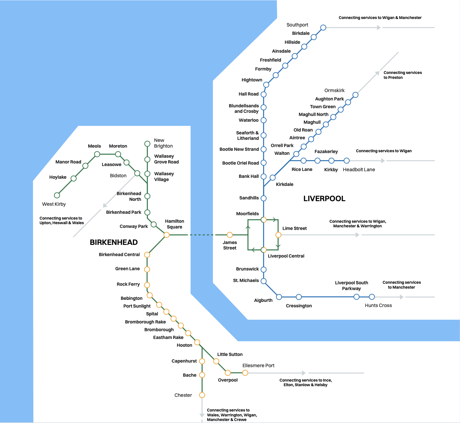
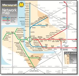
Grid thickness too similar to bus routes spoiling appearance; Poor rail route bifurcation in places (Conway Park, Edge Hill), Wirral Lines look like they split at Conway Park rather than Hamilton Square; Liverpool loop could still be better with Liverpool Airport bus more symmetrically aligned; Key shows soccer bus in green - grey on map; No reference to grid references; Why show road tunnel but not rail tunnel - inconsistent; Key refers to Intercity station - a brand long gone; Arcane language: 'observations', 'facility' Key: Key destinations are all locations shown on map, look too important, could be line colour or TfL style ticks. Key: why are bus and rail services described as 'links'? |
|||||||||||||||||||||||||||||||||||||||||||||
Interesting new map from Kijog using original diamond stations. |
|||||||||||||||||||||||||||||||||||||||||||||
 |
1.jpg) |
 |
|||||||||||||||||||||||||||||||||||||||||||
 |
||||||||||
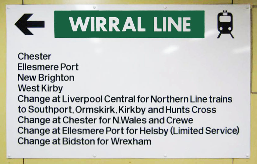
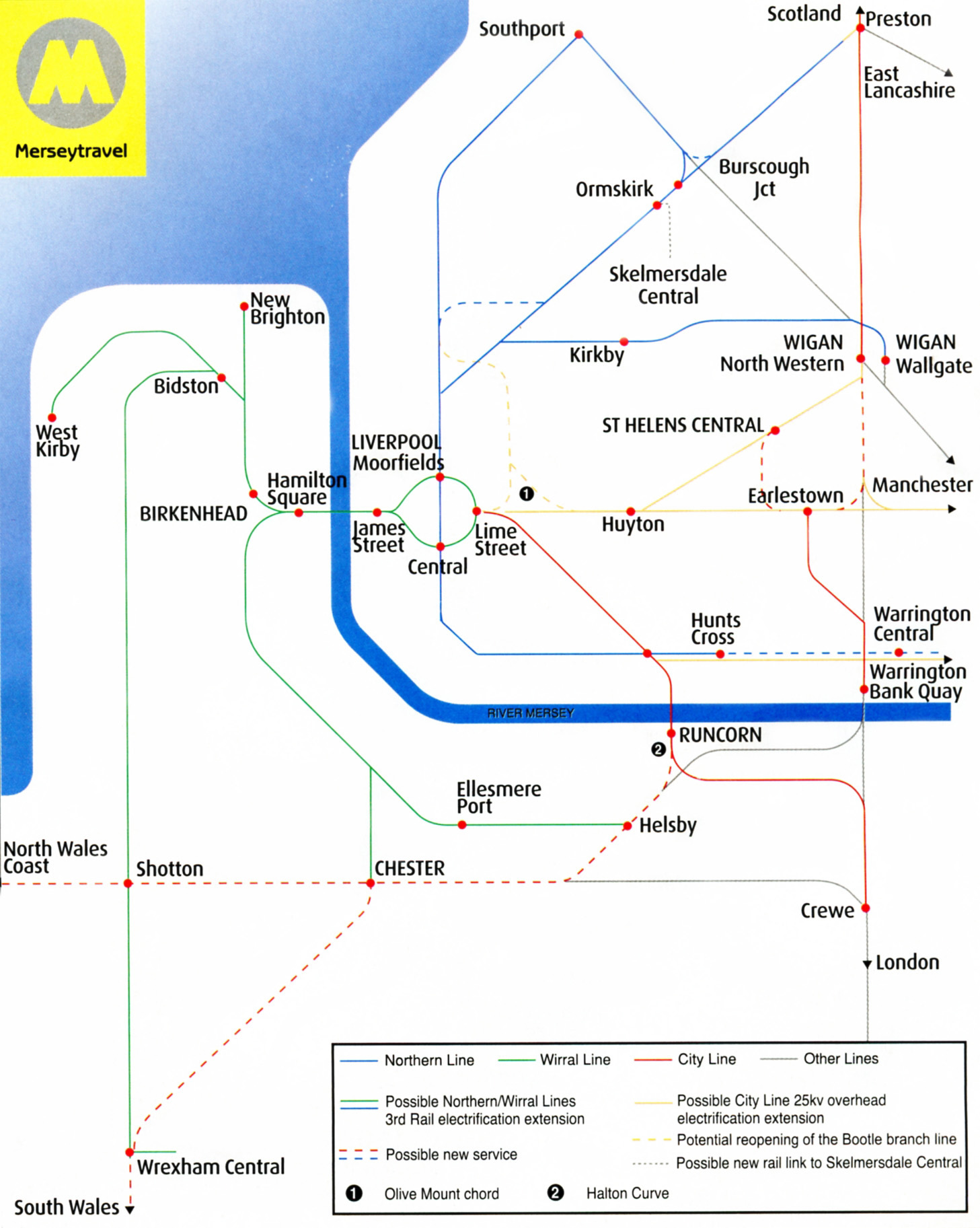
Based on the standard Merseyrail map and seen in Rail Magazine, the key claims to show possible 3rd rail electrification but uses the same solid line as currently electrified lines, so you don't know what is proposed. Shows a Burscough curve and new Southport service as though they exist, yet these are proposed. Shows Wrexham General as Central. |
Similar to the poor version in Rail Magazine. |
|||||||||
 |
 |
|||||||||
 |
 |
 |
 |
|||||
 |
||
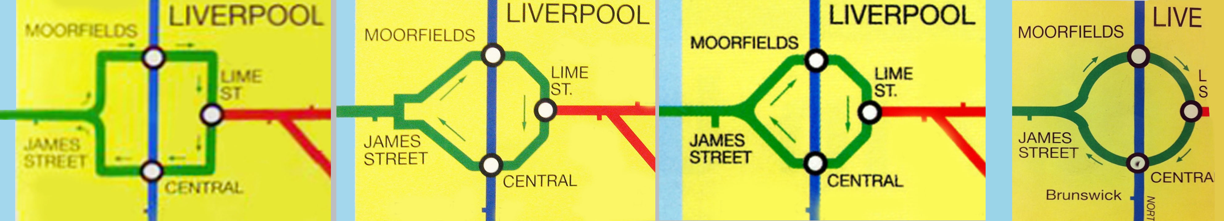
From the sublime to the ridiculous. Left to right, a rendition (complete with eight arrows) as a square; a ridiculous square necked bottle shape; a fairly poor rendition of what is in reality a simple balloon loop but could be interpreted due to poor cartography as a circular route too; a poorly drawn circle. |
||
 |
||
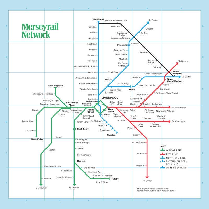
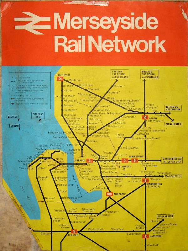
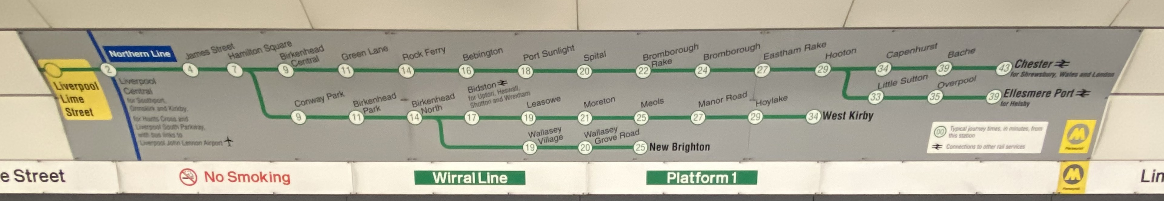
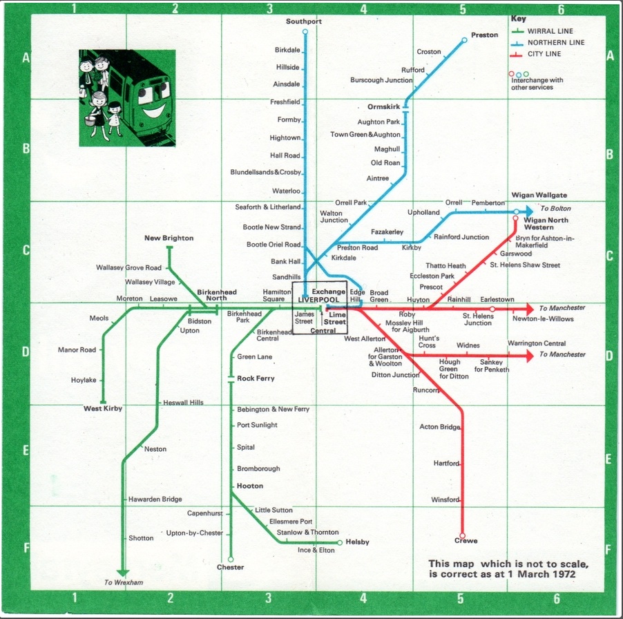
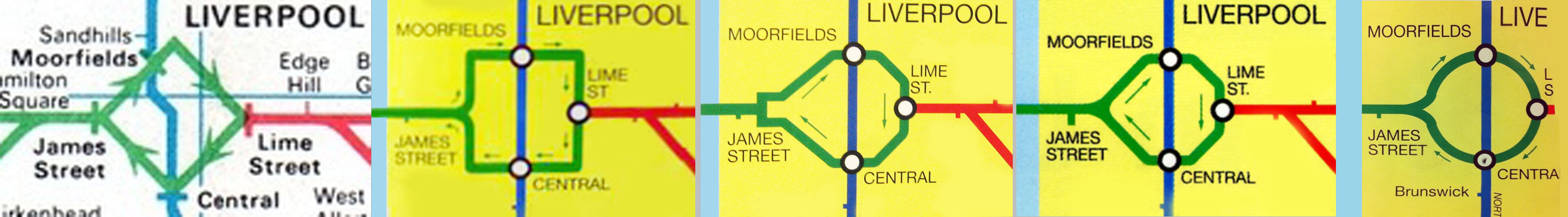
Updated April 2024 with diamond on left, 1977. |
||