 |
||||||||||||||||
|
|||||
|
|
||||
|
 |
|
|||
|
|||||
|
|||||
|
|||||
 |
 |
|||||||
 |
||||||||
 |
 |
|||||
 |
||||||
 |
 |
|||||||||||||||||||||||||||||||||||||||||||||
 |
||||||||||||||||||||||||||||||||||||||||||||||
 |
||||||||||||||||||||||||||||||||||||||||||||||
 |
||||||||||||||||||||||||||||||||||||||||||||||
 |
||||||||||||||||||||||||||||||||||||||||||||||
 |
||||||||||||||||||||||||||||||||||||||||||||||
 |
||||||||||||||||||||||||||||||||||||||||||||||
 |
||||||||||||||||||||||||||||||||||||||||||||||
 |
||||||||||||||||||||||||||||||||||||||||||||||
 |
||||||||||||||||||||||||||||||||||||||||||||||
 |
||||||||||||||||||||||||||||||||||||||||||||||
 |
||||||||||||||||||||||||||||||||||||||||||||||
 |
||||||||||||||||||||||||||||||||||||||||||||||
 |
||||||||||||||||||||||||||||||||||||||||||||||
 |
||||||||||||||||||||||||||||||||||||||||||||||
 |
||||||||||||||||||||||||||||||||||||||||||||||
 |
||||||||||||||||||||||||||||||||||||||||||||||
 |
||||||||||||||||||||||||||||||||||||||||||||||
 |
||||||||||||||||||||||||||||||||||||||||||||||
 |
||||||||||||||||||||||||||||||||||||||||||||||
 |
||||||||||||||||||||||||||||||||||||||||||||||
 |
||||||||||||||||||||||||||||||||||||||||||||||
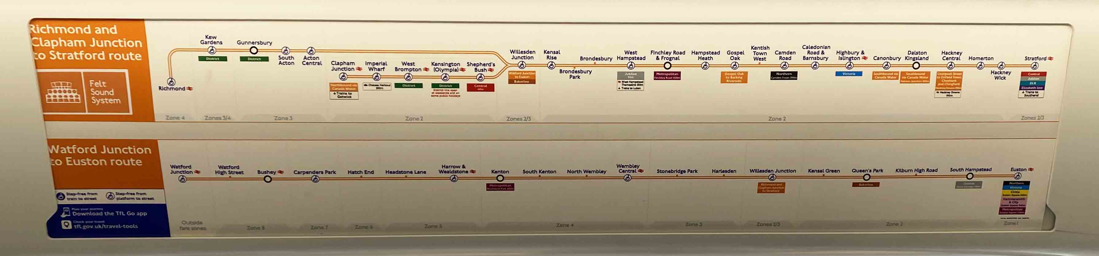
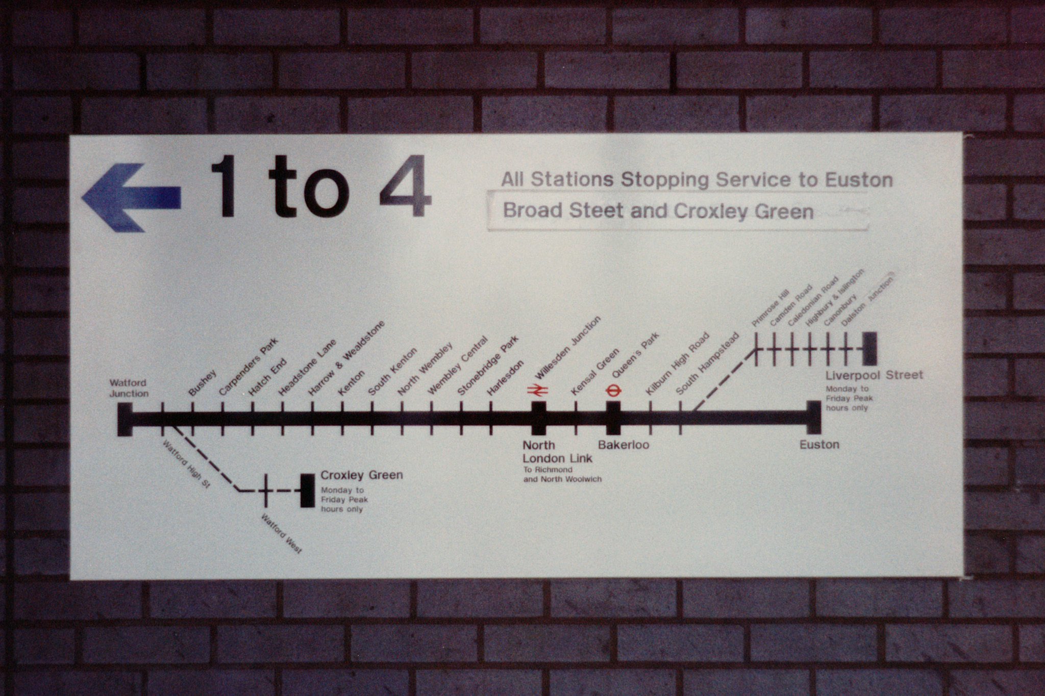
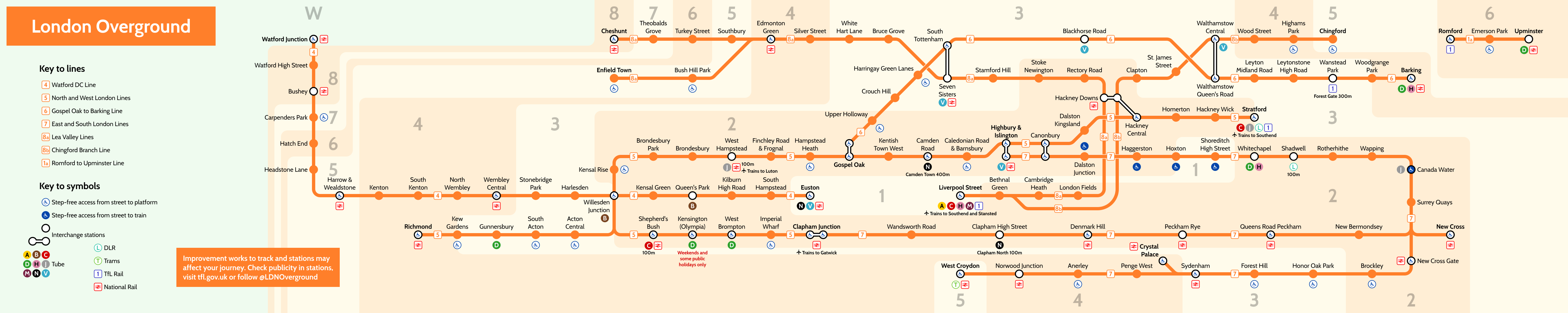
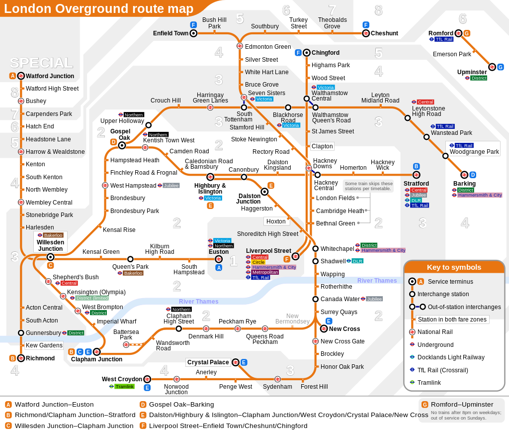
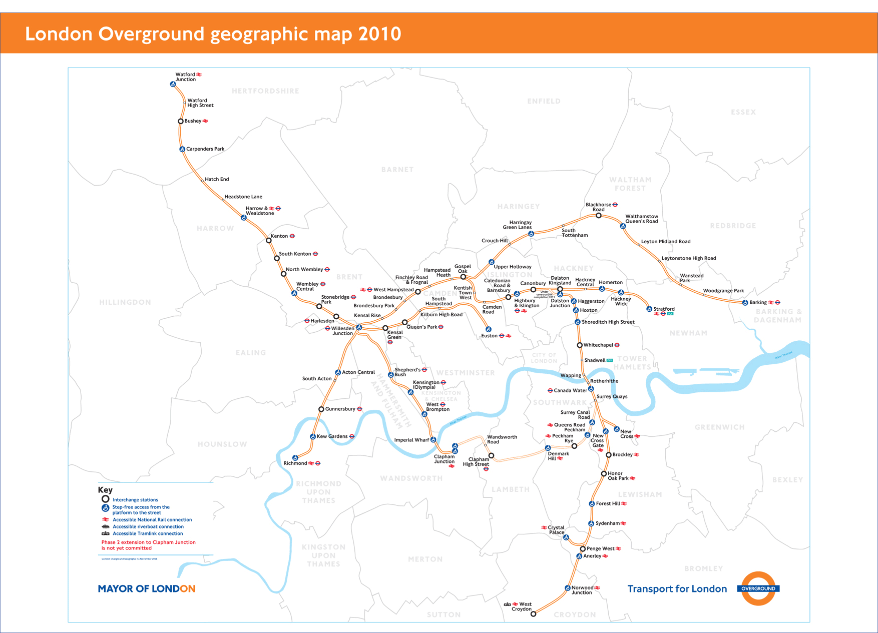
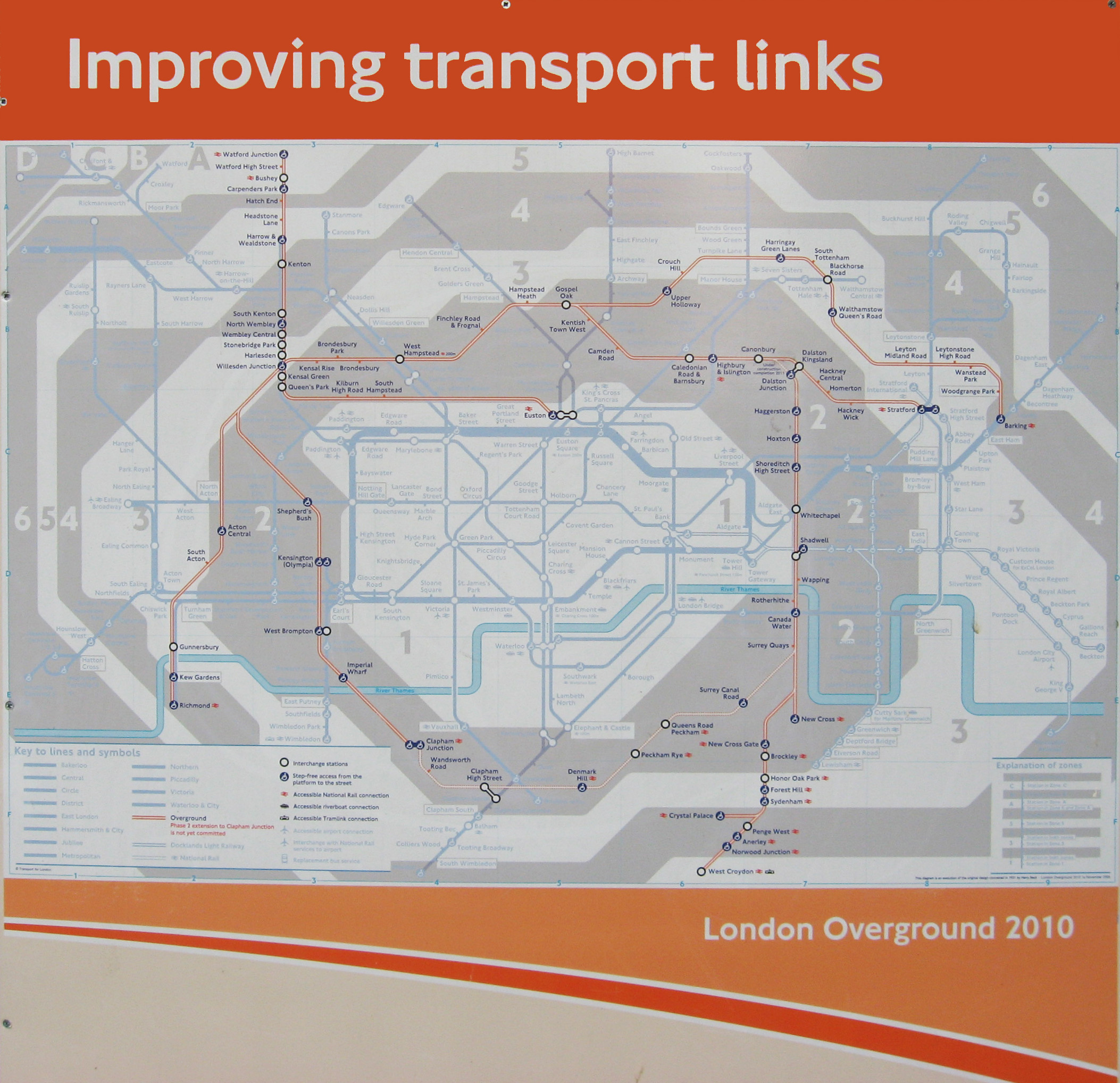
Clapham Junction and Richmond transposed from reality? |
||||||||||||||||||||||||||||||||||||||||||||||
With New Cross and New Cross Gate error (should have been NCG only). |
||||||||||||||||||||||||||||||||||||||||||||||
 |
||||||||||||||||||||||||||||||||||||||||||||||
 |
||||||||||||||||||||||||||||||||||||||||||||||
 |
||||||||||||||||||||||||||||||||||||||||||||||
 |
||||||||||||||||||||||||||||||||||||||||||||||
 |
||||||||||||||||||||||||||||||||||||||||||||||
 |
||||||||||||||||||||||||||||||||||||||||||||||
 |
||||||||||||||||||||||||||||||||||||||||||||||
 |
||||||||||||||||||||||||||||||||||||||||||||||
 |
||||||||||||||||||||||||||||||||||||||||||||||
 |
||||||||||||||||||||||||||||||||||||||||||||||
 |
||||||||||||||||||||||||||||||||||||||||||||||
 |
||||||||||||||||||||||||||||||||||||||||||||||
 |
||||||||||||||||||||||||||||||||||||||||||||||
 |
||||||||||||||||||||||||||||||||||||||||||||||
 |
||||||||||||||||||||||||||||||||||||||||||||||
 |
||||||||||||||||||||||||||||||||||||||||||||||
 |
||||||||||||||||||||||||||||||||||||||||||||||
 |
||||||||||||||||||||||||||||||||||||||||||||||
 |
||||||||||||||||||||||||||||||||||||||||||||||
 |
||||||||||||||||||||||||||||||||||||||||||||||
 |
||||||||||||||||||||||||||||||||||||||||||||||
 |
||||||||||||||||||||||||||||||||||||||||||||||
 |
||||||||||||||||||||||||||||||||||||||||||||||
 |
||||||||||||||||||||||||||||||||||||||||||||||
 |
||
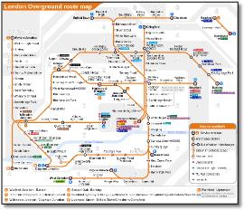
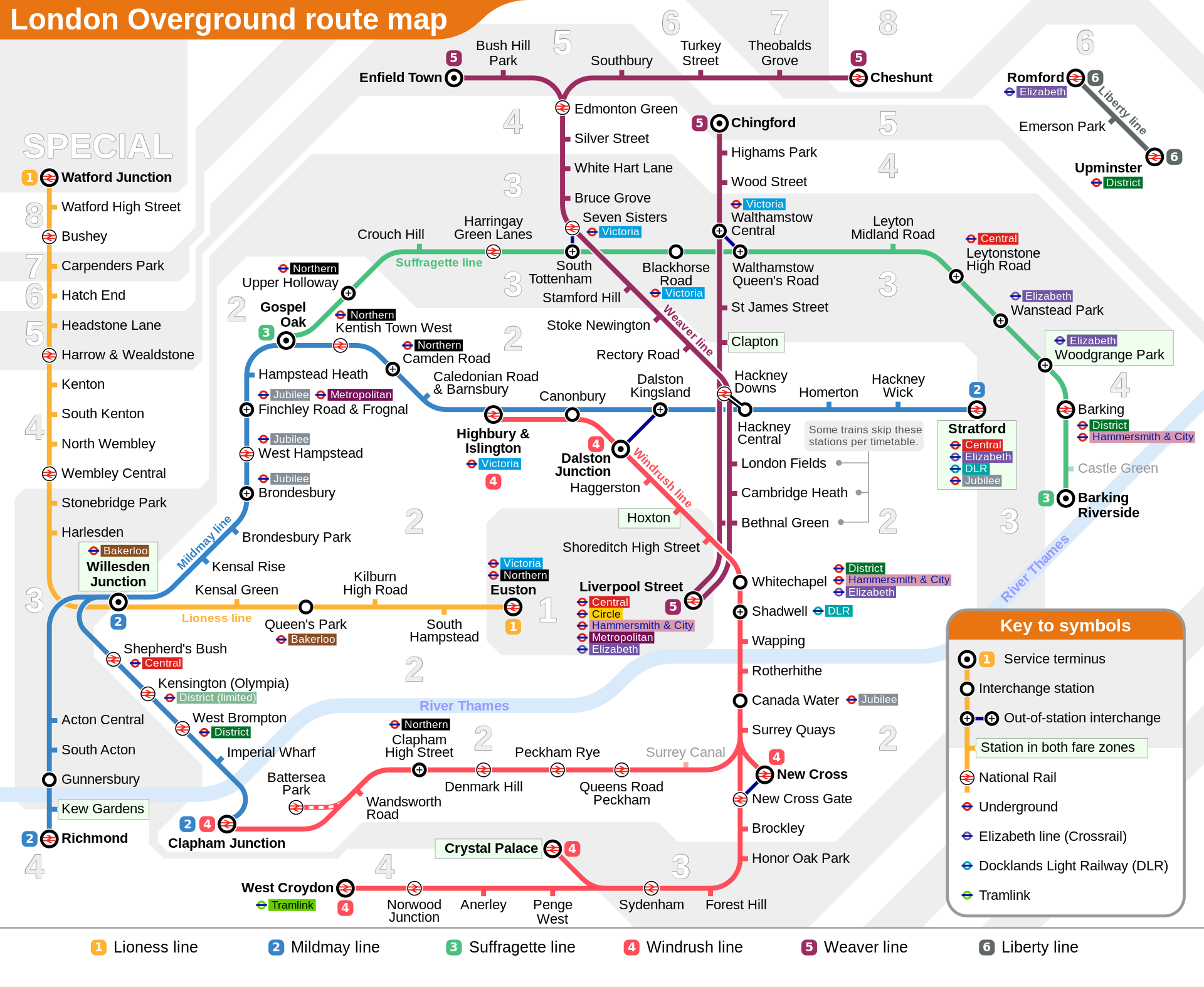
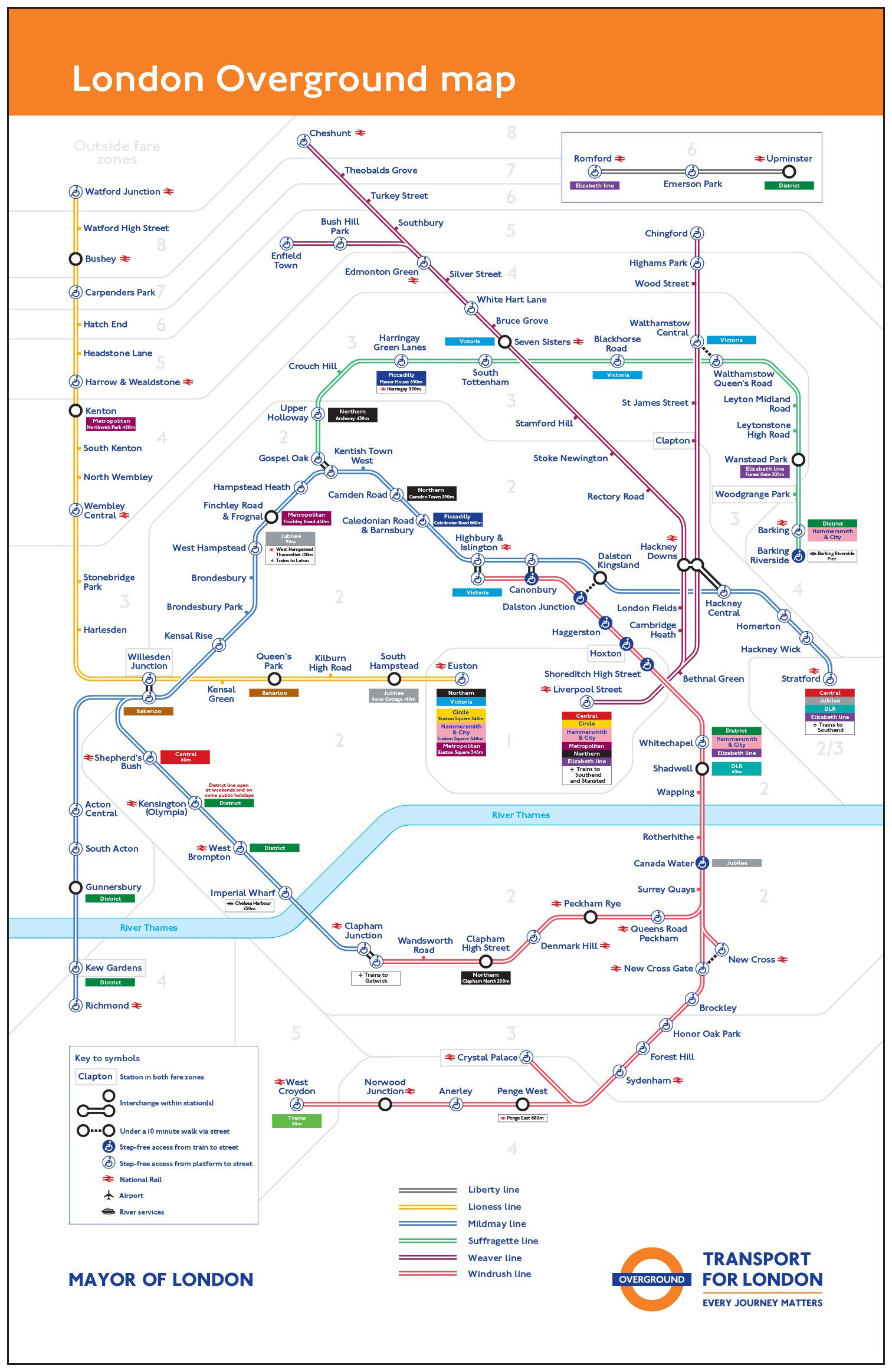
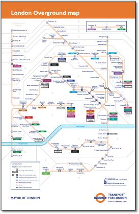
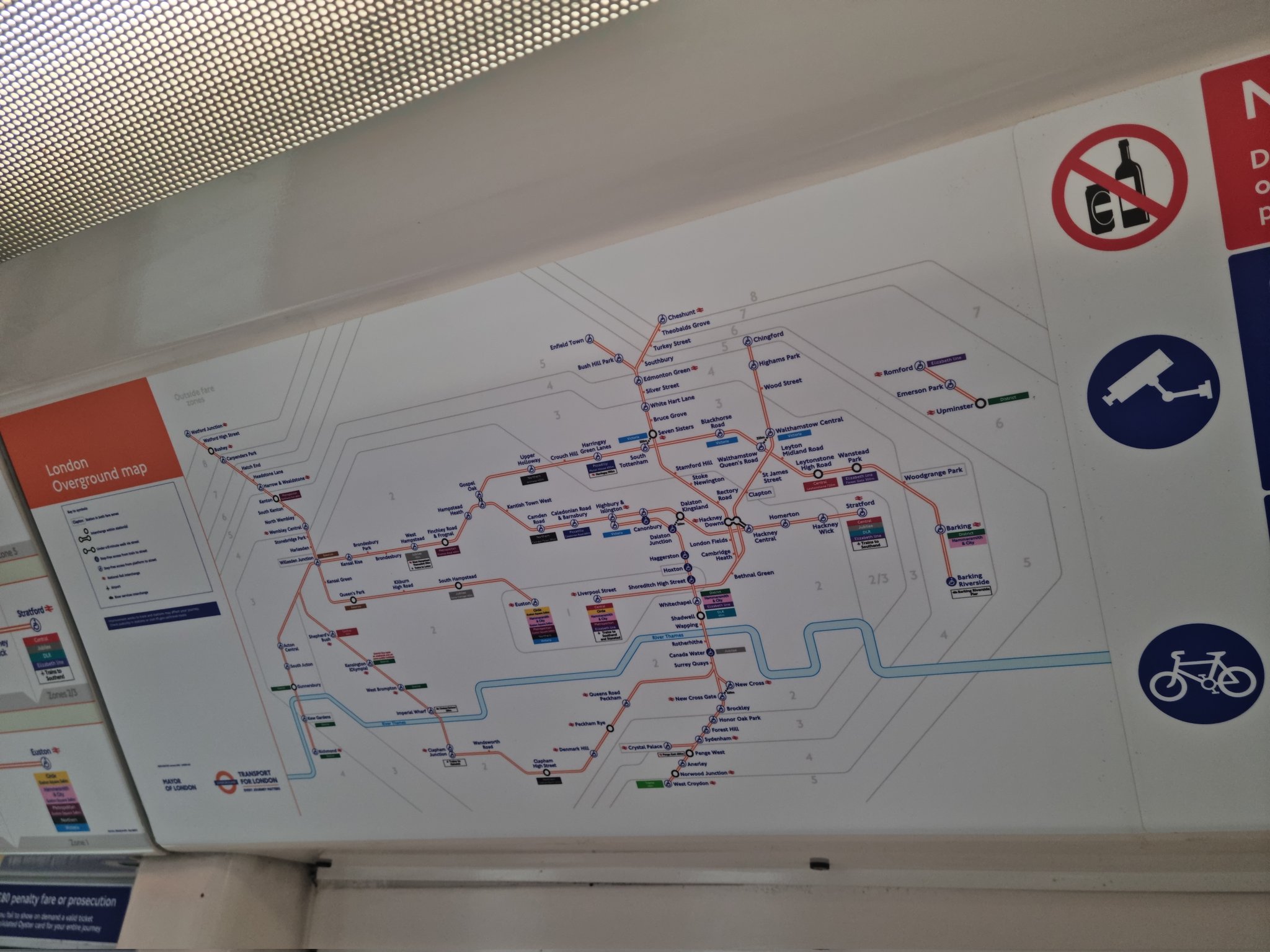
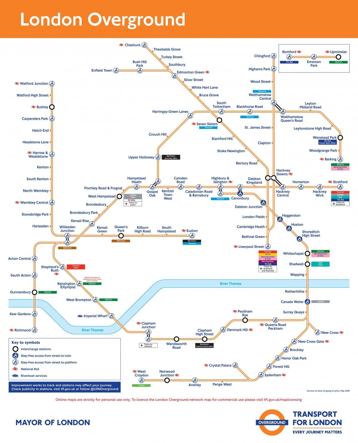
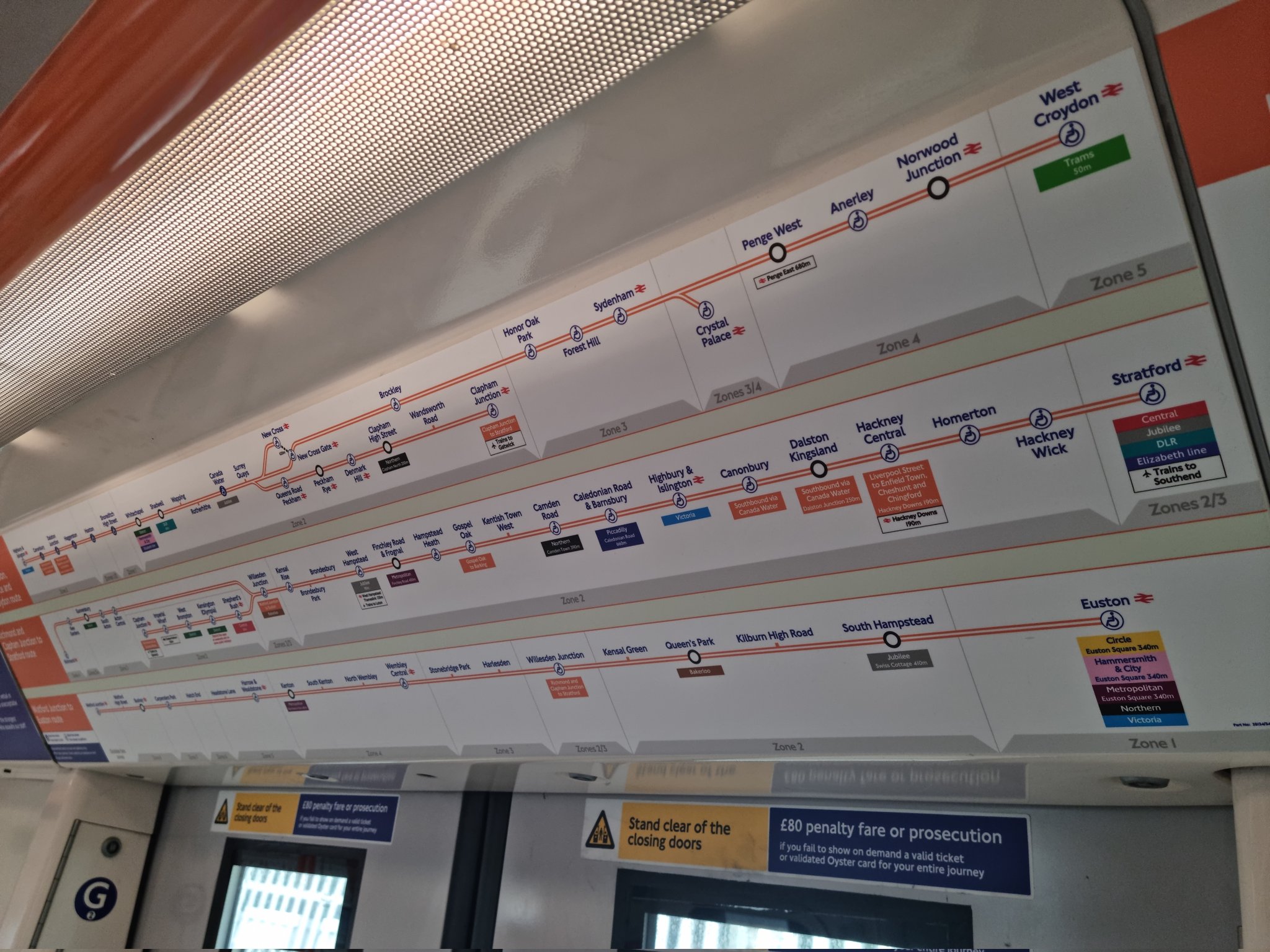
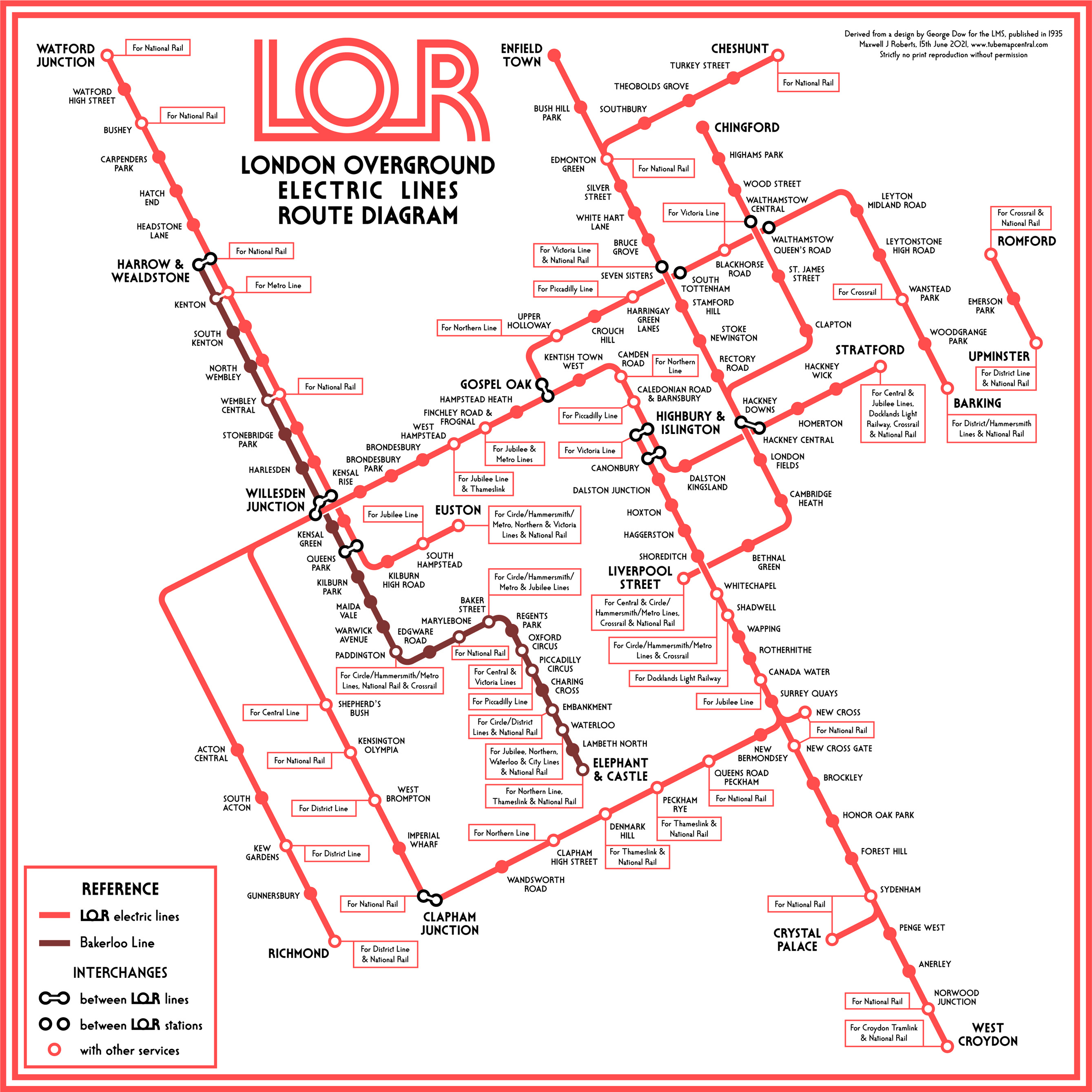
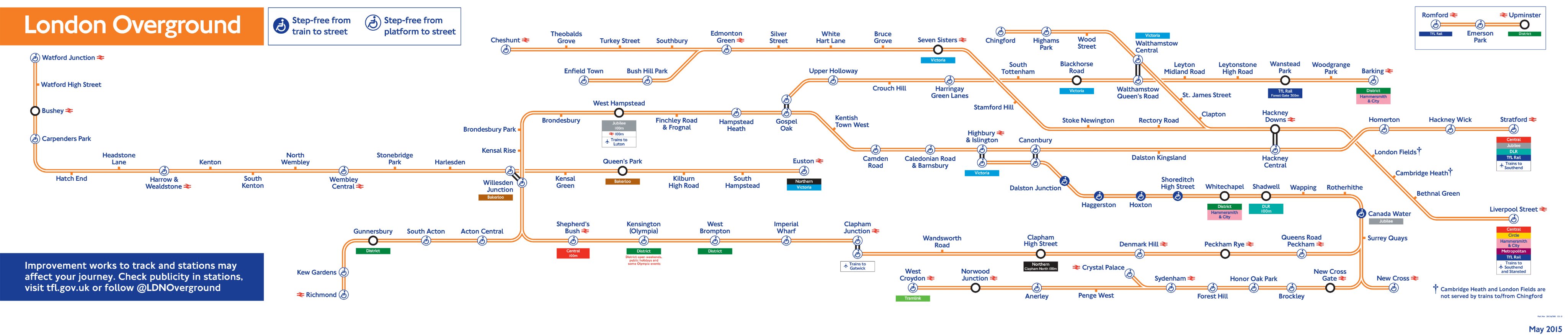
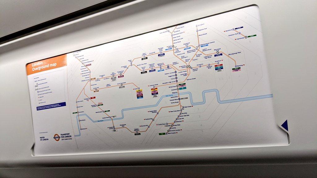
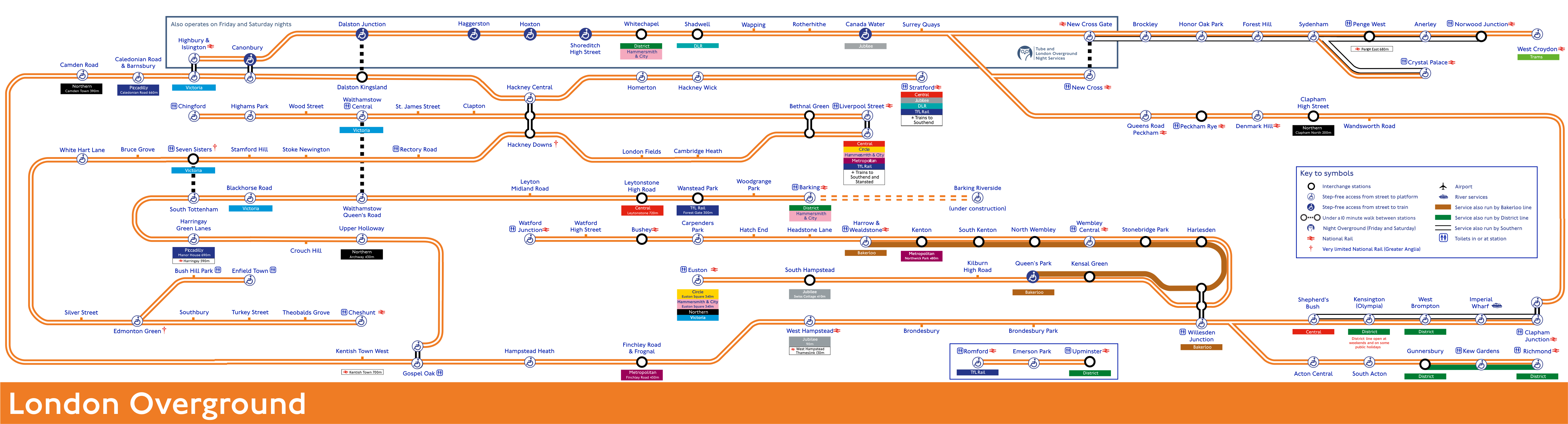
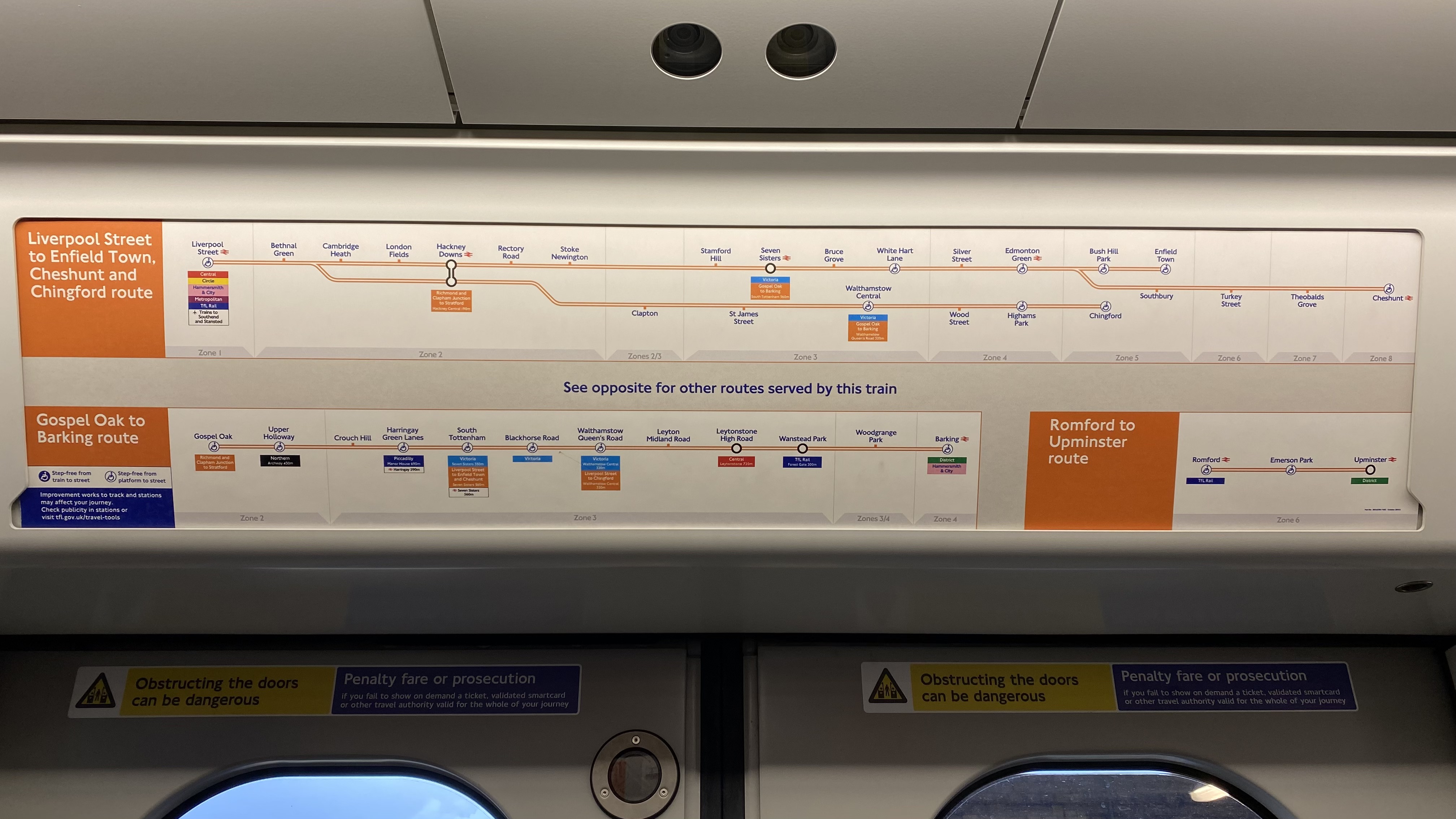
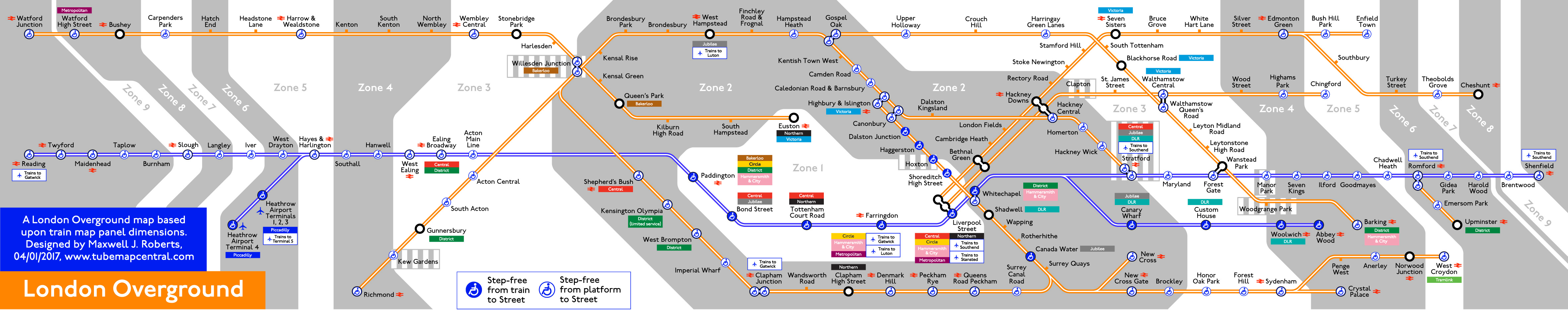
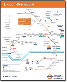
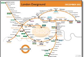
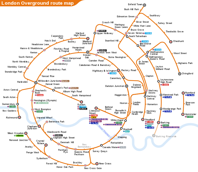
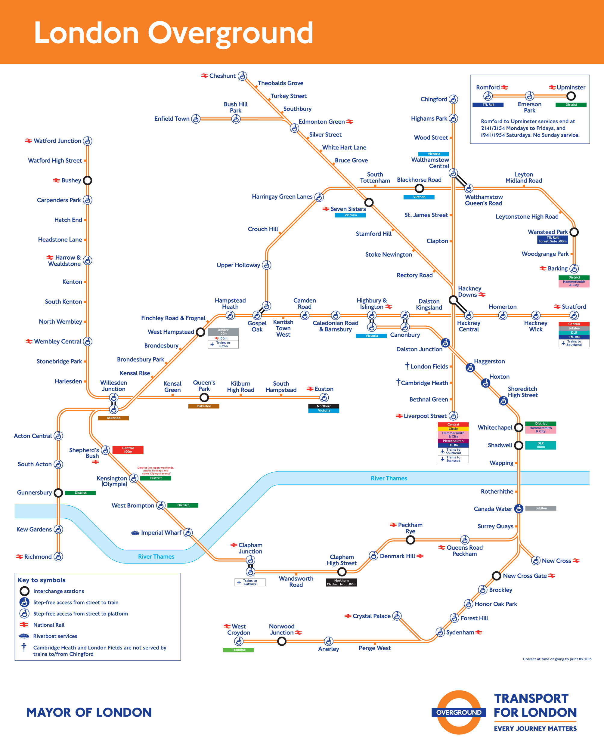
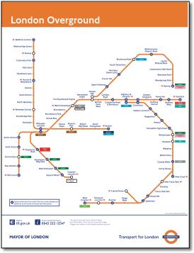
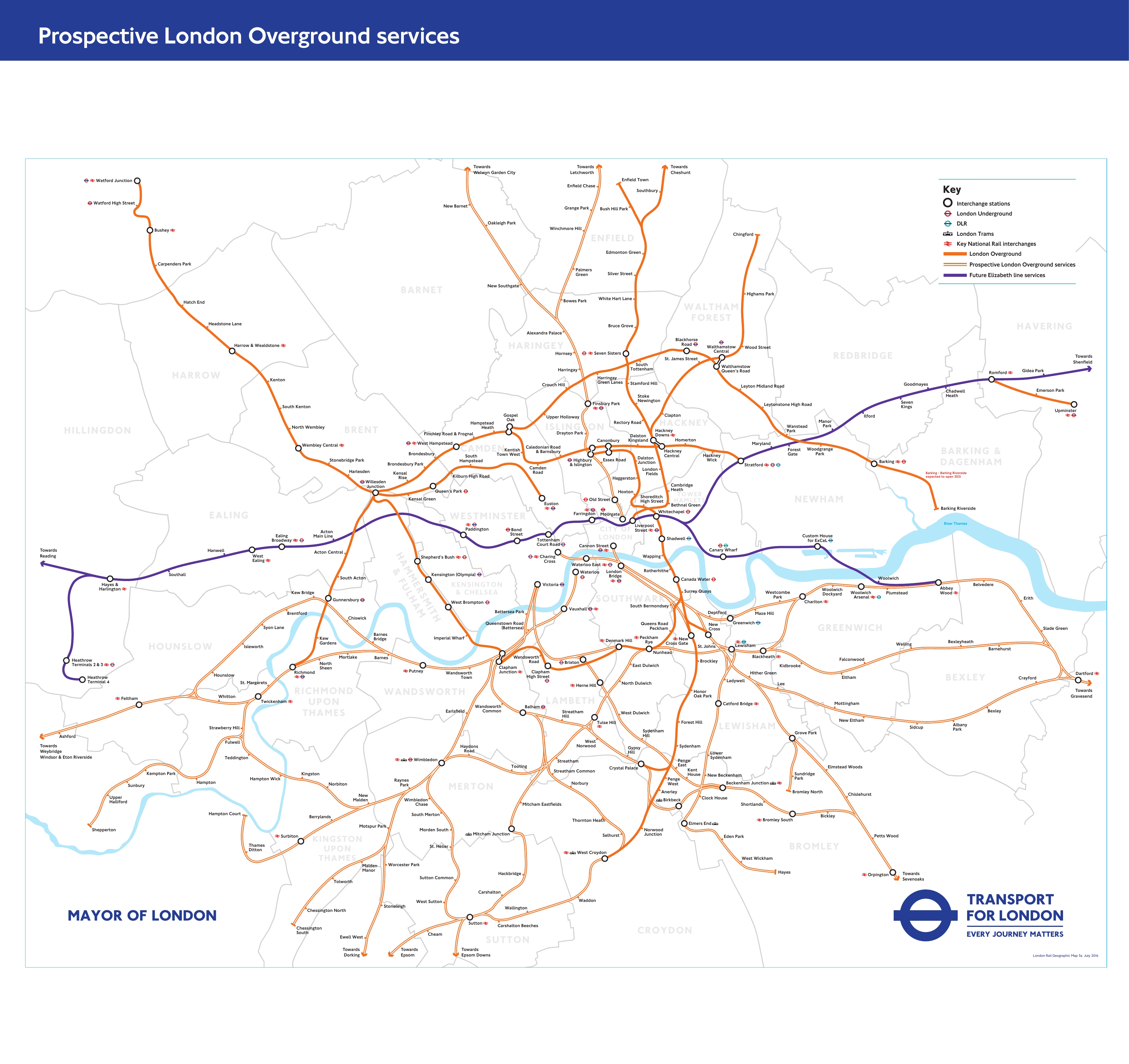
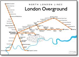
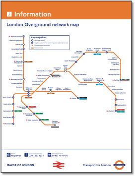
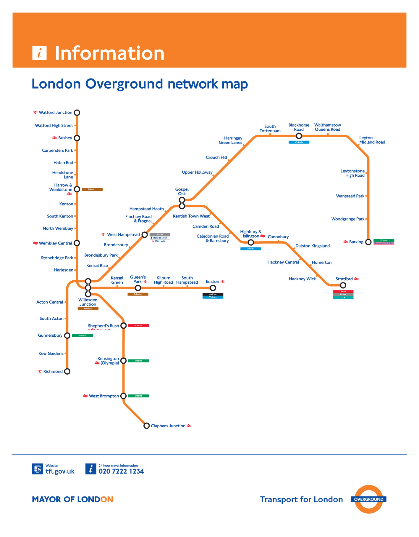
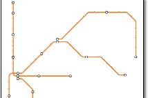
Whether the London Overground needs a separate map of its own for publicity purposes is a moot point, as it is really just an operating company for the ex-Silverlink lines (plus the East London line in due course). As far as the public is concerned, the tube map or the London Connections map are more useful for planning a journey. Obviously each of the ten operators providing London's urban metro services needs its own map for identification and administration purposes, but the London Overground map is probably the most odd looking, describing as it does a series of disparate lines brought together by circumstances of history. The map may improve once the southern side of the 'outer circle' is complete if a circular design can can be produced, but apart from some new connections, the southern lines are just running powers over existing routes without the primary ownership that the northern lines have. London Overground also goes underground for a long way in east London and I wonder if the underground/overground thing is a bit irrelevant, especially when you see provincial bus services branded Overground. I'm sure TfLs marketing gurus have thought deeply and at length about this but isn't it about time this was all ditched in favour of Metro? There's always a rash of maps appearing when a new franchise is launched, but they disappear after a while when no one's looking because they're political and don't actually help the user. This is certainly true of the new London Overground network map - note the meaningless word 'network' there. (Another network! - how does it relate to the south London 'Overground Network'?) But if you're going to have a map then lets have a good one. A well designed map should enable stakeholders to identify with it - it should be the symbol or icon. Unfortunately, the London Overground is another poor one. TfLs |
||||
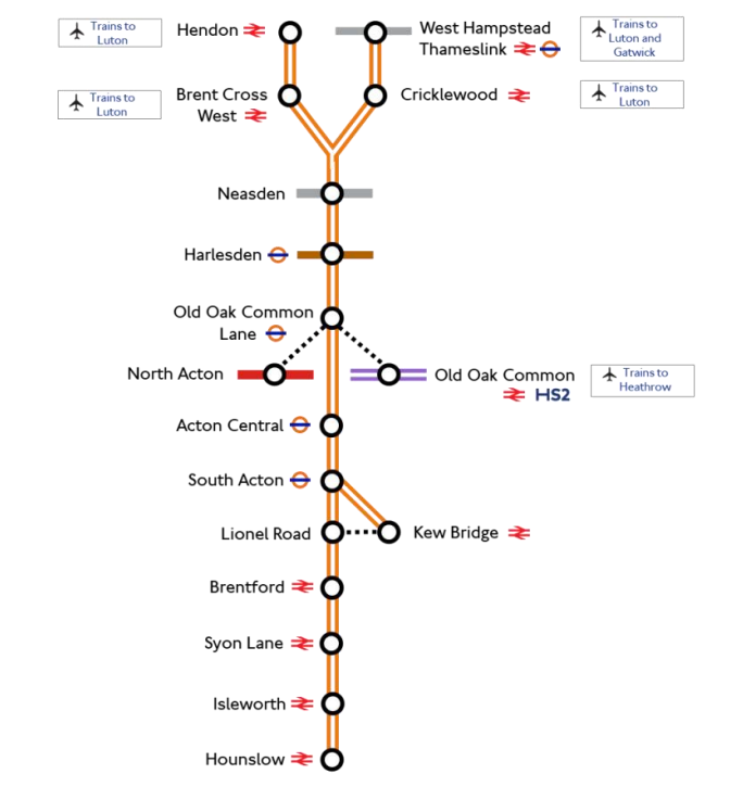
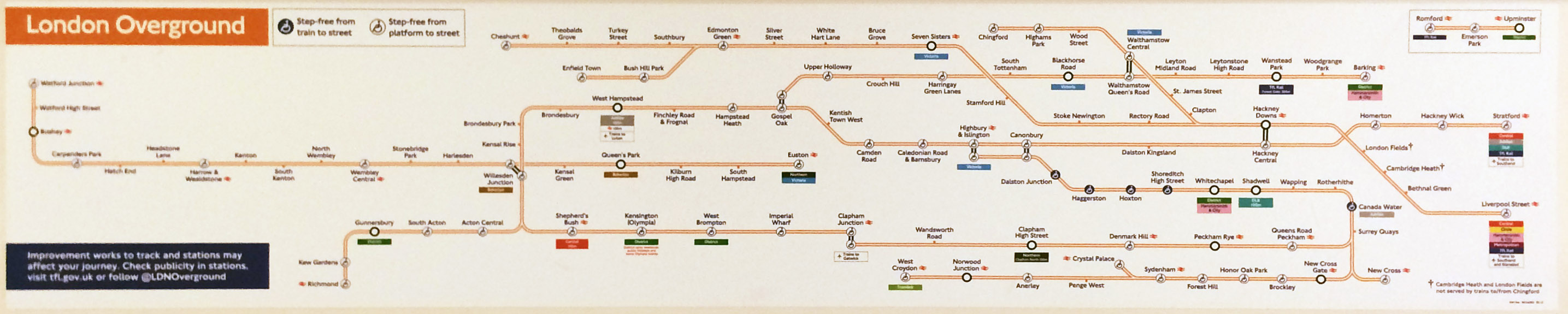
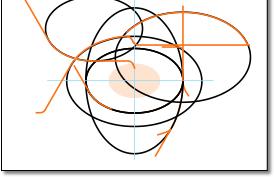
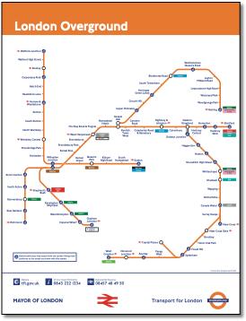
rail map designers use the Harry Beck design style with gay abandon, jettisoning any relationship with geography or other lines. For example, it takes a rectangular area of London that is wider than it is deep, and makes it square. It puts Clapham much further south than Richmond when they're pretty much level. It makes Willesden Junction look like three stations, or a station with three sets of platforms, making it very difficult to get from the West London line to the North London line, when in actual fact they use the same platforms. It turns up the distortion control on the Goblin line (Gospel Oak - Barking) into an arching shape turning due south into Barking. Why? And the TfL rail maps just don't compare with the superb TfL bus maps. So I've had a go at designing one as shown above. Hard to start with, as it was difficult to find something underlying that would make a map 'hold' together. But the expanding ovals are the key, binding the lines into orbit around London (outer orbit rather than 'outer circle') and enabling curves to be more subtle over longer distances and providing an overall 'pattern' and 'balance' without jerkiness. It's not perfect, perfection can be time consuming, but there's some ideas there. And its not finished - no information on connections etc. And I've renamed Dalston Junction Dalston Lane as it isn't a junction. TfL are still playing dangerously with the interchange symbol, reducing its significance by the introduction of the round disabled symbol where ticks do the job elsewhere. It's not a functional symbol and doesn't work on the tube map where it doesn't indicate an easier or more difficult interchange. Rail maps in general just don't have the iconic status they deserve as train operating companies and ATOC do not understand the importance of design and are not prepared to invest. |
||||
1.gif) |
||||
 |
|||||||||
 |
|||||||||
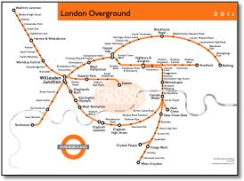
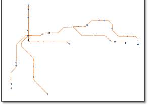
Some innovation with the District and Victoria line inclusions. From Mark Boulton at http://tfl.moonfruit.com |
|||||||||
There's always problems when you try to ghost lines, very difficult to make it work. Nice phrase in key 'Phase 2 extension to Clapham Junction is not yet committed' - also slightly thinner orange keyline on this line. Otherwise no indication of what 'Improving transport links means'. |
||
 |
|||||||||
 |
 |
||||||||
|
|
Ok, it's based on the tube map but has increased the distortion. |
||||