PMlogo2
item4a item4a1
item4a History.. item4a item4a2b
item4a2b History.. item4a2b item4a1 Contact.. item4a1
item4a1
item4a2b
item4a2b History.. item4a2b item4a1 Contact.. item4a1
item4a item4a2b item4a1


site map


New schematic maps of the


Network outline
Network Rail station symbols / graphics
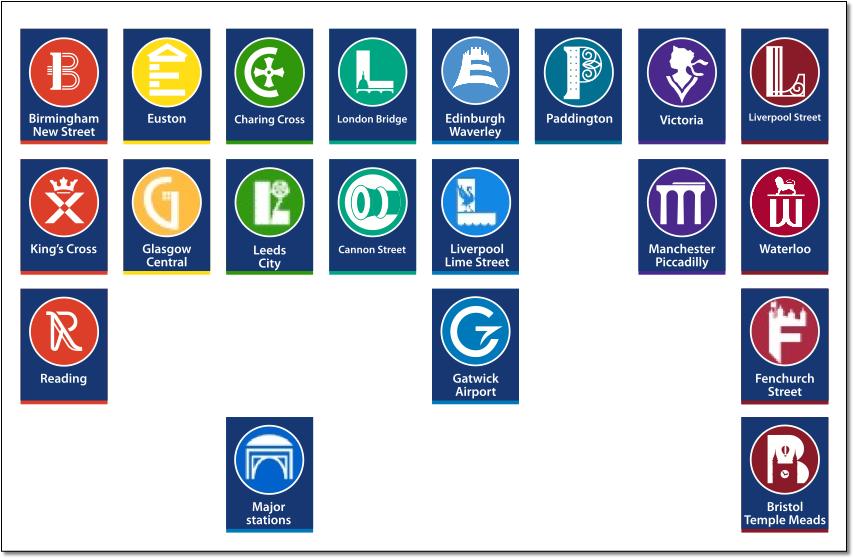
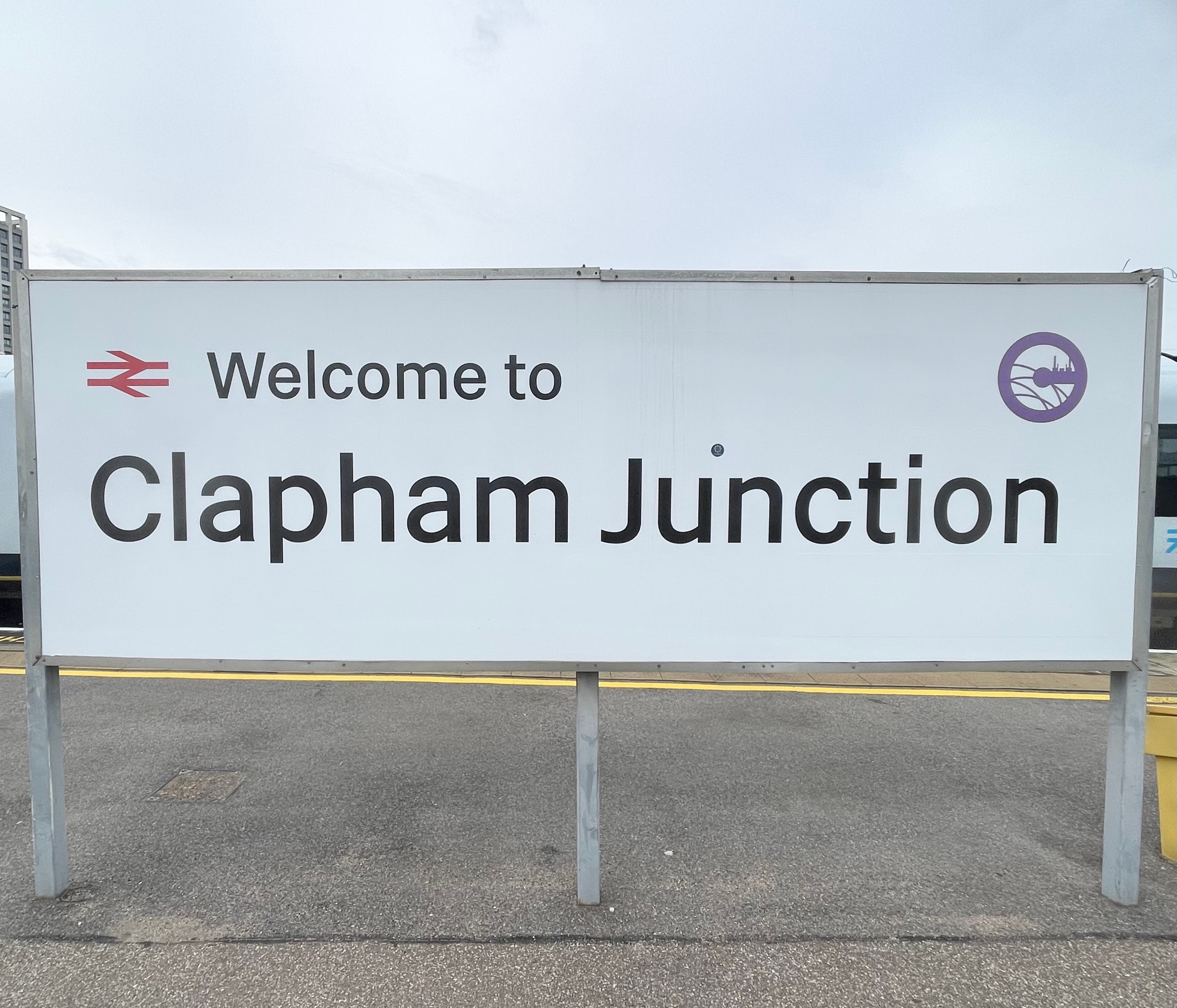
Besides the many TOC designed station graphics is the scheme used by Network Rail (previously Railtrack) at its eighteen major stations. These are quite nice, London Bridge for example. But I've never understood the colour selection, for example why are London Bridge and Cannon Street the same colour when they are so close together, ditto Liverpool Street and Fenchurch Street? If these last three are all Eastern stations why isn't Birmingham the same colour as Euston and Glasgow?
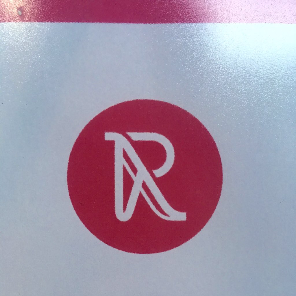
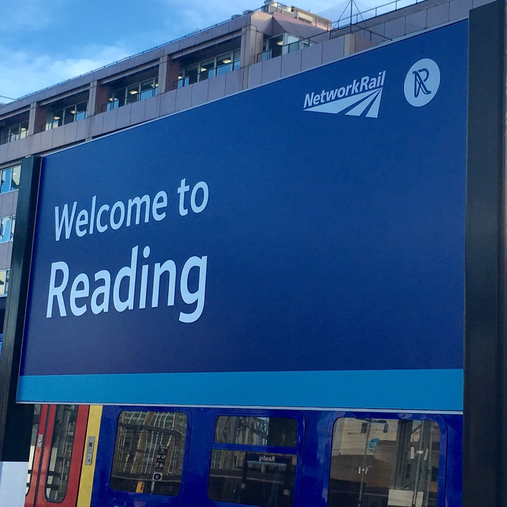
New (2020) symbol for Reading.
Reading Station symbol Network Rail Reading Station symbol Network Rail
Network outline
Network Rail station symbols / graphics
Network outline
Metro M symbols world wide
item4a1 item4a item4a item4a2b item4a2b item4a2b item4a1 item4a1 item4a1b item4a2a1 item4a2a1 item4a2a1 item4a1b item4a1b