 |
||||||||||||||||
|
|||||
|
|
||||
|
 |
|
|||
|
|||||
|
|||||
|
|||||
 |
||||||
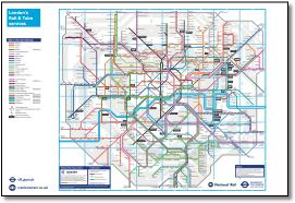
This is difficult, I'm not a great writer, but something has to be said. It's hard to offer a considered crit of the latest Rail & Tube map (December 2018) as the general level of cartographic design is low. And unfortuneately the map started from the wrong place, it took the tube map and added National Rail. This has resulted in some major distortions, for example London Bridge to Cannon Street which doubles back on itself - making what is simple complicated. It would just take too long to list all the issues. These run from individual points to general points about consistency of presentation. Reference the latter, I believe that running non-stopping services as separate lines remote from their companions is a no no. This is done on the TfL map where trains don't stop at stations and a caption may have to be read across the line to its station circle or tick. Other maps do not consider this a concern. A schematic should take geography and simplify it not meddle with it. What you see out of the window of a train is what the map should show (apart from some complex grade separated junctions). There are two major examples : Generally too there is inconsistency in the spacing between lines - I thought touching lines indicated different services running on the same tracks, but this rule is not applied consistently. Look around Wembley - Bakerloo is slightly further from the Met than the Met is from Chiltern; the four Euston routes nearby are much closer together. Bakerloo and Overground touched on the last map but I assume they've been separated as brown and orange (with a white keyline on the Tube only map) are too close to distinguish. Why do the two lines running into Euston and Moorgate touch? Generally the circular interchange symbol is badly used - sometimes one line runs in, sometimes more, see Paddington and Liverpool Street as examples. A common single interchange symbol is used where the Met and Chiltern share the same track at Amersham while separate circles are used where Bakerloo and Overground share the same track north of Queens Park. What does it all mean? Bridges are often wrong - which line runs over or under, and there are many layer issues eg Kenton and Wenbley, Old Oak Common and Chiswick Park. Point size for station captions is small too making the map inefficient. And there's the usual geographic culprit with the Cannon Street branch having to double back to above London Bridge. This is the problem from starting with the tube map (and adding National Rail on afterwards). Individual points There's some good though too! In addition to the well received walking routes - But you see what I mean? It's all a bit of a mess really, too time consuming to go into full detail. |
||||||
 |
 |
|||||
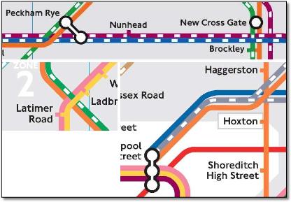
• Unnecessary kink in Overground at Queens Road Peckham |
|||||
 |
|||||
This article is now rather old |
|||||||||||||||||||||||
Layer mistakes on latest map May 2015 Note the wrong overlaps on the three sections of the May 2015 TfL Rail and Tube map. Most of the time the different TOCs are running on the same track but are shown to go both over or under lines they cross. |
|||||||||||||||||||||||
 |
 |
||||||||||||||||||||||
 |
|||||||||||||||||||||||
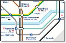
Four problems here. Obviously the interchange symbol (flogging a dead horse here) - doesn't mean at Embankment that it is easier to change from the Circle & District to the Bakerloo than the Northern line. Horrible Waterloo - why the extended interchange link to the Jubilee line? And why is the Jubilee line so bendy? Also, incidentally, weaving up and down between the Bakerloo and Northern lines. Overstretched Waterloo & City / Jubilee / Northern lines with hardly a station on the south side of the Thames! This is due to previous distortions elsewhere. Why do lines go over the Thames with white divider? Tube lines cross without this divider. |
|||||||||||||||||||||||
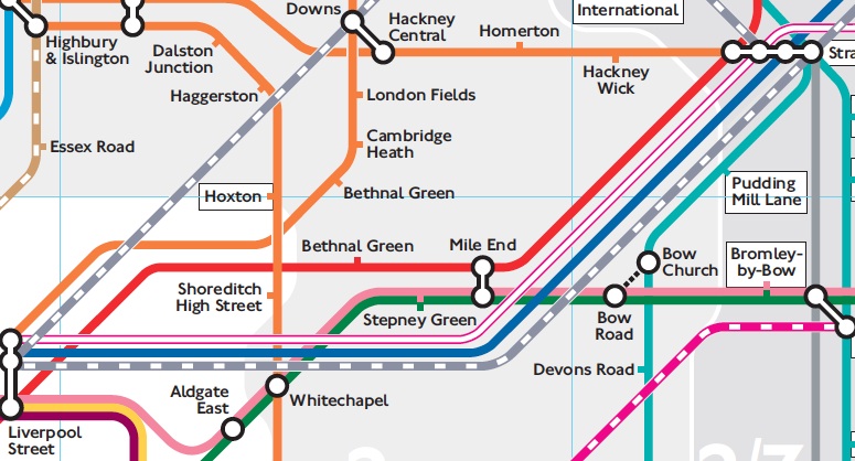
There is so much that is wrong with this horrible, horrible map, but picked out here is the treatment of the closed East London line. Is it necessary to show the three separate replacement bus services with all those full-sized interchange symbols? Add the bus symbols, ELW, ELP and ELC and the dagger symbol! Far too complicated. And as the supporting text becomes increasingly patronising, we now get: This section of track is part of the National Rail network. London Overground services will operate on this line from 2010. Oyster pay as you go is not currently valid on this line. Just leave it all off! |
|||||||||||||||||||||||
 |
|||||||||||||||||||||||
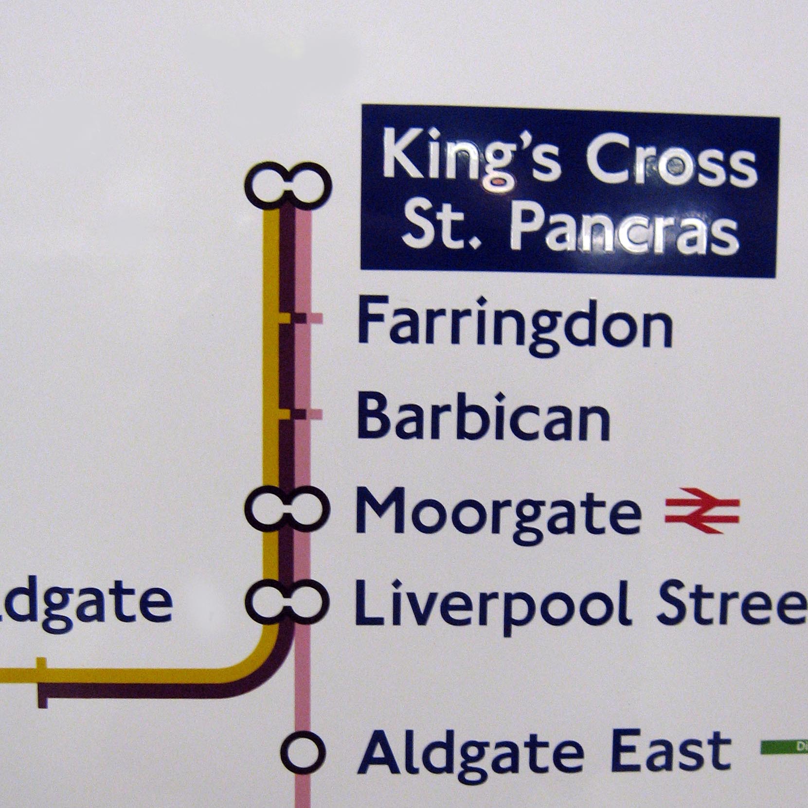
The Tube map I believe it was a design classic, but unfortunately no longer, for the following reasons. Beck was lucky that he had the Circle Line and a reasonable matrix of central London deep level tubes for which his formula of line weight, curve and station symbols worked. Extensions to the East have made it lose its simplicity. His formula doesn’t work for many other systems, the Paris map using the Beck formula is no more helpful in planning a journey than the geographic one, because the actual system is unplanned. A bit like the Southern Region, I don't think a map can be made to make sense of it - I haven't seen one yet. It’s only a design classic in the UK, because Londoners have grown up with it, its a cultural thing. Show a Parisian the Beck style Paris metro map and they think you’re mad - surely it’s better to have the streets in the background they say. The interchange symbol is the biggest problem, giving the impression that it is more difficult to change, for example, from the Central to District at Mile End than it is from the Bakerloo to the Victoria at Green Park, whereas you have cross platform interchange at the former and a very long passageway at the latter. This is done just for the designers cartographic convenience rather than helping the user plan a journey using the least physical effort. There are many examples of the confusion caused by this, Earl’s Court etc. This is because of the limitation caused by the simple interchange symbol that can’t encompass many lines, the map would be better using elongated loops like the German maps of Munich or Cologne. Another example is where the northern circle has three routes in parallel but only two interchange symbols as shown here on a sign at King's Cross - does the Metropolitan stop at Moorgate? A symbol should mean something consistent, here it doesn’t. |
|||||||||||||||||||||||
 |
 |
||||||||||||||||||||||
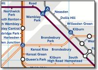
Four problems here. Both the Euston and Baker street routes share the same lines yet are shown differently. Jubilee and Met are set so far apart that a new extended interchange symbol is used, particularly weird at Wembley Park. The North London line wrongly dips up and down at West Hampstead. The readability clash between the brown and hollow orange colours is self inflicted. |
|||||||||||||||||||||||
All respect to wheel chair users, but this is getting ridiculous. A very bad design idea - confuses the original doctrine of ticks equal stations, circles equal interchange. A useless halfway house. Beginning to think that a wheelchair turns up instead of a train... |
|||||||||||||||||||||||
 |
||
And now they've introduced the new disabled symbol, is it a station or an interchange station? It just emphasises the problem and draws the eye to the DLR. Bank, Woodford and Waterloo look terrible. A very dubious bit of graphics this - there are so many other ways of doing this. For example, just use black ticks (better than using line colour anyway) and circles for inaccessible stations and red ticks and circles for those with disabled access. There are many poor layouts. For example, stations on radial arms are reasonably consistently spaced, whereas the stations between Morden and Stockwell are the most closely spaced, this is because there is too much space given to the Victoria-Stockwell-London Bridge triangle - all the stations in this area are more widely space than the central London area. Why does the Victoria line have to be so stretched here and why does the Jubilee line drop down so much for Southwark, it could quite easily be closer the Thames. What is the benefit in dropping the Central Line down at Bank and destroy the beautiful simplicity of a straight horizontal line? It is not like that geographically or necessary diagrammatically. The river could be brought closer at Blackfriars as there is a riverboat connection shown. The designer is working hard to keep station captions within zones, but this means double stacking some captions when they'd be more readable on one line (Hounslow East for example) and squeezing stations together (Kilburn Park to Warwick Avenue for example - although double stacking would have solved this - inconsistency of solution). There are lots of other poor renditions, bad alignment of interchange symbols at Waterloo, the New Cross Gate branch coming off the East London line without using the transition curve used elsewhere, an unnecessary bend in the DLR above West India Quay. Why drop the Hammersmith & City Shepherd’s Bush station down so far away from the Central Line station? This raises the issue of stations with the same name on different lines - what is the significance of the gap at Hammersmith compared with gap at Paddington? Why flush right Kensington Olympia over the station when centering is used elsewhere? You can't see the yellow tick at Aldgate - surely this is an interchange station just like Edgware Road? Farringdon should be slightly further down to look evenly spaced. The network should be the 'Underground', not the 'Tube' - or 'Metro'. |
||
|
||
The Londonist opinion : brand new maps brand new mistakes The new Tube and Rail Map replaces the Oyster rail map, which replaced the high frequency services map before it. It’s the result of an agreement hammered out between TfL and the Association of Train Operating Companies, and it should soon be showing up at every station in London, whether train, tube or tram. That’s a pity. Because it’s rubbish. It isn’t the fact that it’s ugly that’s the issue (although it is, astonishingly so). No, the problem is that it’s done away with whole chunks of useful information. For one thing, it’s oddly silent on how regularly the trains run, so that you can never be sure whether a line offers tube-level frequencies or one service a week. More importantly, though, it’s abandoned the practice of colour-coding lines based on which stations they run into. Instead, they’re coloured based on which train operating company (TOC) is currently running the things. North of the river, the routes only tend to go to one terminal anyway, so this doesn’t really matter (even if some of the colour choices suggest that the map was designed by a particularly poorly sighted bat). South of the river, though, it’s more problematic. The new map is helpful if you want to know which group of semi-competents are to blame for the cancellation of your train this morning (and we bet it’s Southeastern). But it’s not much use if you want to know whether you can get a direct train from Hither Green to Victoria. Which you can’t. But then, why would anyone need to know a silly little thing like that? It’s not all bad: the decision to colour-code by company will, at least, be useful for those whose season tickets are only valid on certain company’s trains. And the terminal-based system did seem unable to cope with the confusion caused by those trains that run into both London Bridge and Victoria. Nonetheless, it looks suspiciously like the new version has sacrificed information about London’s transport network that’s actually useful, in favour of sticking to the correct corporate brand identity. Because that, of course, is what really matters. Those of us who use the trains are, as ever, in no doubt as to where we come in the TOCs’ priorities. |
||||||
Project Mapping : more of the same from TfL So TfL beat ATOC when it came to design of the new map and TfL's old, tired format won out against the inovation in ATOCs Connections map. National Rail lines play second fiddle to tube routes - even to light rail and tram. Look at the title, tube comes first; look at the symbols, rail comes second. Described in the press release as 'a new, clear and combined map' it is hardly any different from previous versions, the excitement leading to the usual disappointment. The big issue as far as bloggers on the London Reconnections and The Londonist websites is colour coding the National Rail lines by train operating companies rather than by termini served. To some this is an improvement as there is a link with what people see at stations, the TOC corporate identity - the colour of the trains. It also leads to a lot of simplification with fewer lines and fewer colours. And 'filmstrip' styling versus 'tramline' styling for National Rail lines seems to be controversial. More important is the poor cartographic execution, the two biggest problems being the variable spacing between parallel lines and the inconsistent use of the interchange symbol. If anyone is looking for examples of why it is actually so bad, then look at West Croydon - why such a long connector? And Reeves Corner the wrong side of the Southern line. Why is Shadwell two blobs when Limehouse is one? And London Midland striking out on a new completely different route between Kilburn and Wembley! Waterloo & Waterloo East are one station? Arbitrary layer preference when lines cross. One gets the impression that TfL just rejects new ideas suggested by the many enthusiastic designers writing in on a regular basis. There is no debate, no open discussion, just more 'this is good for you'. Although I'm sure Pulse Creative are not complaining, good work for old mates. The importance of the iconic London tube map is too important to leave to TfL. |
||||||
|
||||||